
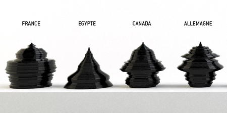
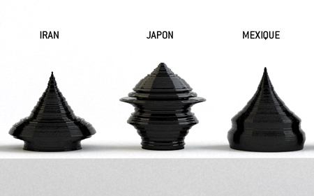
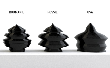
The Age of the World by Parisian designer Mathieu Lehanneur is a set of jars and urns that each map the ages of the population in a given country.

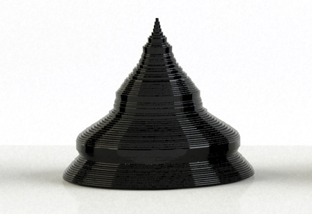
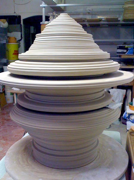
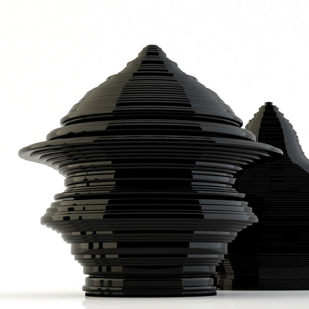
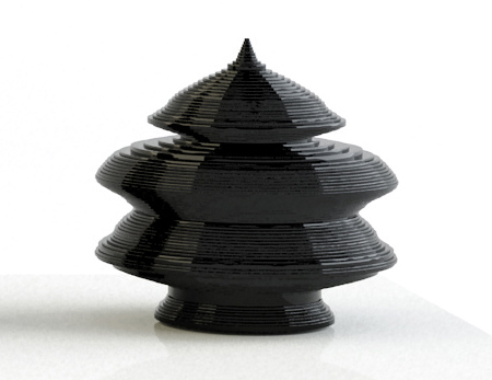
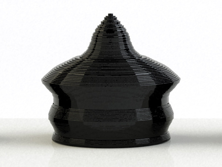
The ceramic containers are built up of 100 layers, each representing a year of life with birth at the bottom and death at the top. Above: Egypt

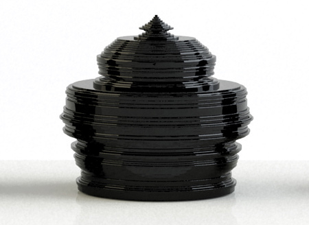
The circumference of each level is dictated by the number of people of that age in the relevant country. Above: France
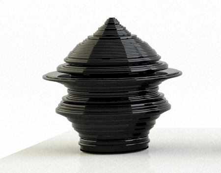
Above: Japan
More stories about Mathieu Lehanneur:
LaboBrain and LaboShop
Local River
Local River 2
Bel-Air

Here’s some text from the designer:
–
Age of the world’ by Mathieu Lehanneur at Issey Miyake (Paris)
France, USA , Japan, Egypt, Russia. The age-pyramids of the populations of five countries moulded in 3D, opening a perspective designed to freak us all out. Statistics quit charts and graphs to reincarnate in a curious set of containers, whether jars or urns, creating a radical representation of our human bondage in this world. Above: Russia

Birth is the base and death the apex of these enamelled terra cotta pagodas, whose contours change in phase with the age rings that translate life expectancy. From bottom to top there are 100 strata, shaped in solid or void, but the top end is always a sharp tip. What we have here is a fascinating twin-scope view of the state of living, a look at our own life-span in a sculptural surround view. Above: USA

Death is the motor of architecture… Spooky, creepy, prose-poetry.

What level are you at neighbour? How many you got left brother? Where you been all this time honey?

Dimensions: 60 cm high x 60 cm wide. Material: enamelled ceramic made at Vallauris by Claude Aiello.


July 22nd, 2009 at 6:08 pm
Very nice! Puts me in mind of Bertelli’s Continuous Profile: Head of Mussolini: http://www.tate.org.uk/liverpool/exhibitions/historyofclay/section2.htm
July 22nd, 2009 at 6:11 pm
next furniture?
http://www.adcet.edu.au/Admin/UploadedFiles/Images/Photos/statistics.jpg
July 22nd, 2009 at 8:36 pm
Nice, a la Tony Cragg…
July 22nd, 2009 at 8:38 pm
Great stuff! A genius response to those who don’t think statistics are sexy… It would be even better if it was design with a purpose rather that just being “urns”. It’s too generic a programme.
July 22nd, 2009 at 10:14 pm
somehow familiar :
http://www.via.fr/telechargement/gp/surfaces/briziosoundsystem.jpg
July 22nd, 2009 at 11:08 pm
How apropos that the jar based on US statistics is squat, rotund, and largely devoid of the elegance of the others…
July 23rd, 2009 at 2:29 am
The idea is beautiful, unique to each country without being cliche. But I agree with Max “It would be even better if it was design with a purpose rather that just being “urns”.
Why is it that everybody who finds a great inspiration for form always seem to manifest it in urns or vases? It seems to be the easiest solution- a cop-out.
Surely it is time to push the applications of these ideas further, match inspired ideas for form with an equally beautiful and intelligent function.
July 23rd, 2009 at 5:29 am
Kind of similar:
http://www.joelescalona.com/projects/head.html
July 23rd, 2009 at 1:45 pm
Idea is great…not so sure I like the result though! USA the fattest of all…suprise suprise
July 23rd, 2009 at 3:52 pm
and if the object has a pointy tip which makes it fall over the population is too old – nice image!
July 23rd, 2009 at 5:08 pm
Why should it have a purpose?
Its purpose is after all to talk about its own subject. Design is after all related to what an object should do, and trying to superimpose a discourse over an object, a discourse that has nothing to do with the nature of that object is always dangerous.
Let’s remember Adolf Loos a bit… and then try to imagine life expectancy in the us translated into a chair
July 23rd, 2009 at 5:45 pm
how original to make fun of USA. you guys should be journalists or something.
July 23rd, 2009 at 5:53 pm
If you see beyond the form, it’s fascinating…. I could spend lots of time looking at them…..
July 23rd, 2009 at 6:40 pm
i just do find this conceptually interesting, but i don’t know anything about Adolf Loos etc, nobody is really making fun of the USA in this project, at least I don’t think that that’s what this project is about,
July 23rd, 2009 at 7:49 pm
quite beautiful objects when there are all together.
One by one….not that strong.
July 23rd, 2009 at 10:55 pm
You should check my one year old “meta-design” project “URNA the shape with meaning”, that I did on my stay on Universität der Künste in Berlin. The shape of each urn is original, reflect the spiritual characteristics of given individuals, using Eysenck’s cross, age, goodness and rationality model. After ordering you get kit for manufacturing it personally.
Try create “your” URNA hire:
July 23rd, 2009 at 11:35 pm
How interesting that almost every country have a waist at 70 years, when WWII broke out.
July 24th, 2009 at 2:11 am
Cat, that is an embarrassing comment on your part. Its population not fat index. Yeesh
July 27th, 2009 at 4:13 pm
Interesting how similar Canada, Germany and Japan’s urn are, and to an extent Romania and Russia’s. If you arranged them in the right order it might even look like a natural progression. Add Egypt, Iran and Mexico’s to the start of the line and you have a pulsating spire.
July 28th, 2009 at 8:55 am
Conceptual very strong and also beautiful objects. Congratulation!
July 29th, 2009 at 6:30 am
world age in ceramics
July 30th, 2009 at 2:30 pm
Sorry, but this looks like an complete rip-off of Fernando Brizio’s design ‘Sound System’. Even the base idea is the same!!!
Check it out: http://www.iconeye.com/images/previous/icon062/fernando12.gif