Frank, Ettore and Toyo by Chris Labrooy
Graphic artist Chris Labrooy has designed a series of type faces based on the work of famous architects and designers.
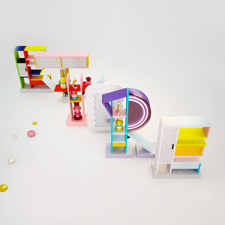
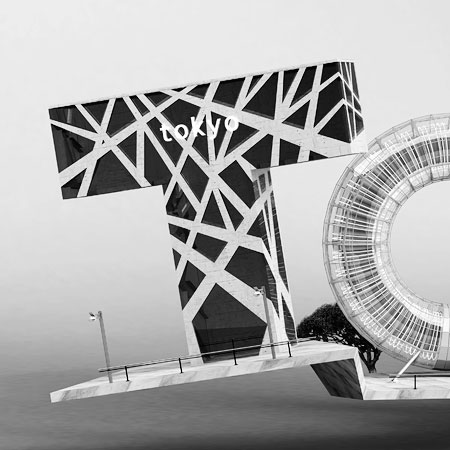
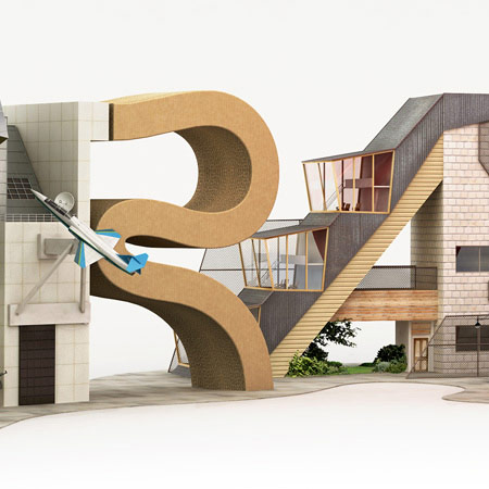
The designs are inspired by the work of some of Labrooy's design heroes: Frank Gehry (top), Ettore Sottsass (above) and Toyo Ito (below).

Here's some text from Labrooy:
--
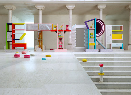
ETTORE: Letter forms inspired by sottsass's early 80's furniture.
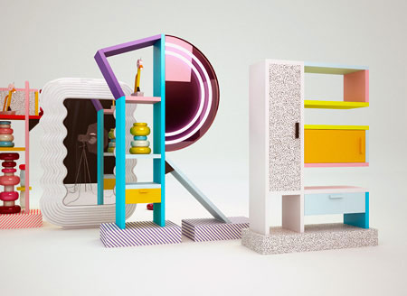
This period in history wasn't particularly beautiful, but was very colourful with shit loads of attitude.
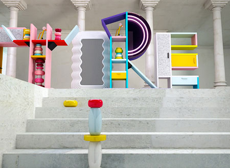
This work is an attempt to revisit the past, get inspired, and share with people new and interesting interpretations on familiar historical works.
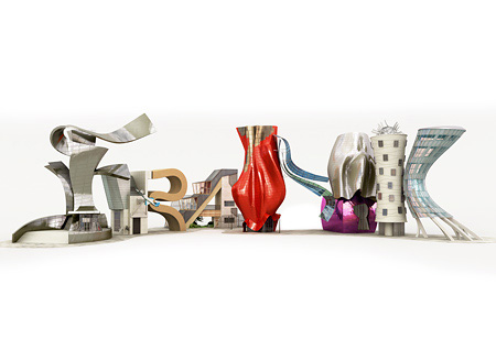
FRANK: The Frank image was fun to make because he has a rich and diverse vocabulary.
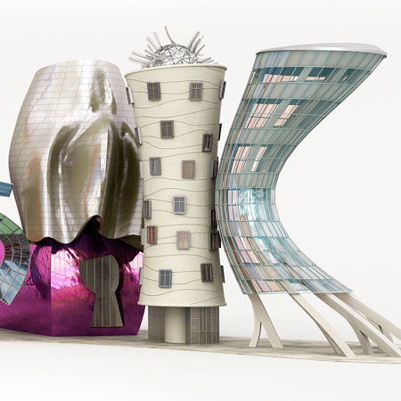
I was spoilt for choice when developing each of the letters but i settled for those which made for the best composition.
They include : Guggenheim Bilboa / Aerospace museum / Ghery house / experience music project / dancing house prague.
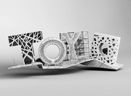
TOYO: The TOYO piece aimed to be simple and complex at the same time.
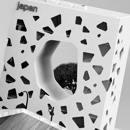
I love the combination of simple forms and inricate perforations. These letters are based on : TOD's omotesando / Tower of winds / Taichung opera house / Mikimoto department store.