August 28th, 2009

004-pr-completed1000px-04.jpg

Amsterdam architects O+A have completed an extension to a villa near Eindhoven in the Netherlands.

004-pr-completed1000px-03.jpg

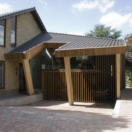
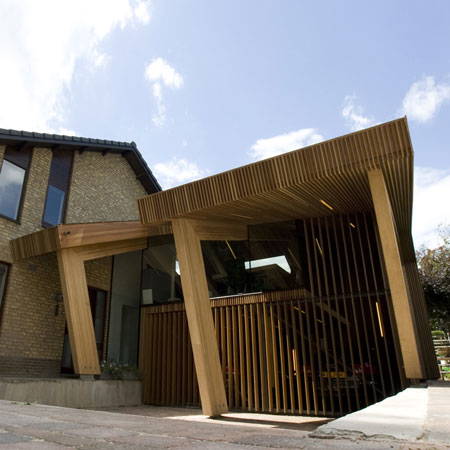
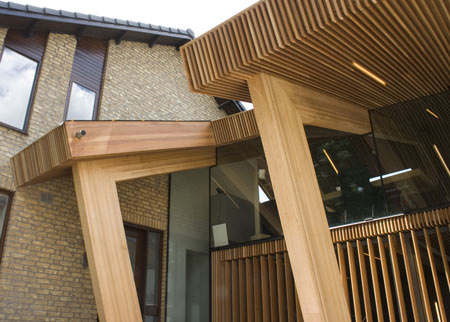
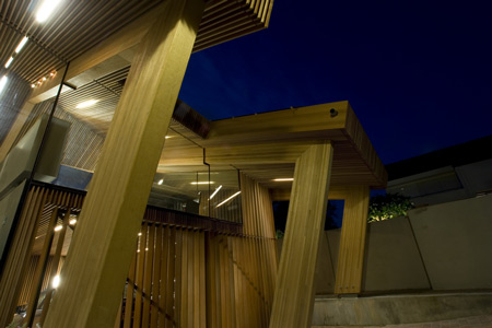
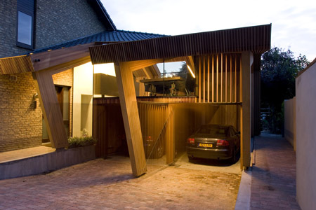
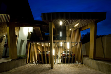
The upper story houses a glazed conference room, with a wood-clad garage below.

004-pr-completed1000px-063.jpg

Photographs are by O+A.

004-pr-completed1000px-15b.jpg

Here’s some more information from O+A:

O+A was commissioned by a private client to design the addition to a detached villa.

004-pr-completed1000px-05.jpg

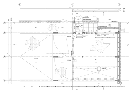
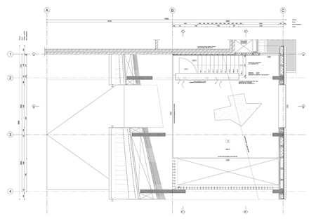
The project brief entailed the design of a carport for two cars and a conference space.

004-pr-completed1000px-09.jpg

The villa, designed and built in the 1970s, has an extroverted addition which was completed in the 1990s.

004-pr-completed1000px-15.jpg

In avoiding a cacophony of material and form, the villa was taken as a starting point for this latest addition.

004-pr-completed1000px-16.jpg

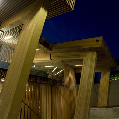
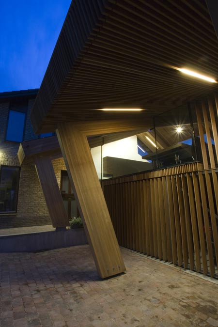
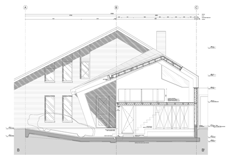
The particular shape of the roof is a result of bureaucratic zoning law limitations, technical limitations in constructing a foundation next to the existing house, and demands in terms of use.

004-pr-completed1000px-13b.jpg

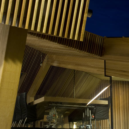
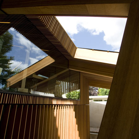
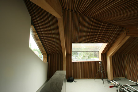
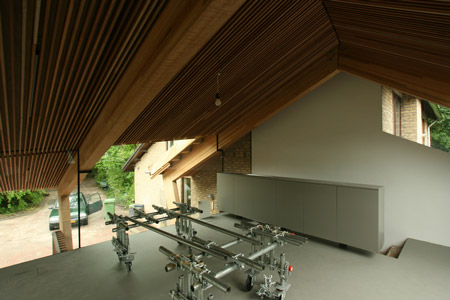
The architectural ambition is especially evident beneath this roof, where the functions ‘conferencing’ and ‘parking’ form two intersecting L-shaped volumes.

004-pr-completed1000px-12b.jpg

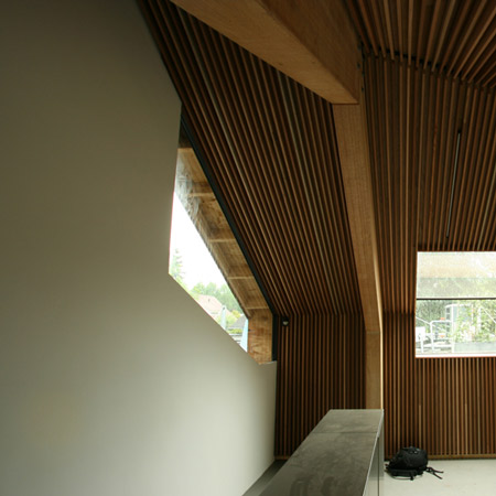
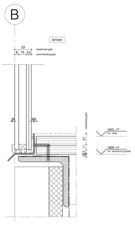
The climatised conference space is enclosed with minimally detailed, structural glazing.

004-pr-completed1000px-11.jpg

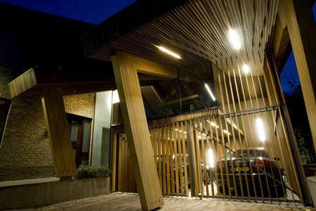
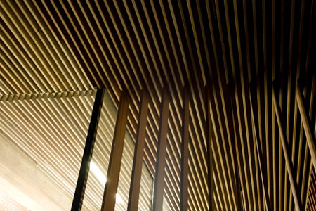
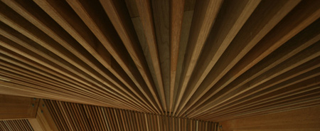
The carport is not climatised and is enclosed with timber boards, which seamlessly continue into the ceiling- and wall finishing.

004-pr-completed1000px-17.jpg

Beneath the roof, an interesting dialogue arises between material and space.

004-pr-completed1000px-12.jpg

The project was completed in July 2009.

004-pr-completed1000px-07.jpg

An aspect that sets this commission apart is that O+A has assumed the roles of both chief contractor and glass engineer.

004-pr-completed1000px-02.jpg

villa-extension-by-oa29.gif

villa-extension-by-oa27.gif

villa-extension-by-oa28.gif

villa-extension-by-oa26.gif


Posted by Jonny Jones

14 Responses to “Villa extension by O+A”

  1. trent Says:

    …ahem…overkill…

  2. kanwal Says:

    anything with wood gives distinctive character to the place….
    reminds me of Gehry’s serpentine gallery last year.

  3. JohnH Says:

    bulky

  4. Waleed Ghanem Says:

    Wood .. very warm material to work with ..
    i like it ..

  5. lex Says:

    I really don’t like the roofmaterial and the colums…
    The projects looks a bit disturbing in total.

  6. Maria Says:

    well put trent.

  7. Michael Says:

    While I really dislike the glazing details, the overall space is great. This is a really bold addition that does not compete with the villa, yet tells the local planning office to go screw themselves. I am always a fan of designing around ordinances and zoning laws. Great work guys!

    You can see by using the wood like that, it is technically not an insulated space, but the bulk of the “structural” wood members act as insulation. Enacting the bulk was needed to create a stiffer frame so the entire wooden addition could be set on pin-connected columns to avoid a new foundation. There are no interior finishes, and it seems to extend up from the carport. This is an uninsulated, unfinished, carport without the need for new footings or foundation. Can’t anyone else see the brilliance in that?

    Don’t compare this to Gehry’s gallery, that was steal clad in wood. That office couldn’t design a sophisticated structure if their lives depended on it.

  8. cameron Says:

    would be nice to see what the original building looks like and how the addition works as a whole.

  9. Tumi Says:

    Wonderful design.

  10. Ara Says:

    The angles are really nice.

  11. Zabel Says:

    I really enjoy the uncompromised visual statement this addition makes.

    The geometry is bold, with a floor plan that is straight forward enough to seem simple, but the angled column lines and roof lend so much to make the form wonderfully dynamic.

    It’s just complex enough to warrant interest, but avoid a cluttered look. And who wouldn’t want to play with a hyperbolic paraboloid roof? It was a solution to work around a wonky ordinance at that!

    It’s also detailed so well that the lines and joinery look continuous, clean and effortless. Very few pull that stunt off well.

    While the parallel wood slats can seem a bit overpowering, maybe even a bit wasteful, there is a lot of payoff in the conference space with a look like a high end recording studio or performance hall.

    I also like that the roof material matches the main structure – it’s just enough to visually link the two parts.

    Two thumbs up, and a loads of jealousy since I haven’t had a commission yet that allowed this kind of creative freedom.

  12. Shengel Says:

    Best project in years!
    Reminds me of a giraffe, drinking water.

  13. ness Says:

    really nice, but dusting this place must be a pain in the a*$

  14. marielle Says:

    It looks a bit heavy, bulky and not so inviting to me. Would this have been better (and more pleasant to experience) if it would have been white perhaps?

Submit a comment

See our comments policy