10 Hills Place by Amanda Levete Architects

| 42 comments

10Hills-Place

London practice Amanda Levete Architects have completed the facade of an office building off Oxford Street in London.

Hills Place 4

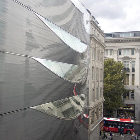
Located at 10 Hills Place, the project consists of four glazed slashes in the aluminium surface, funneling light down into the offices.

Hills Place 8

The architects drew on technology normally used to build ship hulls.

Hills Place 9

Photographs are by Gidon Fuehrer.

Here's some more information from Amanda Levete Architects

--

Work on 10 Hills Place is now complete.

Amanda Levete Architects has harnessed high quality ship hull technology to create an ingenious sculptural facade for a new office building just off London’s Oxford Street.

Hills Place 2

Lack of daylight in the narrow streets around this major retail artery was a key issue. Inspired by the art work of Lucio Fontana AL_A slashed the aluminium skin with large glazed areas orientated towards the sky to maximise and channel natural light into the office space.

Hills Place 7

The facade is fabricated using curved aluminium profiles assembled on-site. Self cleaning glass and hidden gutters within the eyelids ensure the facade remains low maintenance.

Hills Place 11

The fine faceting of the aluminium strips creates beautiful and complex reflections of sky and street, making the building highly visible from Oxford Street.

Hills Place 10

At ground level a bespoke glass, mesh and dichromatic film sandwich is animated with fibre optics to create visual depth of field and a dynamic moiré pattern on an otherwise blank facade.

Hills Place 5

Hills Place 6

One Response to 10 Hills Place by Amanda Levete Architects

  1. Tim says:

    Wonderful, unseen architecture in reality. Formal logic reminds me of old OMA projects and the work of Lucio fontana. From the exterior photo the work looks like implemented in pretty fine detail…. great, congraturation, I wan to see more from them… Good luck..

  2. It looks like alien between these old buildings, intriguing… I like it!

    Francois Beydoun

  3. Ninian says:

    Clever idea, looks like an amazing space inside. Even if it externally it’s a bit at odds with its neighbour!

  4. Ninian says:

    Materially i mean, but for the first time in ages something that I LOVE!!!!

  5. tman says:

    Absolutely stunning. The contrast of old and new, textured and sleek, chromatic and nonchromatic, serve to lighten the weight of London and its burden of repro-historicism. This reinforces the sage idea that our urban environments must understand the past, stay in the present, and keep an eye on the future. This is bold and brave architecture.

  6. akib says:

    just stumbled over it the other day, it looks great in reality!

  7. Anamaria says:

    Very elegant! I like the fine edges, they make it seem organic in some strange way

  8. boedz says:

    smart idea, great detail! I love it. Congratulation!

  9. Beautiful façade in terms of design and material used. I would like to see a detail of how the aluminum sheets are supported. I’m wondering how thick these aluminum stripes are and how were they cut in order to achieve this perfection and a very smooth result. I’d love to see the interior space and the quantity of light in it. Nice

  10. N says:

    really nice the way the reflections make the building look like it’s merged into the sky in the photographs.

  11. Art's Life says:

    naaaaaaah
    it’s just nor right…. the place of the building is somewhere else
    it’s sure not like the other buildings I admire that
    but it has to be part of the street.It has to belong to the street .it’s like a choc …. in time in materiels used in design
    hmmmmmmmmmm
    honestly I don’t like it, it’s not something i’d love to look @ for the rest of my life …….. >>>> I’m a nature lover people

  12. Trish says:

    It is wonderfully simple but yet powerful idea. I enjoy how the design was taken to the detail and its expresion of materials. Thumbs up

  13. Archzed says:

    Interesting execution, but it seems they slapped Jan’s Maserati Museum roof on a vertical surface.

  14. Neil Sharman says:

    Amazzzing and just around the corner from another FS facade project. A great way to perhaps update aging non-classic London architecture

  15. LOW says:

    An aluminum shark

  16. biggy says:

    I saw the renders of this project previously on the web and never thought they could ever bring it to reality, but I guess I am wrong!

    It looks amazing, just like the renders! The detailing around the windows look really nice and sharp. I really look forward to seeing more stuff from these guys.

    I want to see more of the interior though anyone got more info?

  17. Jejon Yeung says:

    Looks like a giant desk pedestal.

  18. Ron says:

    Seeing metals used for facades before I truly hope that they thought about the glare and how to control it. It already looks like in some of those photos that the sun is extremely bright and potentially a hazard. Very novel idea but I wish material choices would have taken a larger consideration.

  19. ios says:

    awful, especially when you know that they have designed one of the most horrible facades on oxford street.

  20. J says:

    very cool !
    ..so, Amanda Levete is the one with taste?!

    Thats the future systems I love!
    CONGRATS!!

  21. Filip says:

    Ahhhh! I can’t wait to see this later tonight! Going to geek out.

  22. sell-out says:

    saw it in real life- it rocks!

  23. toni o says:

    this is brilliant – so like a render, love it!!

  24. sean says:

    This building in the location it is makes me think of those beater cars that are sporting the top of the line rims. Everyone looks at it and thinks it looks stupid yet in the mind of the individual it was somehow a good idea. The setting is totally inappropriate for the design. To me making something that should be amazing to something silly and kitsch.

  25. tony harding says:

    Intriguing; beguiling as an object but I can’t help feeling that the lettering on the shop window of the third photo down says it all – ‘SPACE INVADER’.

  26. Nicolette says:

    I disagree. Sun light is the same brightness regardless of the angle of the window. In this case, the glass also looks like it has been treated to prevent such hazards. The angle actually allows light to reach an even bigger area to light up the interior.

  27. M says:

    One of their best recent works… ! much better then the diamond facade one they did on main oxford street…

  28. coco york says:

    I really really like it – amazing – and the facade works well –
    http://www.najjar-najjar.com/ already used it in 2002 – it works and it’s not glary

    it feels really good seeing someone is really producing architecture on top top level – gratulations!!

    we wanna see more!!

  29. yaulee says:

    the windows actually reminds me of the copper coloured Starck bldg in Japan (Osaka?)

  30. Jon says:

    In response to Ron:

    Have you ever been to London? Have you ever been down the side streets off Oxford St?

    Trust me they are not bright, and London is rarely sunny. I think the material is a great choice it looks like it really is bringing some much needed life to what is a dark dreary side street.

    If you are in London I really suggest you go down and see it. I work round the corner from this building and in real life it just does not look real; it looks like someone has created a real life render.

    I saw the AJ have a building study on it:

    http://www.architectsjournal.co.uk/buildings/office/10-hills-place-london-by-amanda-levete/5207832.article

    I guess the printed magazine must have a technical section on it? Though I haven’t seen it yet.

  31. fl!p says:

    i wonder what jan will say about this?

  32. Arnauld says:

    AMAZING!!! surrealistically good!..evolving new skin…nice too

  33. Saiman says:

    A really tight design flawless detail. Very clean and no fuss. well done!

  34. Martin says:

    Art’s life.. no mate, just.. no.

    Ron.. I’m sure that the aluminium will acquire a film of London grime within a few months, which should take the shine off by the time next years all too brief sunny season starts.

  35. steve says:

    Art’s Life: honestly, sit back, relax, keep admiring this building and it will finally click… this is an excellent solution to a set of design constraints.

    Ron: not everything can be built out of brick… boring world that would be.

  36. sluggo says:

    Anyone who discusses context and the buildings matching please educate your eye. The buildings in the third shot on the right are a beaux arts style classical building and what looks to be a thirties moderne building on the left. These styles are not considered “matching”. The moderne building would have been criticized in the thirties for not “going” with the building on the right. This is a tired critique on a building so obviously well-considered and realized as Levete Architects project.

  37. mauz says:

    The facade looks wonderful, but what about the space, what happens inside, what about the rest of the building?

  38. M Sharif says:

    Fresh, fresh, fresh.

  39. mahrous says:

    i like ur work amanda since future systems

  40. Obayashi says:

    I think this is one of the best works that have successfully bridged the boat construction technique with architecture using modern technology. The result is a highly original and eye-catching design. Aesthestics aside, the building is also very functional and practical with the clever “eyes” that are able to draw in light into the interior that would otherwise have been relatively rather dark due to the narrow street frontage. Definitely a very thoroughly thought through design that fuses unusual form with practical function, and a good case study for architecture of the future. She is definitely a lady to watch out for, as I believe she might surpass the great Zaha in no time if she keeps producing work of such high standard.

  41. gaque says:

    i do find it interesting at first glance, but it’s really just another hermetic, air-tight box with a sexy façade.

    if obayashi thinks ms. levete could surpass zaha hadid, she’ll have to try something new, because everybody knows ms. hadid is already the master of hermetic, air-tight architecture.

  42. biboarchitect says:

    The detail text is very small.. I cant read it.. cant it be larger?

Leave a Reply

Your email address will not be published. Required fields are marked *

*

You may use these HTML tags and attributes: <a href="" title=""> <abbr title=""> <acronym title=""> <b> <blockquote cite=""> <cite> <code> <del datetime=""> <em> <i> <q cite=""> <strike> <strong>