web tracker
October 6th, 2009

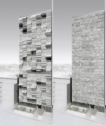
Berlin practice Hackenbrioch Architekten have designed an apartment block for Lima, Peru, where sections of the facade fold open.

Called Golf’s Tower, the building will have a view over a golf club on one side and the sea on the other.

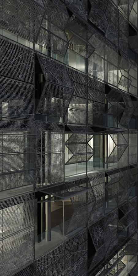
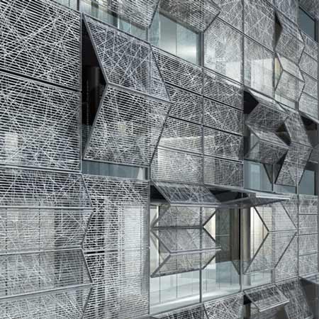
Full-height windows in the facade fold away and open completely, combining with folding sunshades to transform the opaque block and open it to the surroundings.

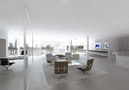
The apartments are divided into rooms on the south side and have an open-plan arrangement on the north side of the building.

Interiors are divided by sliding walls and screens.

Here’s some more information from Hackenbrioch Architekten:

Golf’s Tower – Apartments San Isidro, Lima, Peru

The Golf’s Tower provides “Panorama Apartments” which embraces the view over the Lima Golf Club. The graded rooms and the multiple ways to open and enclose them allow the users to individual configure the inside-out relations.

The apartment unfolds towards the context through the plan that turns from an enclosed sequence of spaces at the south side to an open plan towards the north side. The main rooms like the living room, dinning room and master bedroom are situated at the façade, while the TV-room, study, kitchen and master bathroom are connected to these main rooms. Living, TV room, dinning, kitchen and master bedroom can be combined to one continuous space along the facade to maximize the experience of the “Panorama Apartment”.

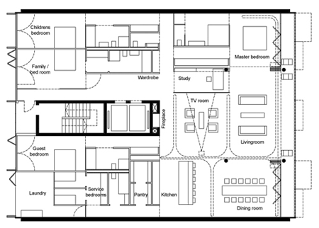
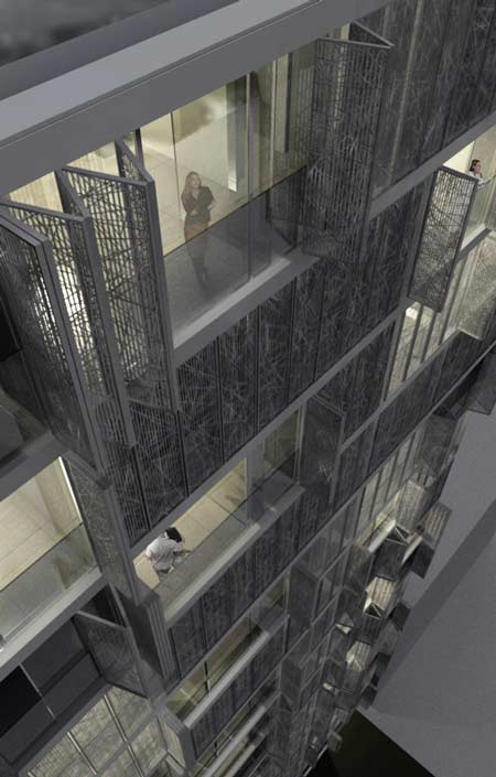
The inside view from the apartments is modulated through various elements: The balcony along the entire width of the building has operable sunscreens, the floor to ceiling windows of the facade fold away and open completely to turn the inside out. The dining area and the kitchen have four sliding walls to close them to the living and TV room. The master bedroom is separated from the living room by one large sliding door; the study is separable from the living and TV room by electrochrome glass. A “soft” separation are the curtains running in a curtain rail “loop” which is cast into the ceiling and so the curtains can be placed anywhere along this “loop”.

The remaining bedrooms are facing the Pacific Ocean towards the south. The operable floor to ceiling windows have external covers, similar to the front facade, which act as view protection. When open they give way to the Ocean view as well as protect the view from the side.

The structure of the building is a cast concrete structure. The north side is open and flexible through four columns supporting the structure. The circulation core structurally supports the north side.

The privacy of the apartments is enabled by the external sunscreens. When closed, these form a “solid” building and provide an ever-changing pattern when partially open. The flexibility of the apartments constantly shapes the sculptural appearance of the Tower from the Lima Golf Club like a living organism.

This website uses IntenseDebate comments, but they are not currently loaded because either your browser doesn't support JavaScript, or they didn't load fast enough.

30 Comments

  1. designdummyblogger Says:

    is the profile of that building really thin?

  2. Katy McDevitt Says:

    The exterior looks kind of Blade Runner-y when the screens are down and I’m not too sure how you market dystopia. I also have to wonder how often those folding façade bits would fail to work. Moving parts = recipe for cursing, tooth-gnashing, cat-kicking tenants.

  3. designdummyblogger Says:

    yeah i have to agree katy. i thought of designs like these for my projects (like i have any to brag about)…. but it boils down to execution and maintenance.

  4. bodkin Says:

    Katy, as long as the management company levy a large enough service charge to pay for someone to maintain the shutter mechanisms i’m sure they will be ok. i would assume that this is not intended as a cheap social housing development seeing as it overlooks a golf course and the sea so the price for the maintenance will probably not be an issue.

    but i do tend to agree with your sentiment that the more complex you make something the more likely it is to fail, and that is contrary to the sustainability agenda.

  5. Post Says:

    kennel-sized service bedrooms with no window … welcome to the 21st century … the plan in general looks nice, generic. but as long as such a minor detail becomes a manifest of a hopefully overcome society, I think the architects didn’t cope with their responsebility. Especially since they are from Europe.
    I don’t mind that some people can afford servants. I think that is a desireable job for many. But only the relation of laundry to service bedrooms shows the value of human beings for the owners of such apartments.

  6. stefan Says:

    that`s sooo herzog&de meuron… 15 years ago

  7. yimyim Says:

    one way to react to an extremely inefficient floor plate….talk about designing your way out of your own problem…very….questionable…

  8. El Dylan Says:

    Is this the same site/lot as the Arquitectum “Golf’s Tower” Competition?

  9. Etienne Says:

    guess what? i like the facade. and the interiors seem very elegant and calm. great design.

  10. Gabi Says:

    I wonder if people living in a flat with such a confused floor plan will be happy because they have this folding grill on the facade..

  11. Moll Says:

    … not bad !.. it woul’d be good to see mor of such buildings arround … i think )…

  12. a-ngine Says:

    Post: you got it precisely!

  13. Tim Says:

    The facade is kinda cool, but that’s just dressing up the mess of the floor plan. There are so many things wrong with that, that I don’t even know where to start…

  14. angry catalan Says:

    To be honest the moving parts needn’t be too complicated to actually work. As in the H&dM building this is ripping off, or some Enric Miralles buildings which had absolutely crazy wooden shutters (Hostalets Town Hall comes to mind).

  15. ryan Says:

    wtf. do the windows open sideways or up and down?

  16. ajua Says:

    Lima Peru?
    Interiors, exteriors and materiality doesnt look like Peruan, for me is one more non-place building, looks the same if is in Berlin, Bogoto, Mexico city, Sidney, NY etc…

  17. peter Says:

    totally disagree with katy. can`t see any notion of distopia or bladerunner at all. its a simple and clear jet vivid façade. more like an architectural cy twombly if anybody needs an exterior reference…
    @Post: the thin line between laundry and service bedrooms is still to be interpreted i guess;)
    anyways i love it.

  18. mp Says:

    ok people get your shit together… do they open horizontally or vertically??

  19. aeolus Says:

    There does seem to be a security problem with the elevators opening directly into the apartments which I suppose could be controlled to a degree but not entirely and as was mentioned the long term reliability of the screens. Beyond that, the ability to get away from the claustrophobic aspect of apartments is exciting.

  20. plopp Says:

    I think the owners will afford the maintanance of the shades, they actually have a “service bedroom” ->not cheap…

  21. peter Says:

    @ajua @mp Thats a no-brainer. The left side its vertical and the right side its horizontal.

  22. julien Says:

    This is just their LOST entry for ARQUITECTUM GOLF TOWER COMPETITION. They are not designing it!! Check it out at arquitectum.com under golf tower competition. On their own website, the architects mention it was a competition and they don’t pretend it would be built. I don’t understand the ambiguity…@ Dezeen?anyone?

  23. Barton Smith Says:

    I surprisingly don’t mind the scratchy facade graphic, like an oversized fiberglass texture.

  24. Etienne Says:

    …well, when i look at the finalists at the competition website, i can only wonder: this design should have won the competition!

  25. Anne Says:

    Well you know guys, that ARQUITECTUM stuff is simply a lottery. The point is to make money for the organisers – there never is, or will be, a real project. Quite a clever scheme, but no self-respecting architect or designer should participate in such a fraudulent scheme.

  26. D_SPOT Says:

    bad H&DeM from 86

  27. _ee Says:

    hate to break it to you, @Barton, but that facade graphic is just a graphic. It’s lazy and a quick rendering trick to use one bitmap and avoid the gridded look of panels that would actually occur. Unless you think they’re actually going to custom lasercut every single one.

    @Peter, thanks for proving there is at least one dezeen reader who can actually read a plan.
    @ Everyone else, are you thinking of HdeM’s Rue des Suisses in Paris? Just visited and I immediately thought of it, or do you have a different reference? @ D_SPOT, you mean Ricola?

    Finally @Anne, Thank you!!

  28. Juca Says:

    Totally agree with Post. Location and size of the service bedrooms in comparison with the laundry room is obscene.

  29. Kevin Morris Says:

    I like the facade, and the mechanics are really not that complicated.

    In terms of maintenance, those shades will likely have tremendous benefits to building occupants, the environment and the building owner. Here’s an example in an article in the Wall Street Journal about the problems with glass facades when no external shading is integrated into the design (faded fabric, extreme heat gain, privacy):

    http://online.wsj.com/article/SB121997078093581911.html?mod=residential_real_estate

  30. arjun Says:

    not really sure what the weather in lima is like but there is a serious lack of cross vent caused by the structural arrangement and i guess there need to be a whole bunch of domestics around to keep moving the partitions and curtains. wonder what the interior space looks like when the screens are shut, could be quite dark and dingy.

Submit a comment

See our comments policy