web tracker
March 3rd, 2010

Japanese architect Toyo Ito and b720 Arquitectos of Spain have completed two adjacent towers in Barcelona containing a hotel and offices.

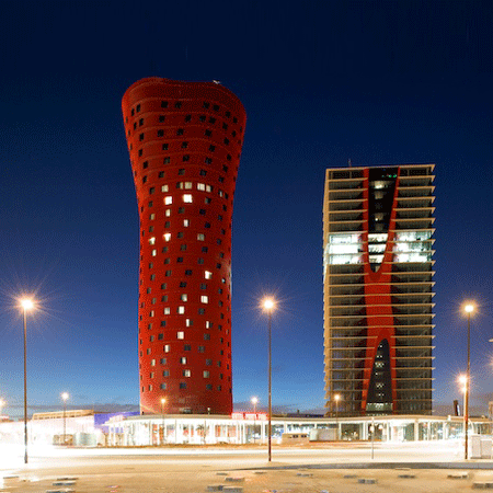
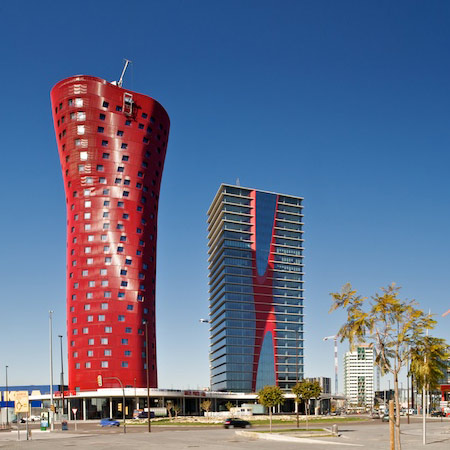
Called Porta Fira Towers, the two buildings are linked by a common atrium.

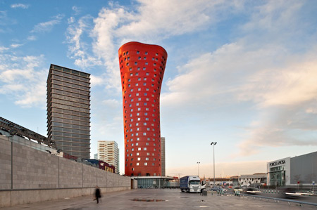
The hotel is contained in a distorted cylinder, expanding towards the top and clad in red metal panels.

The office building is a rectangular volume with a glass curtain wall and red motif running through the centre.

Photographs are by Filippo Poli.

Here’s some more information from b720 Arquitectos:


Porta Fira Towers

Hotel and offices building in the Plaza Europa. Barcelona

Designed by the Japanese architect Toyo Ito and b720 Arquitectos, lead by Fermin Vázquez, the uniqueness of the large architectural project proposed has as one of its priorities to respond to the environment and exploit its strategic position. Located between the airport and the city of Barcelona, the Porta Fira Towers intend to become the gateway to l’Hospitalet de Llobregat and the city of Barcelona.

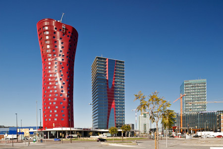
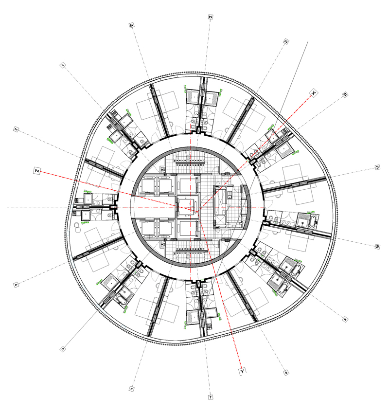
The project consists of two towers that perform a subtle dialogue between them. The hotel (PB +25), is designed to turn on itself changing its perception as it is surrounded. Its skin is made of a system of red metal tubes placed with a certain inclination. This perception is complemented by the second tower, which will house offices (PB+22). A pure volume at the first sight, with a glass curtain wall, but the core of which also turns red on itself, becoming, in this way, a reflection of the hotel tower. Between the two towers, and connecting it, there is a common atrium.

Its unique appearance, along with its 110 meters in height and the total gross floor area of 80,108 m2 of the two towers, turned the project into one of the new milestones in the new Plaza Europa, in the town of L’Hospitalet de Llobregat and a clear reference in the Barcelona’s skyline.

FUNCTIONAL PROGRAM

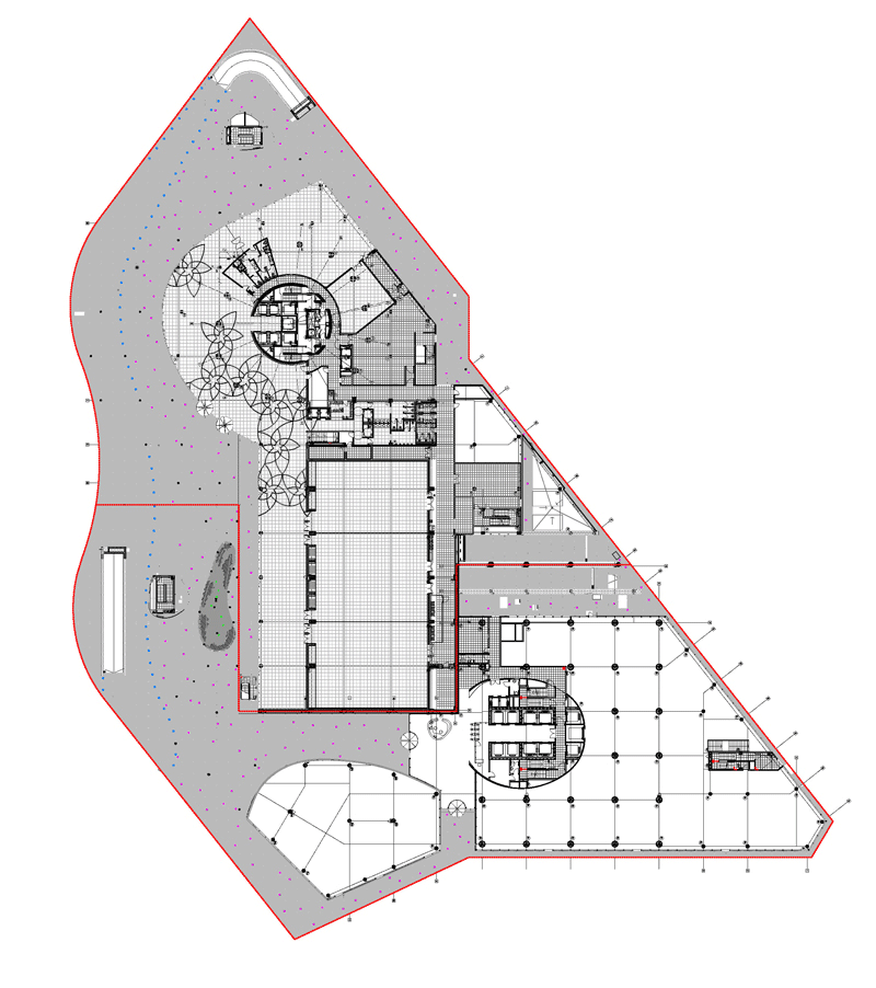
The project consists of three main uses: hotel use, office use and commercial use. The various uses are distributed as follows:

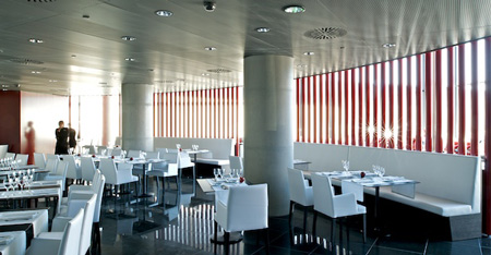
  • The hotel program was introduced in 28 plants spread over PB+25 and two technical floors and a gross floor area of 34,688 m2 in which are located approximately 344 rooms and 2 technical floors. The remaining space is distributed in a hall, a large banquet area, restaurant, conference and services areas (back/front office y bach of house).
  • The offices program office, distributed in PB+22 and two technical floors, distributes and open floor plans of great structural light in a gross floor area of 45,420 m2.
  • The commercial program is located within the parcel for offices, on the ground floor, building the façade that defines the park and closing the commercial ring Plaza Europa.

Location: Plaza Europa. L’Hospitalet de Llobregat. Barcelona.
Gross Floor Area: 80.108 m2
Architects: Toyo Ito (ITO AA) and Fermín Vázquez – b720 Arquitectos
Project: 2004-2006
Execution: 2006-2009

This website uses IntenseDebate comments, but they are not currently loaded because either your browser doesn't support JavaScript, or they didn't load fast enough.

57 Comments

  1. contort to retort Says:

    oh my god that is so ugly. there has got to be some protesting public in those shots. this is bad. very bad. go on prove me wrong.

  2. Francois Says:

    What the f…..
    Architecture isn’t a video game !

  3. Eamon Dunphy Says:

    Oh no Ito!!!

  4. martin Says:

    I feel slightly nauseous..

  5. Paul Says:

    A “subtle dialogue”? It´s more like the cold silence between a couple that finds out after years of being married that they in fact have nothing in common but are only bound by marriage and the fear to leave

  6. urbanizr Says:

    5 star restaurant with hospital ceiling?

  7. stefan Says:

    I love Toyo Ito but this is a very poor design

  8. san Says:

    “respond to the environment” – cannot see any dialogue at all in this project – neither between the two towers (come on guys, theres better ways than just a shared atrium…) nor between the buildings and the context. btw – what is the use of spending lots of money building a non-standard tower with a “unique appearance” when using standard windows with absolutely no unique appearence whatsoever? If this is really “one of the new milestones” I feel bad for the “Plaza Europa”

  9. michael Says:

    the ito tower is kinda interesting, but it doesn’t get nicer because it’s red…

  10. colectivo futuro Says:

    now that’s an ugly as hell building!!

  11. JP Says:

    that is why they say architects are dangerous people!!!!
    this is a joke.

  12. angry catalan Says:

    What’s interesting about this project is how it leads you to the Fira 2 complex: the two towers are the gate of what amounts to a corridor which leads you somewhere else in a short time while mantaining an urban character (well, as urban as an area next to an airport, a motorway and and a mega industrial park can be…), which pretty much fits Toyo Ito’s ideas of fluid space, fluid urbanism… I don’t know what to think about the tower themselves, though, the red one had a similar but much better shape in the renders, and they’re definitely not Ito’s best, but they’re not unreasonable either, they’re just kind of there.

    There’s some other interesting stuff in Plaça Europa. Check out RCR’s building, currently under construction.

  13. JP Says:

    Definitely not ITO’s near best.
    it is there only because it is signed Toyo Ito, if it were a young spanish architect he would have never had this opportunity although might have been better,

  14. I Can Has Cheeseburger Says:

    gotto luv barcelona…thy really invest in architecture! UK…F****** take note!

  15. Chen Says:

    Like Paul’s comment!

  16. Abhi Says:

    The red tower is pretty cool.weird but cool !

  17. Mikey 3000 Says:

    VOMIT!!!!

  18. Maro Says:

    that red root is like a mushrom without its cap!!!

  19. eye + Says:

    these look really horrible lol and it’s not about the color

  20. scetchy Says:

    well,…. so awful.
    I once thought I like weird things. Being sometimes a culprit myself I sometimes wish back the times of Mies’s Seagram building. Where is the sublime these days.

  21. amsam Says:

    Blood in the sky!

    Paul is LMAO on the money.

  22. oscar Says:

    What a stunning collaboration between two cutting-edge architectural practices, showing that, when disparate architects put their minds to it, ideas and forms can truly be created in harmony! You both used… red. From the city’s planners, to the enlightened developers and the talented designers, congratulations are due for all.

  23. angry catalan Says:

    JP: the area is full of rather bad buildings by local practices. Oh, and a Nouvel which looks horrible.

  24. angry catalan Says:

    By the way, the red tower is not clad in red metal panels, it’s clad in red metal tubes, hence the render-like shiny effect.

    ps. b720 is pretty much the worst famous Barcelona practice

  25. idealist Says:

    you get the impression from the plan of the tower that the perimeter is a continuous glazed surface/curtain wall… which would have been much more interesting… imagine the rooms, each with splayed walls opening the space to the exterior… of course, this presupposes an interesting view…

    i hope the window cleaning apparatus doesn’t hit a bump on the way down.

  26. ANY Says:

    Ito might not win the Pritzker, because of this awful project…
    What a pity, a brillant career just ruined by this meaningless project and a very bad idea which became realized… It should never have been built… would be better for both Ito and the project surroundings to be just on paper!!!

    Poor Ito, poor neighborhood!!

    What happened in his mind nowadays, he just should stay in the poetry of his formal expression like SENDAI or earlier work… Just Ito, remember the time when you surprised us with meaningful poetic architecture not those nonsense flabby form!!… Please!! We want you back to your golden period!!
    Be ahead, don’t follow the trend!!!

  27. Srch Says:

    I’m from Barcelona and I don’t like this buildings… I think are useless for Fira complex.

  28. noviardi prasetya Says:

    irritating !!

  29. z Says:

    architecture is not about cool!

  30. Laar Says:

    They are posted here because they are designed by Toyo Ito.

  31. schumi Says:

    wow…. the worst-est building by an amazing architect…
    ito should leave this to the blob-masters at least they look good when zaha does them.

    ten thumbs down…huh?

  32. Leonid Says:

    I wouldn’t be so critical about this project. I think that the red tower is quite strange, but not ugly. It will definetely become a landmark. I like its ’skin’ – the facade made of inclined tubes.

    Also, this building reminds me the inner structures of Sendai Mediateque and Mikimoto botique. So, I think, it is the development of Ito’s work and style.

  33. Silke Says:

    I think its playful in overall look. Seems to be a modern interpretation of Le Corbusier forms of some project. This kind of project suites Barcelona city- its south , hot tempered and fun place!

  34. martin Says:

    ahora en el desgraciado chile hay edificios mas lindos ¡

  35. k Says:

    Being an ardent Ito fan, the red monstrosity is v. disappointing. Even if the internal spaces achieve a miniscule level of the quiet elegance that is his signature, the disconnect with facade is far too intense to ignore. i agree with ANY bring back the toyo ito we all love!

  36. dR Says:

    This wasn’t pushed far enough, maybe it’s the red, maybe it’s the skin or the form isn’t really there yet. Whatever, it wasn’t ready to be served, now I have the whole indigestion going on… and what is with that atrium!

  37. fer Says:

    i liked the red tower, its not bad. yes it is a landmark and attractive, why is there so many critics i didnt understand. i think the problem is that rectangular, hanging red monkey building, wtf is that?

  38. adi munandar Says:

    this is new style in the next future, combination horisontal line modern and organic form.

  39. Rudy Says:

    Red is a poor choice for building that is rather unattractive. Red attracts attention. By giving this building a neutral color and it likely gains stature.

  40. Happy_Robot Says:

    Ok then. Where’s the Heinz label?
    It looks not that bad on 3rd pic btw.

  41. Ananda Dimitri Says:

    It is only ‘eye catching’

  42. ray Says:

    respond to Abhi Says:

    The red tower is cool but too WEIRD!!!!

  43. Rune Riis Says:

    - Architecture looking like baathroom design. -A perfume bottle and a aftershave.

  44. ads Says:

    So sad that Architects do not understand color theory and proportions.

    1. There is no harmony between the two building, they are far apart thats why people comments are repulsive. Harmony affects perception, the ability to judge what is beautiful. Straight edges of b720 Arquitectos and the round curves of Ito this simple elementary rules of design, and the building not the same height. This is perfect case of Architects mental block

    2. The color we see affects our mind, this color is crude, image the bulding is a neutral colors, a black will be a killer and will support the grosteque shape.

    Lesson learnt: ” How a simple color can ruin a large scale project”

  45. danny Says:

    The red tower screams barcelona, is a beautiful object, and the plan works. The Toyo Ito building is mute and mediocre.

  46. AB Says:

    I’m sick of people basing opinions on taste and style, contrast in any city is a good thing, stop basing your judgement on pathetic formal opinion. The formal bashers are always the ones with far more formal based concerns. Its ugly, oh, oh oh its grotesque. I’m so sick of these naive assessments .

  47. AB Says:

    People made very similar comments about the Sydney opera house and made it almost impossible for Jørn Utzon to complete his master piece.

  48. richard Says:

    nice combination of colours and shapes in combination
    with the blue and yellow ikea box next door.

  49. rouan Says:

    Wow …”welcome to ‘candy land’ ” was my first thought. It is as though it’s a screenshot out of “Honey I shrunk the kids”, with the big red thing being a toy laying on the front lawn. Strangely enough the internal spaces seem much more appealing and completely divorces from the abomination that is the red lollipop on the outside.

  50. Juampi Z Says:

    jaja! so funny! I’m the only one who like this? Because I do! =)

  51. angry catalan Says:

    Silke: While I agree this has a somewhat Corbusian geometry, within the context of Spain, Barcelona’s reputation is rather northern: factories, serious people, architects and designers, people unwilling to spend money, social confrontation, ironic humour, rational and slightly cowardly people (there’s even a word for this: “seny”, which means something like “being sensible” in the sense of not hot tempered and it’s the word most associated with Catalans in general), Expressionism – in short, it’s “THE industrial metropolis” all countries have. In fact arch schools in Catalonia are extremely critical of this kind of free-hand projects, and architects such as Gaudí or Miralles are studied from a rational point of view: structures and geometry in Gaudí, context and influences in Miralles… also, bright colours are atypical for Mediterranean architecture, which is usually the colour of materials or just painted in off, slightly dark, colours (in fact white architecture, while existing in other places of Catalonia, Italy, etc. did not arrive to Barcelona until modernists such as Sert introduced it!)

    Some sort of red-light, mock-Latin Barcelona does exist but please realise that locals feel rather unconfortable with it, to the point that it’s a big issue in local politics – what to do with the Rambla, how to make locals feel attached to the old city again, how to avoid the same thing happening to the Eixample district… also think that the complex the two towers are in is a whole neighbourhood meant for business and trade fairs, not unlike the German “Messe” complexes, definitely not a fun place.

    Please don’t take this as stupid national pride, I’m just trying to provide some context if it’s helpful (maybe it isn’t – and I’m pretty sure some people disagree with me :))

  52. angry catalan Says:

    Here are some pictures of the context. I did NOT take them, but I don’t know who the autor is, so I hope they don’t get angry!

    http://img186.imageshack.us/img186/4485/dsc001681.jpg
    http://img19.imageshack.us/img19/506/dsc001641p.jpg

  53. aloysiusgriffin Says:

    Silke – “This kind of project suites Barcelona city- its south , hot tempered and fun place!”
    This may be one of the most superficial arguments have been given to justify the construction of this complex. The people of Barcelona (and most of Spanish) are tired of the clichés so archaic that you give us, and as you said angry catalan, Catalans are characterized by a more European mentality, more rational. You cant justify a building with such trivial arguments, Toyo Ito has screwed up as he did with the luxury apartments in front of La Pedrera, seem to be unable to see beyond the skin of the building and the city.

    Angry catalan, me ha gustado lo que has comentado acerca de miralles y gaudi

  54. holloway Says:

    Barcelona is locating the worse buildings of the star system architects, h&deM, nouvel, chipperfield, zaha is threatening, and so many others… so the disgrace comes also from the short-minded promoters, politics (ops… but is a democratic system, isn’t it?) and city planners , that are imposing at the same time the worse of the urban strategies through an american car-based city model in that area and the last soulless developments around the forum, forgetting about the mediterranean culture. I’d cut their hands for that.
    See also the horrid airport and more speculative projects in the waterfront. I thought there was a left-wing government in the city but it seems more like a lobby on behalf of capitalism and the architects friend of- brother-in-law of, son of a…
    what do the schools of architecture there say about that? probably nothing, as most of professors have something to do with that shit, whilst they pretend to be open-minded and contemporary. Bastards.
    good luck to the city, needs a revolution or will be over.

  55. vahid emamjomeh Says:

    a new perception of the hotel subject,3d facade,even my 2 year old son loves the bulding specially the hotel,i like it!

  56. yrag Says:

    “two towers that perform a subtle dialogue between them.”

    I think it’s more a shouting match about which is the more garish and FUGLY.

    But I think there’s no contest— It’s BIG RED.

    eww—

  57. cacas Says:

    put in your ass. the 2 of them… this way it will get atention.. wtf@#$%

Submit a comment

See our comments policy