web tracker
March 26th, 2010

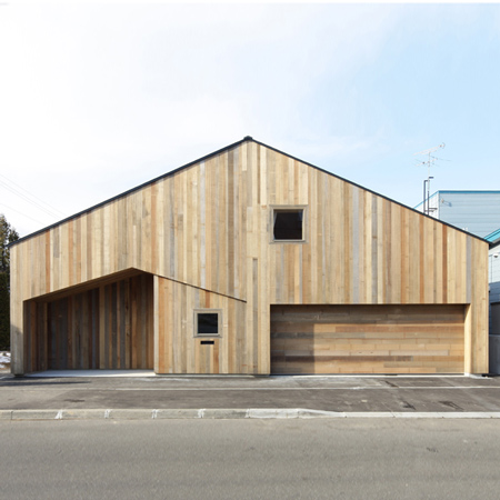
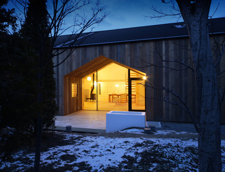
Japanese architect Yoshichika Takagi has completed a house in Sapporo, Japan, where the interior is divided by a series of wooden structures with pitched roofs.

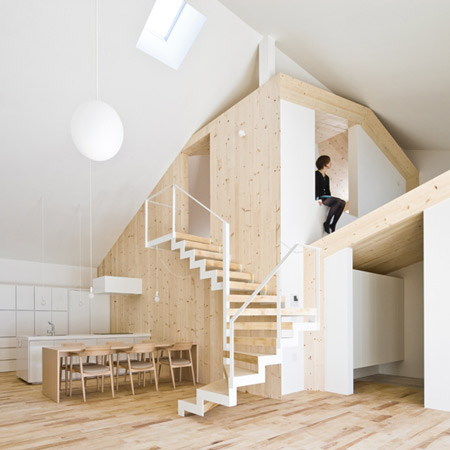
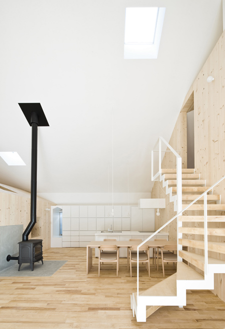
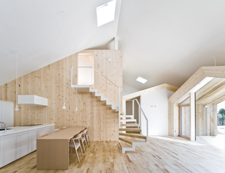
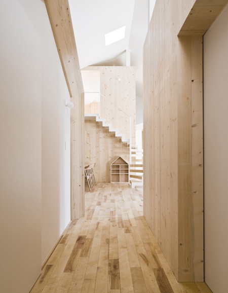
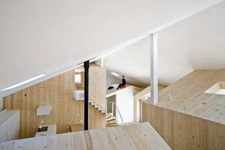
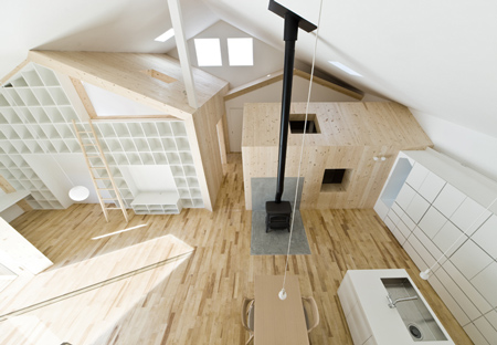
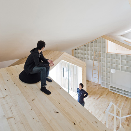
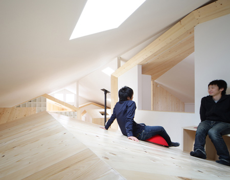
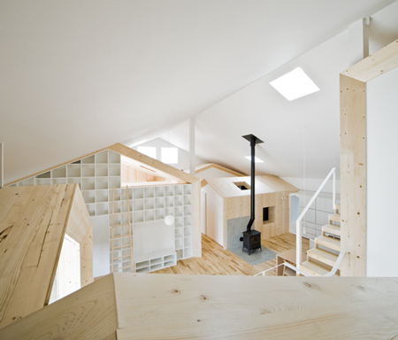
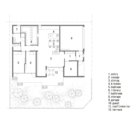
Called House K, the project forms platforms and mezzanines on top of the house-shaped rooms, which are arranged around a central kitchen.

The information below is from Takagi:


Interweaving Space Between ‘Inside’ and ‘Outside’

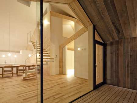
For this residential housing project, the client desired an open space within an indoor environment. But at the same time, one of the other conditions was that it should reveal the house shape on the exterior.

This was on account of the client’s wishes, as they liked the village feeling of being surrounded by other residential houses, but the actual site was in the regular residential area surrounded by manufactured houses.

Considering the cold climate in Hokkaido, it didn’t seem to be the most appropriate solution to make a wide open interior space as outdoors, yet, keeping the house shape on the exterior.

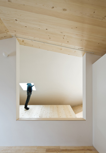
We tried to see if we could design a space that would be ‘indoor’ (which was closed in terms of the thermal environment) but would give a feeling of being ‘outdoors’ as a backdrop within the building.

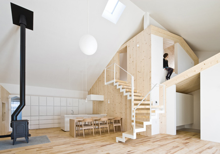
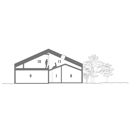
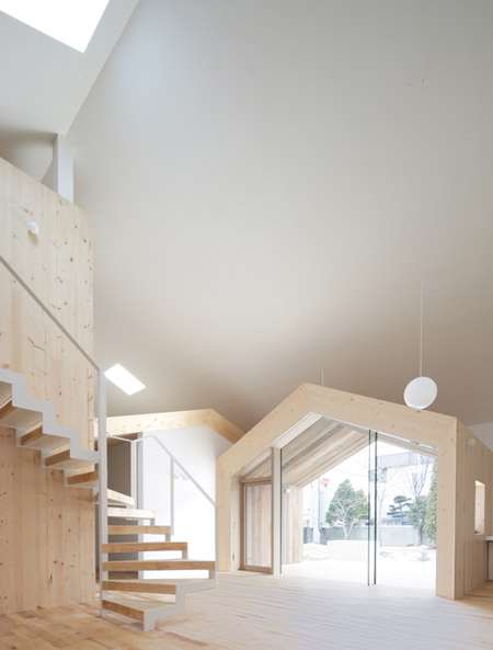
The given condition of making an open indoor space led directly to the idea of making house-shaped indoor rooms. If these house shapes were scattered, it would give a village-like view.

The shape of a house is a code for dividing space indoors and outdoors, and a village is a code that implies outdoors.

By using these codes, we thought that an interweaved scenery of indoor and outdoor would be made possible.

After some trials, it seemed that a set of more than 3 house shapes would give a village feeling, which would potentially create a relationship between indoor and outdoor.

If we could cover these entirely with a bigger house shape, this would function as an indoor space in terms of thermal environment.

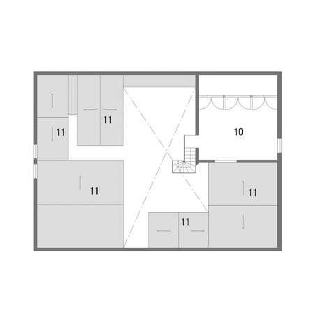
Eventually, we managed to create a interweaved scenery between ‘indoors’ and ‘outdoors’ by placing 6 house-shaped profiles within one large exterior that envelops the entire place.

One of the six house shapes was made into an outdoor terrace.

Indoors, there would be a village-like view using the help of the code for outdoors, inside the building.

This kind of control functions to blur the definition of ‘indoors’ and ‘outdoors’, and this is where interweaving takes place.

As a container, we made those big house shapes as interior, but when people actually live there and use the space, the feeling of the interior switches between an indoor space to an outdoor space.

It would only be then that this idea of an interweaved living space would be expressed and perceived.

Project Specification
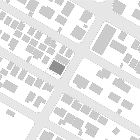
Location: Sapporo, Hokkaido, Japan
Purpose of the Building: Residential
Structure of the Building: 2-Storey Wooden Structure
Site Area: 379.58 m2
Building Area: 193.77 m2
Total Floor Area: 226.06 m2
Design: Yoshichika Takagi (Sekkei-Sha)
Construction: Daisuke Hasegawa (Daisuke Hasegawa & Partners)

This website uses IntenseDebate comments, but they are not currently loaded because either your browser doesn't support JavaScript, or they didn't load fast enough.

46 Comments

  1. Andy Says:

    I do love Japanese architecture but they all appear to be singing from the same hymn sheet! Any alternatives to the above dezeen?

  2. Saiman Says:

    just perfect!

  3. roman kralya Says:

    how they do it? It`s brilliant ’cause it`s not like others… excelent!

  4. roel Says:

    Beauty!

  5. dionysus Says:

    wow! i definitely love this. playful!

  6. white Says:

    superb!

  7. Gozzillo Says:

    very interesting and fascinating, i would like to live there with my girl and my friends.

  8. joshu carpenter Says:

    weird weird weird

  9. ads Says:

    Like kids Play house, All scattered everywhere. Where is harmony in design

  10. ya Says:

    ok i think the inside/outside thing has pretty much run it’s course

    pitched rooves are really useful when it’s raining but used indoors in this way become twee real quick

  11. Gallego Says:

    This is exactly how kids would build a house.
    This is exactly why kids shouldn’t build houses.
    Lucky for the neighbours it’s at least decent on the outside.

  12. rodger Says:

    these guys haven’t moved beyond the 80’s, intellectually speaking.
    that said, i would have a party in this house but wouldn’t want to live there.

  13. T Sandwich Says:

    W.H.A.M.!!! (What A Mess)

  14. ralph_spoilsport Says:

    Apparently there’s no dust in Japan.
    Like to see how it holds together when it’s actually furnished…

  15. konstantina Says:

    ..still, i’d love to be a guest in this house!

  16. michelalano Says:

    So, it’s a nice idea that doesn’t seem to translate well into thoughtful spaces. For a seemingly large open plan, the pictures make it feel cramped, with tiny portholes to the outside. Being able to inhabit the “rooftops” is a nice novel idea, but they don’t look confortable to actually spend any time up there. Roof-sitting is nice if you want to gaze at stars, but in this case, it’s cramped and you’re staring at an awkward corner of wall.

    Also houses devoid of furniture, appliances, toys, or “stuff” always bug me. If the point is to show off the architecture, fine, but showing it without context is denying its function.

  17. supreme Says:

    there is an interesting play of elegance and imagination, a child in an adult’s body.

    more importantly, the calculated architecture of human dimensionality

  18. Jean de Lessard, Principal Designer Says:

    fascinant comme étude et réalisation.Simplement Bravo. Vous méritez mes applaudissements.

    Jean de Lessard
    principal designer.

  19. kumakuma Says:

    gallego, if this is exactly how kids would build a house, it seems to me that more kids SHOULD be building houses.

  20. d.cloux Says:

    Gallego…

    Kids should build houses. This house is fun, and fun is an articulation of well being. I really like the way in which they bring the house within the house, and in so doing, it creates quite a powerful outline of the inherent comfort of shelter. What we have here is one of the first houses I’ve ever seen with an emphasis on form, used to a relevant and well thought effect. It is appreciable that finally form making has been composed while responding to the human emotion (in this case the comfort of the aedicule). Andy… I don’t to see much similarity between this and most of what we see on dezeen. I’ll add that the detailing of the wood is very beautiful.

  21. z Says:

    I like the wood material. But the space looks tight and seem like playing with the form.

  22. Doug Says:

    How will you clean those spaces?

  23. gaque Says:

    this is wonderful–its like having your own little village for a house. this isn’t kidlike or unharmonious, i find it at once very intellectual and very playful. im not convinced by the material choices indoors and outdoors, but it must be a great place to live! the interior/exterior relationship is also a bit lackluster..

  24. alex Says:

    Ideal setting for an IKEA photo shoot.
    Bring in a lot of cheap furniture.

  25. BenBen Says:

    Playful, but I agree with ‘Ya’ that it would grow twee quite quickly. Check out what No. 2 is on the plan.

  26. logorithm Says:

    What the??? Who would wanna sit on a pitch roof inside a house? Why the need to create ‘village-like’ view inside the house? Can’t get enough of it outside?

  27. Obscurity Says:

    Background: Sapporo is in Hokkaido, the northennmost island of Japan. where the lowest temperature is -10℃. The early settlers in the 19th century brought their housing style from their hometown in warmer Mainland. Powerful central heating systems, like the one you have in “Home Alone”, is not popular even today due to high fuel cost. Instead, each room is heated individually.
    I love their solution to provide a thermal environment in this way. Unique as well as imaginative, though undoubtedly based on theie deeply inprinted idea of what a house should look like, feel like, and act like –
    part of their values they have grown up with since they were kids.

  28. Rac Says:

    playful, witty, elegant, warm… balancing due to the choice of material and slopes inspite of being ’scattered’.. however, the above room (10) should be master room, as it offers good view of within the house.. and could do with a bit more detailing..

  29. @SFranciscoTweet Says:

    I think that this would be very difficult to live in for some length of time. I’m in agreement with ads.

  30. yshin Says:

    omg. i just love this!!

  31. onvn Says:

    Not so sure if I would want to live in there.. it looks like a commercial space rather than a hom-ey residential space.. Pitched roof inside is arbitrary, as mentioned by ‘ya’.

  32. marl karx Says:

    this is so much fun!

  33. Space by Eliana Tomas Says:

    great project. love the way architects explain every step – simple and straight forward, as it should always be. everything is there. this is what i call a poetic (effortless) space.
    details like the library wall, indoors terrace and the wooden colour are per-fect! what really makes this project so great is indeed the pure form of the house recognized all over the world.
    (this space reminds me small farms in portugal as well)

  34. Airborn Says:

    A unique and very interesting concept. It’s like having a small village under one roof. What seems random is very well organized. A different way of ordering volumes.
    I definitly would like to see more projects of the architect in the future.

  35. Play Says:

    ok, I love japanese ideas and their aesthetics, but nowadays, in all projects, they look like birds in a cage!

  36. Sara Says:

    I agree.. a party in this house would be fun but I would never live here.

  37. Bill Says:

    this made it onto this website.
    http://unhappyhipsters.com/

  38. Subverbix Says:

    Glad that I am not the person having to clean up the house ‘) but asides from that its aesthetic simplicity is very impressive. It has just the right amount of humor in it.

  39. hana Says:

    Poor people the ones who have to clean the roofs!

  40. anfisa Says:

    a bit funny but nice

  41. lox Says:

    I think the layering inside, with different platforms and heights of roof, somehow echo the Japanese cityscape, with all the different office buildings next to apartment buildings by train tracks that bridge across freeways. But the arrangement with light wood, slanted roofs and the strategic light coming in brings harmony to it.

    A lot of people are commenting that it doesn’t seem balanced, or that it looks too cramped, but I think this is an example of a differing sense of aesthetics in Japan and in Western countries. In my experience Japanese artists will go for a near-organic touch in their composition that may look imbalanced but which brings out a space or shape in an equally beautiful way. As for the ‘crampedness’ in this amazing house, with such a high ceiling and playful division of space, I think every place you can perch becomes a sweet secret, much more fun than the low ceilings and straight lines of traditional Japanese housing (I’m referring here to modern suburbia, not the samurai tea ceremony super-duper tatami houses everyone wishes they lived in).

  42. julia Says:

    exciting way of creating huge, opened spaces for social life, and small, intimate spaces for private use!
    i love it!!

  43. dow Says:

    The idea of an internal neighborhood is good. It reminds me of this project, which I feel is a more successful version of the same basic idea, less literal and more urban in terms of the views through the space:
    http://www.grad.cc/portfolio/residential/townhouse-renovation.html

  44. Johan Says:

    Awesome house, clean and clear design. The pictures give me e good feeling for living in this house. I love it !!

  45. melissa Says:

    much like the warehouses artists have been building out. fort thunder, olneyville, chicken hut, tons of nameless less famous ones…

  46. Nacho Says:

    i take it they don’t mind rats, birds, insects or dust gathering up on those little useless corners… for such a creative design, they did fail at the basics

Submit a comment

See our comments policy