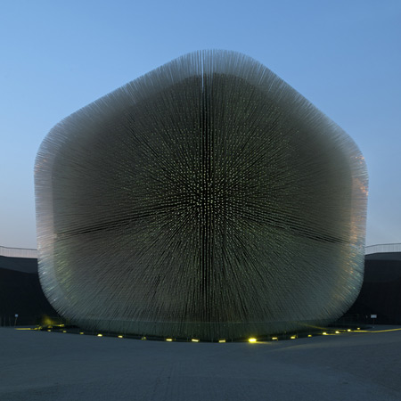
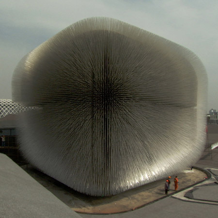
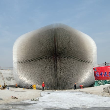
Shangai Expo 2010: architectural photographer Iñigo Bujedo Aguirre sends us this portfolio of photos of the Thomas Heatherwick-designed UK Pavilion at Shanghai Expo 2010, which opened yesterday.

See a short movie of the UK Pavilion here.

More info and photos of the pavilion in our earlier stories here and here.

More Dezeen stories about this project:
Photos of Thomas Heatherwick’s UK Pavilion (March 2010)
Images of updated design for pavilion (June 2009)
Thomas Heatherwick wins UK Pavilion design competition (September 2007)

All photographs are copyright Iñigo Bujedo Aguirre/View and are used with permission.

More photos from Shanghai Expo 2010 by Iñigo Bujedo Aguirre:
Swiss Pavilion
German Pavilion
Spanish Pavilion

See all our stories about Shanghai Expo 2010 in our special category.

For more pavilions see our top ten pavilions story, published in June 2009.


See also:
.
![]() |
![]() |
![]() |
| Movie about the UK Pavilion |
More about this pavilion |
All our stories about Shanghai Expo 2010 |


Looks so… unreal
the american pavilion is so shameful by comparison to many of the other nation's contributions. was the world expo a superficial frivolity we couldn't afford to make a serious contention at, or just another symbol of a nation in steep decline?
its because the gov cant be involved so its funded privately, and as u can imagine, its quite expensive so i think budget was the problem
deeeeeeelicious Thomas
oooohh….
stardust………………..
I really love these super expensive but not so functional design’y architecture. The idea is amazing and it is aesthetically astonishing. It’s definitely in the dead center strike zone of the “don’t make it in real-life” lists, BUT, it’s an Expo.
And its not only just any Expo, but Shanghai Expo 2010.
The Beijing sky is an architect’s dream…it helps every photograph to seem as if it were rendered in Vray.
It´s amazing, the best pabilion of Shangai Expo. Great concept and awesome building.
great pavilion! but still not sure about the pavilion / landscape relationship… love it as an object but for some reason its kinda strange in combination with this technical looking triangulation.
can't get enough of this .)
@cristobal. agreed!
Thomas can strike genius…
Stunnig effect !!!!
English product design.
I’m know I’m Birtish and thus biased, but I really think our fantastic pavillion makes a mockery of all the others. Such a simple, pure, organic, yet also future-thinking idea.
WEIRD STUFF!!!
is seeing union jacks in vary points of view a coincidence or an intention?, great execution though.
it actually resembles the UK flag with the vertical and diagonal crosses that appear on the corners. Bonus!!
Why are there no images of the USA pavilion on any of the design/architecture sites? Is it really that lame???
It was indeed totally lame. The building was nothing, exterior had hardly any embellishments except for a waterfall style fountain on the side, simply a large building with sheathing tiles. Interior was all movies, mostly quite trite and focused on worship of Kobe Bryant (who is popular here, but still). There was an ok one on how we can succeed if we all work together and all that. Finally it finished with a room full of crappy advertisements from each of the sponsors. American indeed. Other countries had a few advertisements, but were more artistic, fewer and/or more meaningful. Note: I’m American.
It’s still really hard for me to see these as actual photos! They still feel like renders to me! I love it though!!
Has anyone seen the Indian one?
http://www.indiaatexpo2010.com/drupal/
Shameful piece of *art by JWT
As an Indian, its conscientiously tough to decide if I should even be sharing the link with anyone!
is it real pictures???!!!!!!!!!!!!!!!!!
looks like a polish brush for copper chairs …
hopefully cud see a bird’s eye view as well
Beautiful concept, it does lead the concept further with an organic poetry. The dezeen video shows the pavilion in motion like leaves gently moved by the wind and to me in term of urban installation, it does look like a sea urchin. Transformed nature has rarely been so inspiring. An amazing work of aesthetic.
http://vimeo.com/10774063
I love this design.. but!
Some of theos shots that form a vague union jack in the bunching of the spines make it look more than a little like a…
giant cats arse :-/
I always love to see this cube!!!!
See you all in China also…
where’s the architecture?
…and all laughed and sayed they would never pull it off… ehe…
Well done Thomas. Now can we draw a line under these futile little shows that seem to occur with alarming wasteful regularity around the world. Totally anachronistic.
A triumph of imagination over the architecture of edifice.
sweet lord have mercy!!! amazing.
this is so amazing, the photos dont look real…
LOL @ Martin! I agree with you! :-D
Check this out…
—> http://stevenhaulenbeek.com/artwork/55905_Zip_Tie_Light_Kit.html
F…. great! Somehow it’s very, very english.
@shexpo , go back to school……..
It is a great pavillion. Until dark. Then there’s no lights in the urban park, making it a dingy, dark, uninviting space – just like a proper British park I guess?
Also, the Seed Cathedral hardly emits any light at all which is a real shame as the “opening view” when you walk into the park has the most f*ck off strobing bridge in the background.
And the acrylic rods hardly budge – not really “swaying in the wind”.
Other than that it looks mint!
i will just ask …why?
fan-bleeding-tastic
It looks like a giant hedgehog and it doesn't represent the United Kingdom culture. Saudi, Polish and French is the best in the expo.
Ahmed, what 'culture' do the Arabs have to begin with? Last time I checked, a British architect designed the UAE pavilion.
hopefully cud see a bird's eye view as well It's cool