Modern Art Oxford extension by dRMM
London architects de Rijke Marsh Morgan have completed an extension to the Modern Art Oxford by transforming a delivery yard into a gallery space and café.

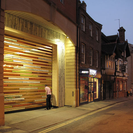
A painted and perforated roller-shutter encloses the space at night while apertures allow passers-by to view the space and any artwork contained within when the gallery is closed.

The omission of façade opens the space up completely to the street, and directly connects the gallery to passers-by.

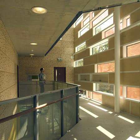
The interior walls and ceiling are clad in timber and polycarbonate panels while the original tarmac floor of the yard, complete with yellow road markings, has been retained.

The space provides street level access into the gallery and will function as a multi-use space and lobby.

The following information is from the architects:
Modern Art Oxford
Oxford, UK
2010
A redefinition of existing ground floor facilities with a new multi-use space for a flexible programme of films, performance events, installations and café bar.

Modern Art Oxford’s brief to promote access to and use of the Gallery was met by dRMM with the transformation of an existing delivery yard into a new type of gallery space for the UK, a ‘storefront gallery’ venue.

The new 5x15x5m ramped lobby is positioned as an installation work; not permanent, plastered or white, but carefully constructed from massive engineered timber and polycarbonate panels.

Artists will in turn react to and transform this entry space with an ongoing programme of exhibits.

The Yard provides a new entrance and overall image for the museum on a more active street frontage, with direct level access, in central Oxford. Streetscape improvements are envisioned with the scheme as catalyst.

The Yard is intended to address the pedestrian or cyclist; shoppers and tourists are as welcome as students and regular gallery-goers.

The deliberate omission of façade connects the gallery directly with the Oxford streetscape by day. At night, a specially painted and perforated roller shutter invites the passerby to view interior and exterior as a simultaneous artwork.

dRMM designed the Yard from an idea by MAO Director Michael Stanley, and coordinated contributing design input of structural engineer, catering consultant and specialist LED lighting manufacturer.

With contributing artwork for bar, furniture and shutter by Richard Woods, MAO and dRMM present gallery architecture as ‘useful art’.

GENERAL INFORMATION
Location: Oxford city centre, UK
Start on site: March 2010
Completion: May 2010
Client: Modern Art Oxford; Michael Stanley, Helen Shilton, Caroline Winnicott

PROJECT TEAM
Architect: dRMM Alex de Rijke, Satoshi Isono, Junko Yanagisawa
Artist: Richard Woods
Structure/M&E Engineer: Ridge and Partners

Cost Consultant: David Flower
Specialist Timber Contractor: KLH UK
Catering Consultant: John Conroy
Main Contractor: Knowles and Son
MATERIALS
Timber, Polycarbonate, Paint
See also:
.
 |
 |
 |
| Clapham Manor Primary School by dRMM | Sliding House by dRMM |
More interior stories on Dezeen |

dRMM is included in our book, Dezeen Book of Ideas. Buy it now for just £12.