Sperone Westwater gallery by Foster + Partners
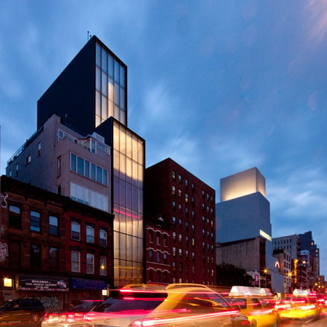
The Sperone Westwater gallery by Foster + Partners architects opened in New York earlier this week, featuring a moving exhibition space that connects the floors of the gallery.

The 12 by 20 foot moving gallery allows visitors to travel between floors or can be fixed at a chosen level to extend the static exhibition spaces.

The milled glass facade of the gallery dampens noise from the street and controls the temperature and light admitted to the gallery spaces.

Photos are by Nigel Young.
Here's more from Foster + Partners:
Sperone Westwater gallery opens on the Bowery
Sperone Westwater celebrates the opening of its new gallery on the Bowery in New York with an inaugural exhibition by Argentinean artist, Guillermo Kuitca.

Nearly 35 years after its conception, Sperone Westwater continues to exhibit an international roster of prominent artists working in a wide variety of media. Its new building, designed by Foster + Partners, doubles the exhibition area and pioneers an innovative approach to vertical movement within a gallery setting.

Responding to the compact 25 by 100 foot site, one of the features of the project is a 12 by 20 foot moving gallery, which connects the upper four exhibition floors and allows visitors to move gradually between levels. It is a prominent feature along the Bowery, visible from the street, its gentle pace contrasting with the fast-moving traffic. At any given floor, the exhibition space can be extended by parking the moving room as required, with an additional elevator and stairs providing alternative access.

The gallery offers a range of exhibition spaces, which vary in proportion and ambience. The design incorporates a double-height, 27-foot high exhibition space at street level, with a sky-lit gallery, a mezzanine floor, a sculpture terrace overlooking a park, and private viewing galleries on the fourth and fifth floors.

A setback at the sixth floor marks the location of the gallery’s administrative offices. Works of art will be stored primarily in the basement, while a library is located at the top of the building, below the mechanical floor.

The milled glass facade that houses the moving room acts as a buffer zone, protecting the building from extreme temperatures and acoustically insulating the gallery spaces.

Norman Foster commented:
'The concept for Sperone Westwater represents both a response to the Bowery’s dynamic urban character and a desire to rethink the way in which we engage with art in the setting of a gallery. The moving gallery animates the exterior of the building and creates a bold vertical element within.'

'Like a kinetic addition to the street, it is a lively symbol of the area’s reinvention and a daring response to the Sperone Westwater’s major program. I hope that artists will be inspired by the gallery’s new spatial and structural possibilities.'
See also:
.
 |
 |
 |
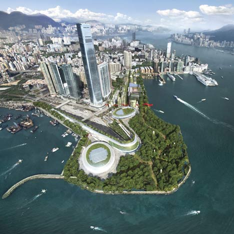
| West Kowloon District by Foster + Partners |
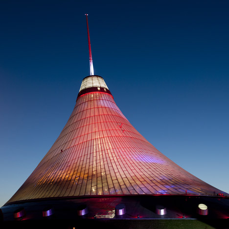
The Khan Shatyr Centre by Foster + Partners |
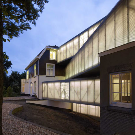
National Glass Museum Holland by Bureau SLA |