
New York graphic designer Cardon Webb collects fliers and hand-written notices from his neighbourhood and replaces them with his own re-designed versions.

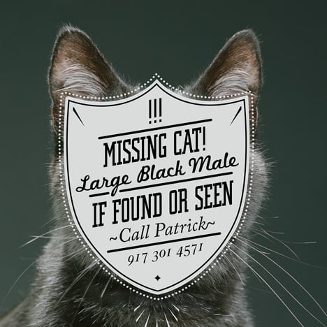
Calling the project Cardon Copy, Webb uses exactly the same wording as the original notice, whether for a for a missing pet or garage sale, but adds his own imagery and graphic style.

The new posters are then displayed on the street alongside the originals.

Here are some more details from Webb:
Cardon Copy, takes the vernacular of self-distributed fliers and tear offs we have all seen in our neighborhoods. It involves hijacking these unconsidered fliers and redesigning them, over powering their message with a new visual language. I then replace the original with the redesign in its authentic environment.

I started Cardon Copy as an experiment to demonstrate the power of visual communication. It also gives me a venue to create and express myself, allowing me to combine my art, design, and typographic ideas. By considering, then altering, such things as color, composition, image and type to a common street flier with a message as simple as, "I lost my cat", the transformation is interesting.

The message changes, though the content is the same word for word. Is the new visual language helping or harming the message? Will products sell better, ads be answered more? Are people more inclined to notice the message, but not necessarily trust it? What demographic will answer an ad for an apartment for rent that is hand written in marker, as opposed to a well designed printed poster? It is interesting to note how the medium and design of a message can affect the success or failure of its communication and purpose. My hope is to open up this type of conversation.

Cardon Copy is meant to be slightly facetious. There is something comical about seeing familiar street fliers presented in such and elaborate way. It is important to note that I am not dismissing these found humble fliers, trying to rid the streets of ugly signage. The fact is, that I appreciate the original fliers, aesthetically and conceptually.

Because of this I only redesign fliers that there are multiples of. This way both the original and the redesign or Cardon Copy exist in the community together, to compare and contrast. I like to think by doing this in some way I aid in the discovery of what is often neglected.
See also:
.
![]() |
![]() |
![]() |
| BBCX365 by Johnny Selman |
The Hybrid Project by Readymade Projects |
More graphic design |


let people express themselves. why does this guy feel the need to one-up the original flier?
Its a little arrogant and pretentious
Yeah, it isn´t as if HE had to work hard for any of his skills! He was lucky enough that they fell from the skies and landed on his head! What a douche for using the original notes and making sure they catch more attention, while at the same time communicating the visual power of graphic design.
Jeez!..
Why would anyone want their urgent notices to catch more attention?
Perhaps because they're urgent???
Sorry to answer a question with a question but: why wouldn't they? I think you supplied your own answer in that post there my friend
Passive-subversive. Redemptive in a recalcitrant manner. Clever at least, perhaps brilliant.
Dear Wayne,
You are a pretentious twit.
Yeah, I would go with brilliant. At first glance the flea market poster seems nearly illegible, but at second glance, all the information is there. That's kinda the point… you're not going to just pass by these without taking a look.
hahahahaha, i like this one!!! at least someone who doesn't take life too serious
i have trouble even looking at those sad posters, so I can't imagine why anyone would want to spend time re-designing them and making them flashier. pretty lame, man.
It sounds like a lot of fun, but I think somebody should start a sign replacement war – I don't think the new designs are all that good, even though they show some light black humour. Buy me a flight to New York.
Thought the same thing polly. Not to mention feeling compelled to photograph one's self doing it followed up with a press kit to blogs. I guess we are in the era of design for the sake of a blog post…
en cuanto el primer comentario creo que hay demasiado gente que se expresa por si mismo q un solito diseñador rediseñando en una ciudad no afectara los derechos de autoexpresion de otros . Esto es arte, y es normal su proceso solo que nadie se lo pide el lo hace bajo una extrategia artistica
Clever indeed! Art on the streets…..and why not?
I like this project. He's not trying to override people's expression with his own. The way I see it, it is an experiment, or maybe a census, to see if people care about design at all. It helps designers to recall their inmost insecurities, to question: "does (my) design works?" and perhaps ultimately: "what does design do?". He himself stated that he wanted to know what reaction will these more "well-designed" products (notices, in this case) cultivate.
"Is the new visual language helping or harming the message?
Will products sell better, ads be answered more?
Are people more inclined to notice the message, but not necessarily trust it?
What demographic will answer an ad for an apartment for rent that is hand written in marker, as opposed to a well designed printed poster?"
Or would people stick with the rudimental and homemade since, perhaps, it is their everyday?
I personally am curious about the same thing.
why make a flyer unless its intended to be eye catching … that the point right? the cat's owner … shame on them for their lack of effort ;)
Great idea – At first all I was thinking – 'he could get paid to do the exact same thing' but it is a clever idea to design something for some unknowing person, and it is probably much more gratifying than working for a client, plus he gets some great exposure here!
Its funny to imagine the person that made the original flier being like… wtf is that my phone number on that poster? They would probably be initially mad, and then realize that it was the same information as their original. Unless someone fwd’s this article to them, it will likely follow them as a mystery they never solve. “Why did someone else make a poster advertising my cleaning services? Who is this guardian angel?”
I don't tink that the new posters work better than the old ones. The old ones attract more attention. They are real. See, this is the difference between people that know what they want and people that just try to do something.
BIG FAN of this idea. Anyway, I like it. That being said, you should have gone the BANKSY route and worn a hood.
Hah! I’ll go along with it. He’s not putting anybody down… just working some things out for himself and having fun with design, which don’t happen enouff if you know wot I mean.
please read the text!! I quote:
Because of this I only redesign fliers that there are multiples of. This way both the original and the redesign or Cardon Copy exist in the community together, to compare and contrast.
fun idea to find project brief. smart graphics. sometimes poignant source material. why publish photographs of yourself doing it though? we believe you
You're a grumpy bunch…If it was an art project everyone would love.
The idea is good and fun, it isn't doing any harm to its objective, you still get the message. People may mistake them by club night's posters, but you still read them.
The blurred one is a sweet reinterpretation of the original. it made me smile.
I guess when it get's down to personal taste the only comment is: try to do it better, if you don't like it.
The original posters are far mor effective. The original missing dog i can clearly read at a glance.
The original flea market sign is much more inviting and clear also.
These reinterpreted posters are not working at all.
For a start they look like advertising and to a degree….jokes.
They do look nice but the intent and execution do not match.
stop grumpin and BE HAPPY, I think this is great idea! talking about opening up conversation look at the debate its sparked here lol.
How Sweet and Fun this project is. A great way to get some design exercise
Like Amelie for designers.