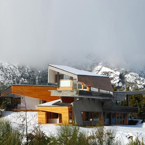
This mountainside house by G2 Estudio in Argentine Patagonia is wrapped in a stone and wood facade.

Called Ribbon House, the single-family home is criss-crossed internally by diagonal columns and windows.

Overlapping planes form canopies and terraces.

More residential architecture on Dezeen »

Here's a bit of text from the architects:
Ribbon House
The juxtaposition of the different volumes between the public and private spaces of the house, the social and family life, gives place to a dynamic walk-through while the users visit the different instances of the house.

This way we can appreciate an up-down experience, connecting all the corners in the house.

The morphology and materials used, were thought to achieve that the strong transform in fragil, the solid in ethereal, the supported in support, the dynamic in static, and vice versa.

So the house is a search between the balance, juxtaposition, ribbon, viewing-point, vital tour, and hug.

Country: Argentina
City: San Carlos de Bariloche, Arelauquen G&CC

Surface: 320 m2
Program: One-family housing

Architects: G2 ESTUDIO

Click for larger image
See also:
.
![]() |
![]() |
![]() |
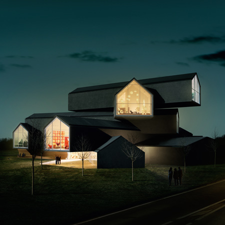
| VitraHaus by Herzog & de Meuron |
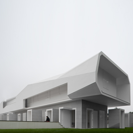
Casa Orquidea by Andrés Remy Architects |
More architecture on Dezeen |


the medusa diagram is the best!
i mean, why SHOULDN'T a house resemble a napping medusa….
it's totally makes sense!
Awesome Comment!!
cacophony of forms and materials. i am pitting the lost time, materials, and money for this monster – collision of volumes- awful project
I do not like the material, not like the texture but were released … and the idea on which the form seems a little fake, I think they could have studied a little but the volumetric …
Just once I'd like to see a handrail on this site. I guess they don't teach architects how to design those anymore.
Plans look complicated, overall result, i would say – annoying
I like the detail where the stone meets wood on the staircase.
Why are buildings often picture stairs with no banister? Is it because the railings or glass panels will spoil the look or can they get away without because there are no building regulations to prevent falling.
I can imagine the architect telling the builders to wait till we've had the photos taken before fitting the glass panels.
Or I can picture someone at a party standing deep in conversation in the lounge, step back and fall to the floor below- or trip over the bottom of the wedge shaped wall aaaaaaaa! another one bites the dust. Then the friend's baby crawls over the edge…
And what's the thing about the naked ladies with the octopus head about? Is that why the house is wonky?
There is so much inspiring work on this site, funny my first comment should be about this one I find hideous!
Sorry, but it is absolutely confusing. So many forms, structures ….What's the point of this project?
I have only one word..pure MADNESS!
Tha bathroom shows the best how you can have an absolute eyesore interior which is completely useless the same time. It is ugly, full of dangerous edges, and full of corners where it's difficult to clean as well. At a hight cost too.
It's all style at the cost of functionality. Nice mountains.
Oh well…accidents happen.
Although there are a few interesting volumes in places, this is just ideas run amok. Too much of everything: materials, angles, etc. I can't even imagine living in such an interior with all those angles going in all directions. Would be nauseating.
*file under ego gone awry*
love it. thank you for creating it!… happy to see something interesting and amusing… madness is amusing, too :) good work guys! peace
looking at the exterior images first, i wanted to believe it was designed as a perfect response to the site and surroundings.
then i saw the interiors and realized it was the worst kind of self-indulgent, egotistical architectural gymnastics.
could have been a good project though – certainly splashed the cash.
The complex construction is totally blocking the amazing view …
Do not drink and draft.
putting mies' chair barcelona in this house is an insult to architecture.
reminds me of one of my 'falling' dreams where I don't know which direction is up and there's nothing to grab hold of.. wonder whether it is as scary in real life..?
Desperately seeking to look cool. It looks like something Coop Himmelblau was ashamed of back in 1993.
Just to say that I'm living this house and it's amazing !
Everyday when I wake up it feels like I'm in artwork !
And the view ? It's an enchantment ! the view is enhanced by the architecture, anywhere you look you can see the mountains !
About the banister it's not there yet ! The carpenter is building it.
Whatever you think it's a real pleasure to live in it !
For the jealous ones don't bother to comment
are you suggesting this is your house then ?
why don't you tell us a little about the 'medusa' concept, and why this is an important factor in the design of the house.
i'd be curious about the cost involved as well.
it's an interesting house, but please help us understand the justification for all the excessive geometry.
the site looks very beautiful, but the house…well, nobody is jealous of that.
if you like it and your happy, then i think the architecture has done its job. after all, One man's trash is another man's treasure, still though, could have got alot more bang for your buck and the architect should have designed something more harmonious and contextual for such an amazing beautiful site. Its definitly thought provoking :)
What is with all the negativity. While I agree that it may be a bit much in some aspects, there are some nice design elements that cannot be dismissed. The "medusa" concept I'm certain has more to do with a mother earth or pachamama (fertility goddess of the Andes) sense of embracing its occupants than with the serpentine Grecian Gorgon. So quick we are to try and be cleaver with our criticisms, that we don't take the time to think past our immediate visceral prejudices.
The house captures a certain Andes/Argentine vernacular of build and pay as you go. The materials appear to be quite locale and are nothing out of the ordinary in this part of the world. I agree that the bathroom shown isn't up to the standards of stark and clinical, but if its what the client wanted then by all means.
At least its not yet another amalgam of white sterile boxes stacked at right angles. And I'm betting if you were to clad the whole thing in titanium and associated it with any number of super ego architects most of the negativity would fall aside.
Oh, is this a house? I thought it was an amusement park…perfect example of architecture that relies on gimmick and is devoid of any true complexity.
i like the overlapping planes and materials concept but totally hate the bathroom and why medusa again?
it's a design attack!!
I could live there
Some of the architects think that more complicated things lead to succesful projects.What a shame.Now world is full of useless concrete.Time consuming,enviromental monster that is all they can get.
this house is arrogant in its attempt for form searching. the relationship of public/private is unnecessarily complexified and the building entirely fails at what the architects claim to have attempted to achieve. awful.
It's pretty, but quite tortured as architecture…
emergency exit please? thanks!
Consider me jealous. I too have always wanted to live inside a dizzying monstrosity that stops just short of physically stabbing me in the eyesockets with a drafting ruler.
It is causing quite a debate…at the least!
It looks cool but I don't want to live there..
Im sorry, im going to be honest here.. I literally screamed "nOOOOOoooOO"! after looking at the images and the conceptual diagram. Congratulations to the architect for realizing something that must have taken some effort. I tend to agree with above, if the house is going to aid in the rape of the environment, could it do something interesting?