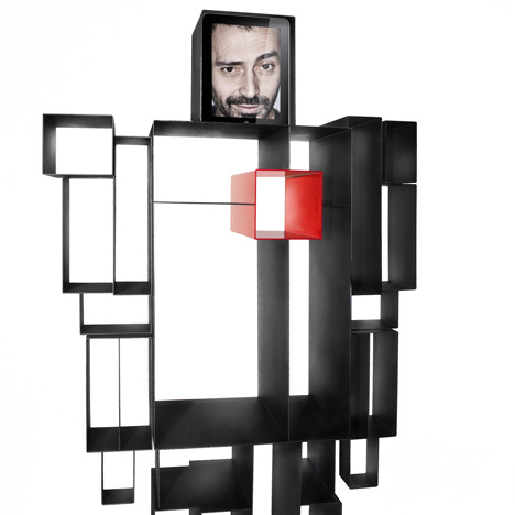
Robox by Fabio Novembre
Milan 2011: Italian designer Fabio Novembre will present this robot-shaped shelving unit for design brand Casamania in Milan next month. Update 31/07/11: see Dezeen's top ten stories about robots.

Called Robox, the shelves have a picture frame at the top and a red box representing the robot's heart.

See all our stories about Milan »
More about Fabio Novembre on Dezeen »
The text below is from Fabio Novembre:
Robox
Maybe a day someone would say that Robox represents my cubist period or that the edge solution has been the trick to find out the “right way” after the hyperboles and parabola of my work. From Mazinga to the Transformers the boys of my generation had always have a robot on their side and I was searching for a new function able to justify still its presence next to my desk.
The simple change of a consonant reveals the inclusive attitude of this new domestic hero: a device with a heart, an hard-disk pre-digital where store our memories.
Freestanding bookshelf in polished metal
Dimensions: Height 78 cm x depth 31 cm x width 184 cm
Available in different colours all with red heart
See also:
.
 |
 |
 |
| Nemo by Fabio Novembre for Driade |
Abarth Chair by Fabio Novembre for Casamania | Him and Her by Fabio Novembre |