Rabobank Headquarters by Sander Architecten
Amsterdam studio Sander Architecten designed cardboard meeting rooms inside a bank in the Netherlands.

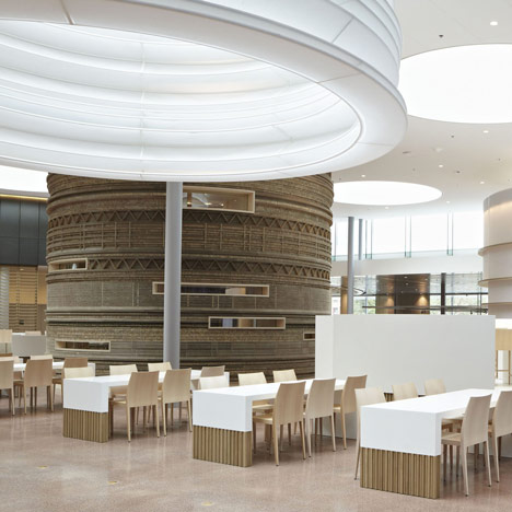
Giant cylinders of cardboard and paper enclose meeting rooms inside the headquarters for financial services advisor Rabobank.

The multi-ply cardboard is layered to create textured patterns on the surface of one cylinder.

Translucent Japanese paper covers a second cylinder, as well as the springy lanterns that surround circular skylights.

Timber screens and furniture fill the surrounding open-plan areas.

This is the second project this month to feature paper or card, following a cardboard labyrinth at the Serpentine Gallery - see all our stories about cardboard here and all our stories about paper here.

See also a bank with faces in the walls and another resembling the Amazonian forest - click here to see all our stories about banks.

Photography is by Alexander van Berge.
Here's more information provided by Sander Architecten:
Sander Architecten stretches the boundaries of the modern office.
Amsterdam firm Sander Architecten completed the Square of Rabobank Nederland headquarters. Rabobank selected Sander Architecten out of a group of twenty to create and supervise the execution of the entire interior design (56.000 m²), including the twenty-five-storey building.

As the office interior is being redefined by the introduction of new methods of working, interior architecture is facing new challenges. In today’s work environment, the emphasis is on cooperation in teams and group dynamics; people go to the office for the social aspect more than anything else. To realize this ambition, we view the building as a modern city. After all, the city is where individual freedom and spontaneous interaction are all-important.

The effectiveness of this concept is visible on the Square, located at the plinth of the new office building. Employees and visitors work, eat, read, and meet one another in a diverse landscape.

The ‘buildings,’ separate spaces with different functions, join up with the uncluttered grid of skylights and slim columns. The new style of working is based on freedom, trust and taking responsibility. In the client’s view, its employees are all entrepreneurs, responsible for their own performance in an environment free of fixed rules, fixed times and fixed locations. The work spaces are tailored to specific activities: multi-person meetings, face-to-face meetings or a place to write a report with maximum concentration. Each activity has its own space.

Click above for larger image
In nature routes are formed naturally; people intuitively find their way. Architect Ellen Sander was seeking that naturalness, that ‘flow’. The busiest routes automatically formed around the cores with the lifts and staircases, beyond which more peaceful zones naturally emerged. Moreover, the psychological concept of ‘flow’, the moment when need, desire and ability come together, connects the employee’s sense of happiness with an optimum result for the employer. The guiding principle for the interior design therefore became ‘form follows flow’. To enable flows vertical partitions were avoided so that the horizon would always be visible. ‘The office is my world and the world is my office.’

The design was generated by cooperation with a number of other designers. The Square on the plinth could not turn into a monotone, homogenous space. Diversity is required in order to stimulate people, and despite the enormous scale of the building, people are not left wandering around lost in sterile areas.

Click above for larger image
The meeting pavilions designed by Sander Architecten are made from washi paper and paperboard. In combination with the Chinese lantern from washi paper suspended from the skylight, a distinctively tactile experience is created. The paperboard pavilion, which features attractive patterns created by the different uses of the material, is particularly inviting to touch.

Sharing art with the city
The wall annex glass display case is the centrepiece of the Square, and features On the departure and the arrival, a work by Chinese artist Ni Haifeng. The vertical museum contains porcelain objects including scissors, a bottle of Glassex and an iron, each painted in delftware style. The work is featured in the interior, too, with stills and a film about ‘the making of’ on view in the area behind the case.

Click above for larger image
Client: Rabobank Nederland
Interior Architect and supervisor: Sander Architecten (Amsterdam)
Gross floor area: 56.000 m2
Completion: December 2011