The Shadow House by Liddicoat & Goldhill
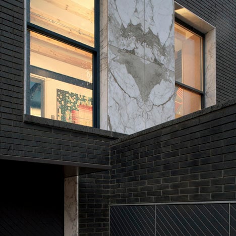
British architects Liddicoat & Goldhill constructed their own north London home using black engineering bricks and slabs of white marble.

Named the Shadow House, the two-storey building is located on the compact site of a former parking garage.

Walls inside the house are of the same dark brickwork as the exterior and contrast with a stark white concrete floor.

Larch beams supporting the ceilings of both floors remain exposed inside every room and bare light bulbs hang from them.

Household appliances including the television and washing machine are concealed inside specially designed cupboards in the ground floor living rooms.

A bedroom and library occupy the first floor, as does a bathroom with a glazed ceiling.

Above: photograph is by Tom Gildon
This house was nominated for the 2011 Manser Medal, which was won by another north London house – see our earlier story about the winner here.

Photography is by Keith Collie, apart from where otherwise stated.

Above: photograph is by Tom Gildon
The following text was written by Liddicoat & Goldhill:
About The Shadow House
Because our budget was so tight, we planned to carry out as much work as possible ourselves and limited our palette to primary materials. We found these limits liberating rather than restricting: there is great poetry in practical things, so we reveled in finding simple means of assembling the house. It is built inside and out in slim-format Dutch engineering brick, a robust material with a delicate black glaze. Interior structure and window reveals are in raw larch, while polished concrete floors flow between each of the rooms.

One small luxury we allowed was to buy two slabs of bookmatched Statuarietto marble, which we used throughout house as a reflective contrast to the brick walls. The whole design revolves around this play of light & dark; carefully controlled moments of intensity and quiet shadow. We wanted to create interior spaces with maximum emotional effect. The bright first floor bathroom has a huge sheer glass ceiling (which needed to be craned into place) that contrasts with the intense atmosphere of the living spaces.

Above: photograph is by Tom Gildon
We created the sensation of being outside; showering in full sunshine or bathing under the stars. We playfully carved space into the walls for everyday clutter; the TV and its cables are concealed behind a black glass wall, the loo roll has its own marble niche, the washing machine is in a secret cupboard behind the loo, discreet storage fills every spare corner while the kitchen extract is buried into the brickwork. In order to give a sense of space to what could feel like very constrained rooms, it was important for us to modulate the section and vary the ceiling heights. By changing the floor level and building roofs at different heights we created a range from 3m in the living room to 2.1m in the entrance area.

Above: photograph is by Tom Gildon
This allowed us to give each space its own sound quality and sense of cosiness or airiness. Just building a house doesn’t make a home: we also designed our fittings and furnishings; the minimalist Zero larch bedframe; kitchen cabinetry in elm, stainless steel, marble and spray lacquered matt doors; The Shadow Lamp, a granite and laser-cut timber table light; soft furnishings using amazing African fabrics, Nyaradza bedspread and Akwasidee cushions.

How We Made The Project Happen
The Shadow House is our own home, but is also an experiment in making a generic small city house. While working for other practices, we designed luxurious houses for private clients and worked on complex urban social housing developments; we were keen to extend this experience into building more modest single houses. Finding a site was an exhausting process. We cycled around London, exploring the backstreets and peering over fences, looking for a forgotten scrap of land. We knew we could only afford a site that was too challenging for developers or ‘Grand Designs’ hopefuls.

We eventually discovered a derelict parking garage - home to rats, foxes and local junkies - just behind the Kings Cross goods yards in NW1. At only 390sqft, it seemed almost impossibly small. Our task was made even harder by its location in the fiercely-protected Camden Square Conservation Area, and by the previous owner’s failed attempts to win Planning Permission. We knew the project could only become a reality through our skills of designing in historic areas, and negotiating with neighbours and local Planners. Our time and energy were our greatest resources, so we re-drew the design constantly to eliminate costs, and carried out much of the work with our own bare hands.

Architect and Main Contractor: Liddicoat & Goldhill LLP
Site: 38a St. Paul’s Crescent, London, NW1 9TN
Client, Architect and Main Contractor: David Liddicoat & Sophie Goldhill
Structural Engineers: Peter Kelsey Associates
Completion date: Winter 2011
Gross internal floor area: 77m2
Total construction cost: £210,000