House 712 by H Arquitectes
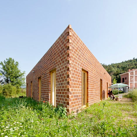
The perforated brick walls of this triangular house in Barcelona overlap at the corners.

Spanish studio H Arquitectes purposely designed the single-storey House 712 with simplistic construction details so that any builder could put it together.

An air chamber functions as a ventilation channel behind the perforated facade, while rainwater naturally drains off the walls through cavities in the brickwork.

Three bedrooms, a study, a kitchen-diner and a living room all fan around a triangular hallway at the centre of the house.

H Arquitectes always name their buildings with a number - see more of their projects here.

Photography is by Adrià Goula.
Here's some more text from H Arquitectes:
House 712
The proposal wants to occupy all the buildable part of the parcel by means of a ground floor house, entailing a triangle shaped plan with each side parallel to its correspondent plot limit.

This triangular geometry minimizes the distribution spaces (having only a central one), reduces the cost and allows a constant and homogeneous relation between both the inside and the outside.

Because of the ground level difference between site and street (the highest one), the triangular roof, almost an icon, becomes the fourth façade of the house.

While designing and planning the project, the budget was cut by 65%.

This fact strongly conditioned all the construction decisions: systems, materials, etc.

By removing all the superfluous and unnecessary elements, the house was given both an inside and an outside which are extremely austere, powerful and very expressive.

Situation: Gualba, Barcelona.
Author: H ARQUITECTES (David Lorente, Josep Ricart, Xavier Ros, Roger Tudó)
Collaborators: Montse Fornés, architect (Harquitectes) Anna Bonet, interiorista (Harquitectes) Iñaki González de Mendiguchia, technical architect

Year of realization: 2008-2011
Surface constructed: 127,40 m2
Budget: 130.000€
Constructor: Construcciones Jufraed 2001, S.L.

Click above for larger image

Click above for larger image

Click above for larger image