The Front Room: Geometry and Colour
Milan 2012: 14 young designers come together to create an ideal living space for an exhibition called The Front Room: Geometry and Colour inside a listed Milanese house this week.

The show includes a coffee table and wall lamp from Daphna Laurens' Cirkel Collection, Phil Cuttance's Faceture vases and Mieke Meijer's furniture inspired by industrial structures.

Henny van Nistelrooy presents a screen made by unpicking woven fabric, David Derksen and Lex Pott provided mirrors that have been selectively oxidised, and there's a clock by Studio Like This that can only be read straight-on.

Seating includes stools from Earnest Studio made by expanding foam around the legs and fabric seat, and a rocking chair by Agata Karolina and Dana Cannam that takes centre stage on rugs with graduated colours by Franziska Wernicke.

Lighting takes the form of OS & OOS' lamps inspired by the alignment of celestial bodies and Miya Kondo's Composition lights leaning against the walls, while swing-seats made of twisted and knotted rope by Tom Price hang in the courtyard.

The Front Room is curated by Matylda Krzykowski and Marco Gabriele Lorusso, all the pieces are for sale and it's on show at Ca' Laghetto, Via Laghetto 11 until 22 April.

The Salone Internazionale del Mobile takes place from 17 to 22 April. See all our stories about Milan 2012 here.

Here are some more details from Matylda Krzykowski and Marco Gabriele Lorusso:
The front room is the most diverse of our domestic space. It is where we mingle and entertain, read in solitude, stay up late and doze off early. The front room must accommodate many versions of ourselves, yet it is a place where we present a singular identity through the language of the products that we choose. It is a room where our families gather, for which we gather a family of objects.

The Front Room: Geometry and Colour is a presentation of new objects for the front room. Each object is a fresh version of it's predecessor, and all are united by the ritualistic nature of sheer geometries and strikingly contemporary color palettes. In a departure from the amorphous forms that have preoccupied the design world in recent years, this up-and-coming group looks to purity with an element of playfulness.

THE FRONT ROOM is a self-initiated project brought to you by Matylda Krzykowski and by Marco Gabriele Lorusso. The show is hosted by Ca' Laghetto.

Phil Cuttance
FACETURE, 2012 - The Faceture series consists of handmade faceted vessels, light-shades and table. Each object is produced individually by casting a water-based resin into a simple handmade mould. The mould is then manually manipulated to create the each object's form before each casting, making every piece utterly unique.

David Derksen and Lex Pott
TRANSCIENCE, 2011 - Over time, dark spots start to appear on mirrors. The silver layer is slowly oxidizing under the influence of oxygen and water, thereby showing some of its history. This process can be regarded as degradation, however this project shows the beauty of this material transition of silver. Normally, the oxidation process in a mirror occurs randomly and evolves slowly over time. These mirrors reveal the different states of this process. In this case, sulphur is used to create an accelerated oxidation process. Depending on the time that the silver is reacting with sulphur, different colour tones can be achieved, ranging from gold to brown, to purple to blue. The states of the oxidation process are being shown in a pattern that consists of the elemental geometric shapes.

Earnest Studio
SWELL, 2011 - Swell is a series of stools and benches which play with the conventional method of producing upholstered furniture. The project works by combining several steps of production into one. Instead of molding massive blocks of foam, cutting them down to size, gluing these separate pieces to a wooden frame and hand-sewing fabric on top, Swell uses the fabric and frame as the original mold for the foam. This results in fewer steps in production, less material and less time-consuming handwork. Because the foam fills the fabric, no material is wasted as cutoffs. Because the foam acts as a binding agent between the fabric and frame, no additional adhesives or sewing are necessary. Lastly, since the foam expands in a slightly different way each time, each piece is unique.

Agata Karolina and Dana Cannam
HUMMINGBIRD, 2012 - The hummingbird is a contemporary take on a classic rocking chair. The name reflects the calm state of suspension between being engaged and deep relaxation. When seated, the user is upright and alert, with a gentle tilt and shifting of weight, the chair creates an embracing sensation, producing the feeling of calm. The objects that surround us must adapt to a richer mix of uses, housing types, living and work situations. The Hummingbird accentuates this dynamic lifestyle without sacrificing the value of history and simplicity.
Daphna Laurens
CIRKEL COLLECTION, 2011 - The pieces of collection "Cirkel" have a shared basis, the circle. Composing, cutting and twisting the surface, adding or removing lines, applying materials and colour resulted in the design of the new coffee table 01 and wall light 01 and 02

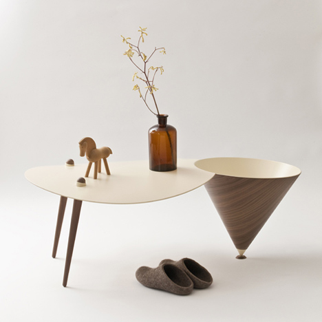
Mieke Meijer
POWER PLANT 1, WINDING TOWER 01, 2011 - Inspired by the photographs of Bernd an Hilla Becher Mieke Meijer restored the disused industrial shapes and placed them in a new context. By reducing the scale and playing with volume, she created a series of autonomous interior objects with an architectural feel. The third piece in the series, 'PowerPlant 01', wasn't based on a Becher photograph but on a marquant Eindhoven building, heritage from the Philips company. Mieke Meijer translated it into a low table with two conical shaped lamps.

OS & OOS
SYZGY LAMPS, 2011 - A continuous light source inspired by the sun, moon and planets. Syzygy [siz-i-jee] astronomical term from Nasa: a straight line configuration of three celestial like bodies produces eclipses, transits and occultations, but brought down to the human scale. The two foremost disks can be physically turned by hand to achieve the desired light effect. The light can only be put out when both are turned to the correct possession resulting in perfect black, for the light source itself remains constantly on.

Miya Kondo
COMPOSITION LIGHTS, 2011 - Composition Light describes the relationship between individual and object, and individual and space through the use of light, creating different perspectives, frames and shapes of light; offering light itself as a mutable spatial object. The result is a graphic light which, positioned in various ways, uses light as a way of communicating spatial dimension, the environment thus determining the form the light will take.

Lex Pott
TRUE COLORS Exclusively for foundbyjames.com, Lex created 40 limited edition artworks that capture the beauty and irregularity of metals. True Colours started as a research project into colour and was motivated by the desire to create a framework in which nature can express itself and still maintain beauty, a contrast to what is expected in our mass-produced world. Starting with 6 rectangle metal panels of processed brass, aluminium, steel and copper, he applies various chemical processes to generate oxidization of the material. He explains these chemical reactions with scientific formulas neatly recorded with typography on the face of the panels. As a result he creates a rich alchemistic colour palette against an industrialized metal framework: a fascinating contrast at the pivotal point in which nature and industry converge.

Henny van Nistelrooy
MYLTADA, 2012 - Myltada is a double-panel space divider which is the latest edition to the "Shelter" collection. Shelter is a collection of space dividers composed of specially selected fabrics, meticulously unthreaded into new geometrical patterns. In reaction to the machine woven structures Henny has been unthreading the fabrics by hand in order to create new geometrical designs within the fabric. By doing this the tightly woven, opaque textile become translucent and the relation between the different threads that make up the fabrics becomes clear. The project has been inspired by recent journeys to China. Here the beautiful architectural features appearing in many Ming/Qing imperial palaces and gardens have been of influence in the use of color and shape.

Fabian von Spreckelsen
The New York City Bulk and Wave collection - My sideboard is made up of powder coated steel and was painted in a bright colour resulting in a stylish contemporary look to give a smart impression. My object, a folded brick and its creation is like our mind and the way we change our paradigm. It takes a lot of effort to change our old patterns of thinking and to achieve the desired results. Whatever the outcome is, it is always unique and every person perceives it differently. The workings are asymmetric and cannot be seen like our inner mind. In addition to my "folded brick", I created "welded waves" which functions as a transcript of our transience. The processed metal was exposed to nature as we are to our environment reflecting the paths we chose to live. Both objects were handcrafted in my studio in Maastricht and only the finest materials were used.

Studio Like This
TIME, 2012 - A clock which requires time be sought out rather than have it as a constant reminder of its passing. Only when approached front-on does the clock allow for the transparency to read time. Viewed from any other angle, it disguises itself as a discreet wall object. TIME is a marriage of classic analog time-keeping and modern nano technology.

Franziska Wernicke
ROOM MOMENT c2, 2011 ROOM MOMENT c4, 2011 - The rugs stand out due to their unique color gradation design and their rich, luxurious finishing. The subtle and smooth color gradient effect gives the impression of a change of dimension in the rug. the design opens up the room in which it is placed, it communicates with its architectural surroundings and invites the user to experience a whole new interior dimension. Manufactured entirely in the Netherlands, the rugs make use of an exclusive high-tech tufting technique that is able to create super smooth color changes within the tufted rug. the rugs are made out of 100% pure New Zealand wool through which a luxuriously soft and voluminous rug is obtained.