Wim Crouwel designs typeface for Holland's FIFA World Cup 2014 kit
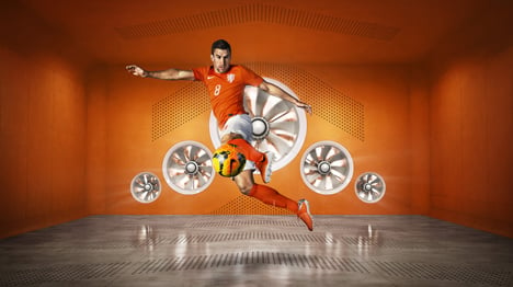
The Dutch team will take to the field for the second World Cup 2014 semi-final match today in a Nike kit featuring a bespoke typeface by graphic design legend Wim Crouwel.
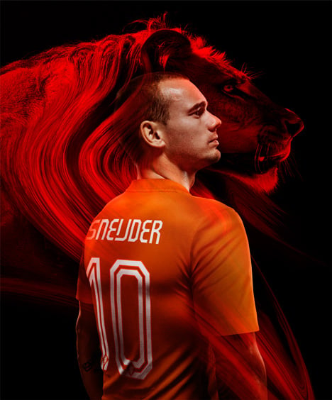
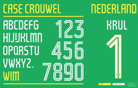
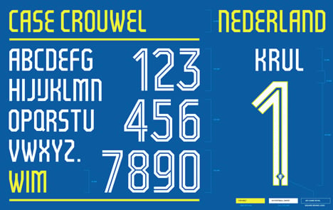
Crouwel has created a modern typeface for the names and numbers used on team jerseys for Holland's new kit, produced by Nike in collaboration with Dutch designer Floor Wessling.
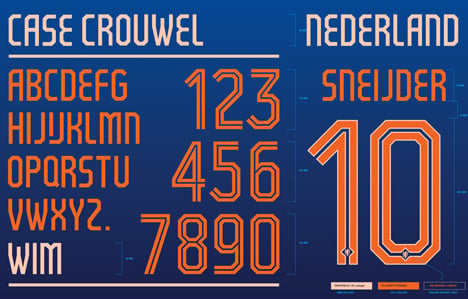
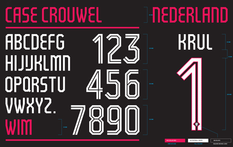
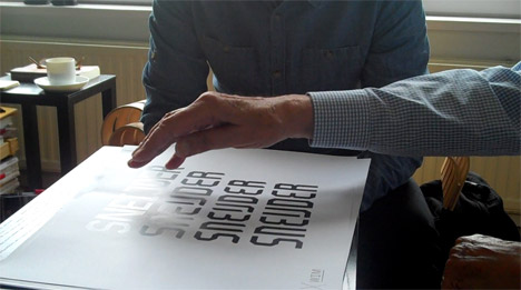
Case Crouwel is based on the Dutch typographer's Gridnik typeface, originally designed in 1974, the name of which is a reference to Crouwel's use of grid systems that also led to his best-known nickname "Mr Gridnik".
Like Gridnik, the new typeface replaces the curves usually used to form the shapes of letters with thick straight lines and chamfered corners.
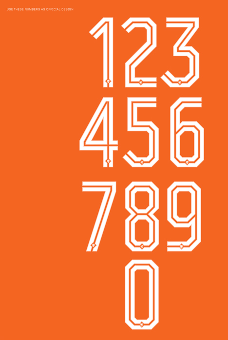
For the numbers, a thin stripe is included down the middle of each line – either in the colours of the jersey or in a contrasting colour from the kit – and the larger characters are outlined with a thinner border.
"The lines inside the numbers are reminiscent of the numbers famously seen in football in the 1970s," explained Nike. "To lend a further stamp of authority, each number also houses a small Royal Dutch Football Association crest at the bottom."

Case Crouwel is used across all versions of the kit in different colour combinations, including white on orange for the home kit and orange on blue for the away kit.
In an interview with Dezeen to mark the launch of a major retrospective of his work at London's Design Museum, Crouwel said that he favoured a "no-nonsense" approach to design.
"I have always tried to be a designer, a no-nonsense designer – straightforward, no baroque, no fantasies, readable, with well-structured typography," said Crouwel.
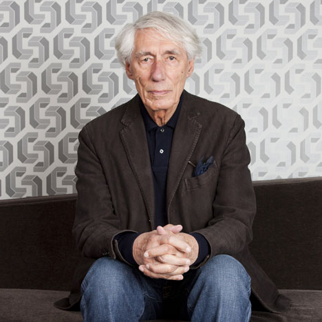
"Design shouldn't be complicated," he added. "It should also have a certain tension, be recognisable, but never stand in the way of getting out the message."
Designed to mark the 125th anniversary of the founding of the Royal Dutch Football Association, the new home uniform includes an orange jersey with a V neck and a hidden white trim inside the cuffs of the sleeves, which can be turned out to suit the preferences of individual players.
The jersey also features a redesigned crest with an enlarged white lion – meant to represent "a new era in Dutch football and the team’s core values of simplicity, honor and unity" according to the sports brand – replacing the previous lion's head.
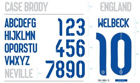
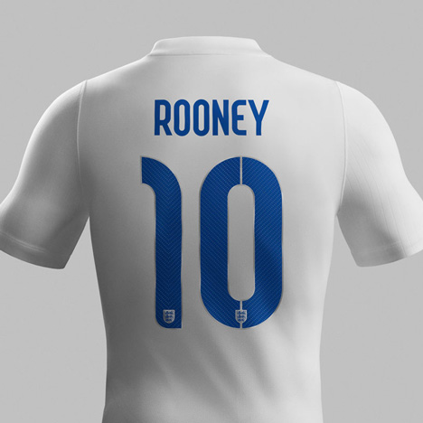
Nike also worked with British graphic designer Neville Brody on the typeface for this year's England kit, as well as creating unique fonts in-house or adapting existing ones for each of the uniforms created for the eight other Nike-sponsored teams in the tournament.
For the Portugese kit, Nike created a modern version of art deco typefaces used on old shop signage in the country, while the US team kit uses the existing REX family from free type foundry FontFabric set up by Bulgarian-based designer Svetoslav Simov.
This year marks the first time that Nike has been the official sponsor of more World Cup football teams than Adidas, the official sponsor of the tournament.
Both companies have created boots for individual players, which have often been worn with kits sponsored by the rival. Adidas' official World Cup boot collection has been worn by a number of key players during the tournament including Dutch team captain Robin van Persie.