Apple releases San Francisco typeface for watch-app developers
News: the typeface used on the recently unveiled Apple Watch has been made available to download alongside a kit of tools for developers who are customising apps for the device.
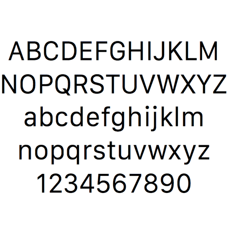
The sans-serif typeface, named San Francisco, comes in 23 variations and was designed in-house by Apple's team for use on the watch's 3.8-centimetre display.
It comes as part of the tech giant's WatchKit, which was released yesterday to provide developers with the ability to extend and enhance the functionality of apps onto the Apple Watch when it becomes available early next year.
Although aimed at app creators, the font family can also be downloaded to replace the default graphics on other Mac devices with high-resolution Retina displays.
Apple commented that it "developed a new typeface to maximise legibility" on the device when it was unveiled in September.
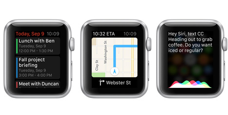
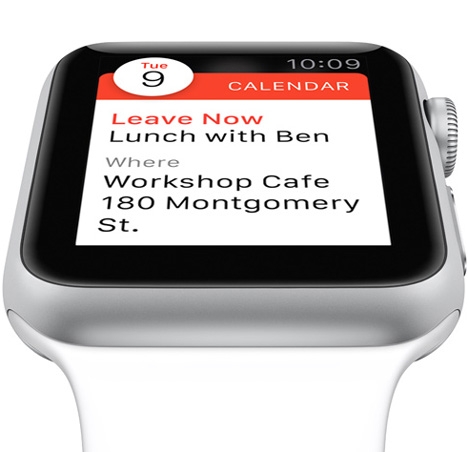
The company's head designer, Jonathan Ive, spoke about how the Apple Watch isn't designed for reams of text during a talk at London's Design Museum last week.
"The wrist is an amazing place to put technology," said Ive. "You're only going to use it a certain way – you're obviously not going to write a dissertation!"
San Francisco follows on from the typefaces created for Apple by in-house designer Susan Kare in the 1980s, each named after an international city including Chicago, which was used on early iPods.
Recent typography stories we've covered include a typeface designed to be easier for people with dyslexia to read and a "ghostly" typeface created by overlaying each letter of the alphabet from over 900 existing font families.