The best and worst Olympic logo designs since 1924
Rio 2016: with the Rio Olympics now in full swing, we've rounded up some of the best and worst Olympics logos that have been produced to promote the summer event, including the favourite logos selected by legendary graphic designer Milton Glaser and critic Alice Rawsthorn (+ slideshow).
The modern Olympics launched in 1896, and the games' most identifiable graphic – the five interlinked rings created by Pierre de Coubertin, co-founder of the games – was first introduced in 1912.
However, it didn't become popular until the 1930s, with the promotional material in the run up focusing instead on typography and highly symbolic illustrations of the human figure. The 1924 Olympics offered one of the first graphics that might be considered an official logo.
Paris, 1924
The line-drawn logo for the 1924 games in Paris featured an outline shaped like a shield, with a ship in the centre. American designer Milton Glaser called it a "bad beginning", and the text, "unreadable" in a recent interview with the American Institute of Graphic Arts (AIGA).
Los Angeles, 1932
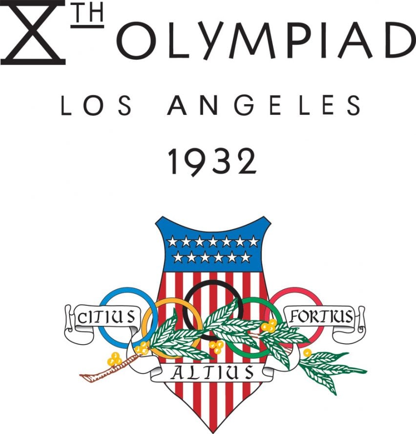
Los Angeles hosted the summer games of 1932, the first American city to do so. The logo prominently features the star-spangled banner, along with the motto of the games, "citius, altius, forties" and the soon to become ubiquitous interlinking rings. Los Angeles hosted the summer Olympics a second time in 1984.
London, 1948
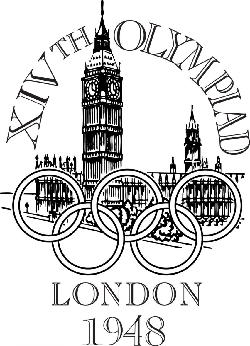
The first post-war Olympic logo features the five rings superimposed on London's Parliament building. "Not all images will work together," said Glaser about this logo.
Helsinki, 1952
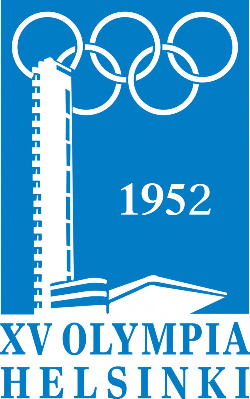
The blue-and-white logo of the 1952 Helsinki summer olympics took its cues from the Finnish flag. In addition to being used as a logo, the design was printed on badges that were worn by dignitaries and important guests of the games and ceremonies.
The design features the Olympic Stadium's tower in the foreground, and the iconic rings in the background above it.
Tokyo, 1964
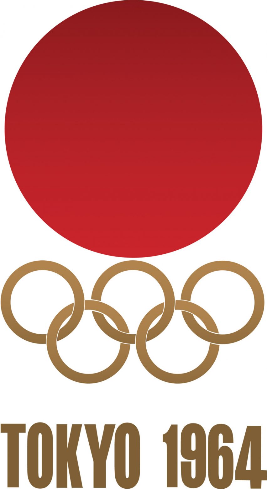
A bright red sun, the symbol of Japan, and the Olympic rings over the words Tokyo 1964 in bold block letters make up the logo of the summer games. This logo, designed collaboratively by Japanese designers Masaru Katsumi and Yusaku Kamekura, was Milton Glaser's favourite, earning the near-perfect score of 92 out of 100 in his AIGA ranking.
Mexico, 1968
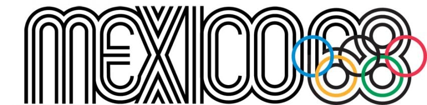
Designed by Lance Wyman – an American designer who was then working for George Nelson in New York – Mexico's 1968 Olympic logo centres around a multi-stroke typeface that incorporated the Olympic rings into the 68. Modified versions of the logo, with radiating patterns of curved and diagonal lines, were used in a variety of places around the city and in the promotion of the event.
In a recent Instagram post, critic Alice Rawsthorne said the Mexico logo was her favourite.
Munich, 1972

Although the 1972 games in Munich are most memorable for the tragic attacks that took place during the event, the logo is an interesting innovation in Olympic graphic design.
The graphic created by German designer Otto Aicher was among the first to drop the convention of displaying the five rings in the design since the 1930s – a move that Glaser describes as "a powerful abstraction" although the result "could be used for almost any event."
Montreal, 1976
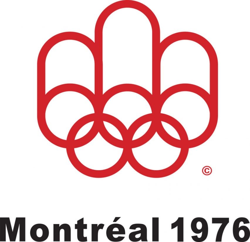
The olympic rings were transformed in this logo to represent the letter "M" for Montreal. Glaser said that the design was "perhaps more appropriate for a manufacturer of paper towels". The logo was created by Canadian graphic designer Georges Huel, who also helped design the 1976 Olympic torch with industrial designer Michel Dallaire.
Seoul, 1988
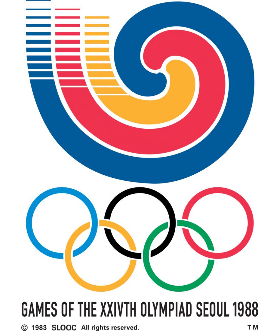
Milton Glaser described this logo as "harmonious". The image features bold lines converging to form a concentric circular pattern above the signature Olympic rings.
Barcelona, 1992
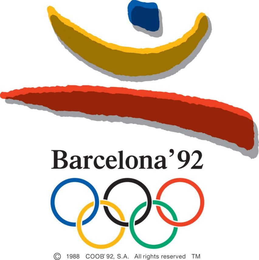
Three strokes form the figure of a leaping athlete in the logo of the 1992 Olympic Games, designed by Spanish artist Josep M. Trias. Despite its simplicity, the choice of colours and shapes creates a direct relationship between the logo and the text and rings below.
Sydney, 2000
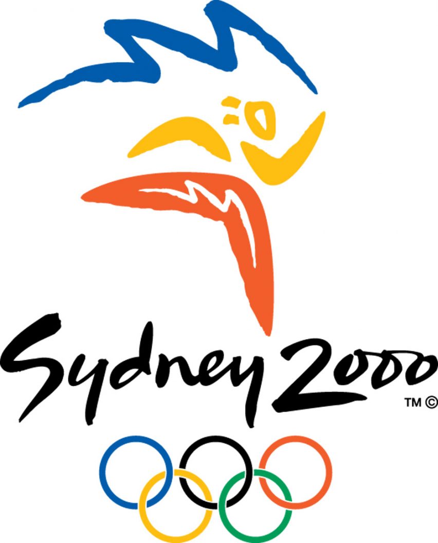
This graphic by Australian architect and designer Michael Bryce is another of Glaser's favourites – particularly because of the lettering. "The gestural quality of the drawing and the typography makes the entire mark feel harmonious," said Glaser.
These games were mostly remembered for their use of the iconic Sydney Opera House, designed by Jørn Utzon. Its outline is hinted at in the logo's background.
London, 2012
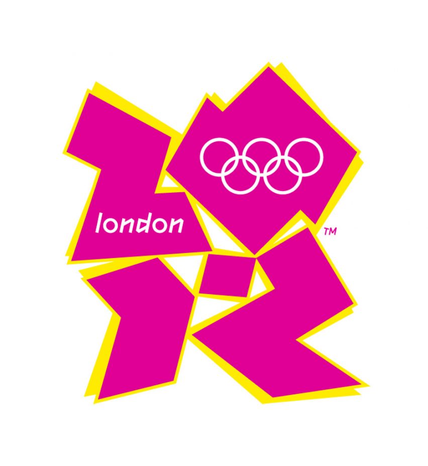
Design brand Wolff Olins designed a vivid logo for the 2012 games that would be highly visible on screens – where most people would be watching. But the result was controversial.
"I felt then – and still feel now – that the 2012 logo was memorable for the wrong reasons, because it looked to garish with its clumsy typography and garish shapes," wrote Rawsthorn on Instagram. "The nadir came when viewers complained to the BBC that an animated version has caused epileptic fits," she said.
Rio de Janeiro, 2016
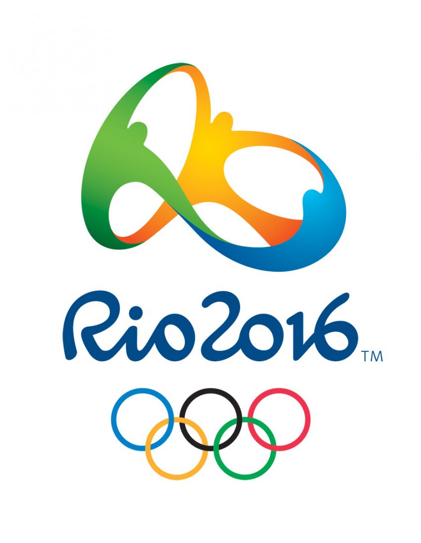
According to Glaser, the logo for this year's Olympic Games "feels like something new". It was designed by the Brazilian agency Tatil after a lengthy selection process that pitted 139 designers against each other to earn the commission.
Tokyo, 2020
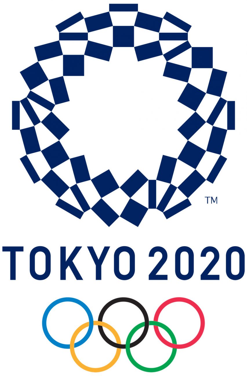
Although they are still four years away, the Tokyo 2020 Olympics have already been the focus of controversy. The organising committee had to scrap the original logo designed by Kenjiro Sano amid allegations of plagiarism.
A pair of new Olympics logos was unveiled earlier this year, created by Tokyo-based artist Asao Tokolo.
Images are courtesy of the International Olympic Committee.