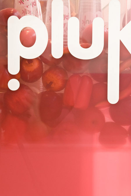
Pluk by Tjep
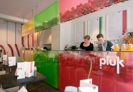
Dutch designers Tjep. created the identity and interior of Pluk, a shop serving healthy take-away food in Haarlem, the Netherlands.
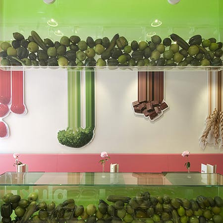
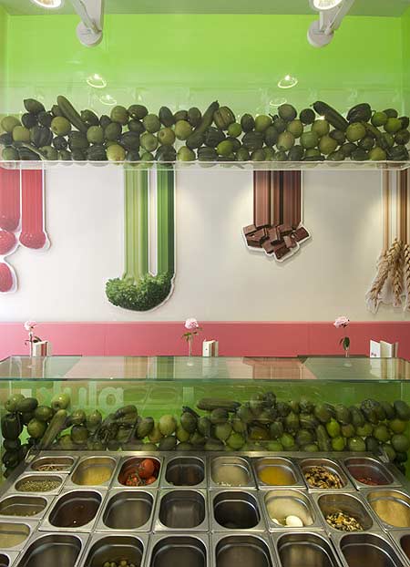
The counters are filled with fake vegetables arranged according to colour.
More stories about Tjep. on Dezeen:
Restaurant Praq
ROC Apeldoorn reception area
Fabbrica
Waater bottle
ROC Apeldoorn interior
Here's some more information from Tjep.:
--
Pluk
Good food is great fun! Pluk is a contemporary take-away formula with as main products: fresh juices, yogurt shakes and special tossed salads that customers can compose themselves.
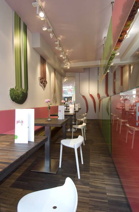
The essence of the formula is to enjoy good food. The emphasis on health is implicit. Pluk says: if you are consuming the healthy things 99% of the times, you can indulge yourselves with 1% of wiped cream. Pluk offers the 99% and the 1% next to each other, on top of each other or mixed with each other.
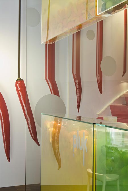
The interior tries to reflect this juxtaposition of healthy and fun. For some reason healthy wants to look boring but we just said no!
The counters contain fruits and vegetables in three color groups. They are actually fake, but because of the way we integrated a special gradient effect the whole counter becomes simply delicious. It took us months to develop the exact right color, gradient and fruit/vegetable combination to get this result: people who enter Pluk are overwhelmed and just cant resist ordering one of the wonderful specialities specially prepared by A嵐 and Zeger. These new friends came to us last year and asked us to help them out with their dream.
Tjep. was responsible for the identity, naming and interior design of Pluk. Anyway if you are in Haarlem in the Netherlands check it out!
Project Team:
A嵐 & Zeger, Frank Tjepkema, Janneke Hooymans, Tina Stieger, Leonie Janssen, Bertrand Gravier, Camille Cortet. Special thanks to Iris.