Virgula I adds warm wood to white-walled Portuguese hotel
Portuguese architecture studio Virgula I has used local Iberian chestnut to introduce warmth and character into this hotel renovation in the town of Vila Nova de Cerveira (+ slideshow).
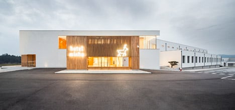
The Porto office of Virgula I was asked to adapt and enlarge an existing building constructed in 2006 to improve the facilities for guests of the Hotel Minho, in a picturesque region of northern Portugal.
The studio proposed a complete overhaul of the guest experience, overseeing everything from the architecture to the simplification of the hotel's name, from Hotel Turismo do Minho to Hotel Minho.
"The most innovative aspect of our solution was to see the building as whole, integrating interior design, communication design, new architecture and a new branding name," JP Pereira, a partner at Virgula I told Dezeen. "We used architecture as the tool to connect all these aspects."
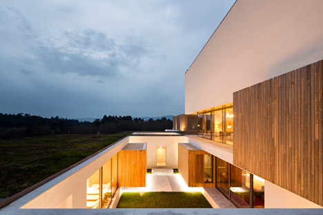
An original wing containing the hotel's guest rooms was retained, while the entrance area and social spaces have been comprehensively renovated.
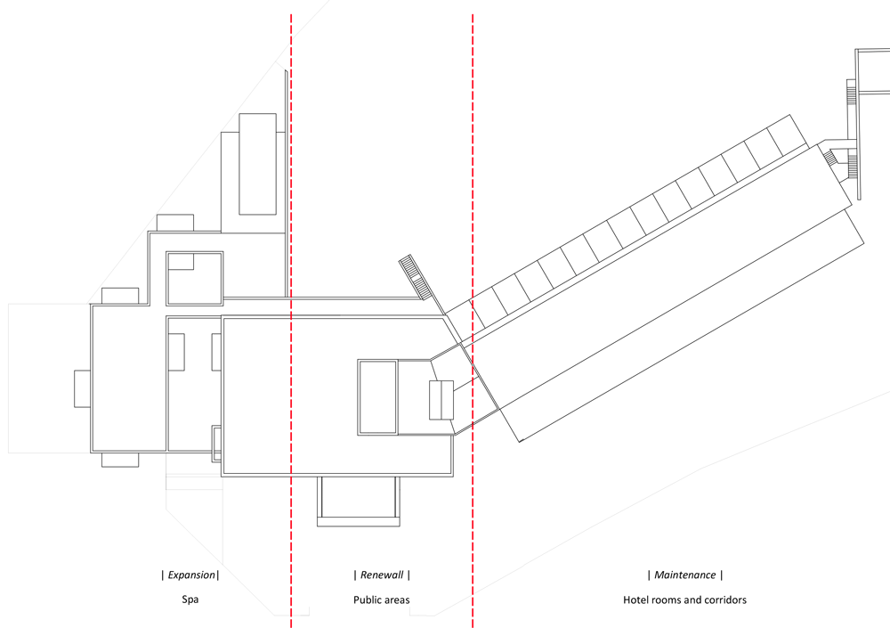
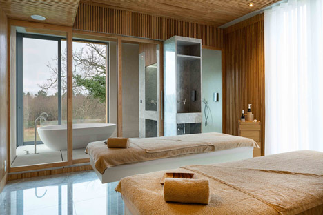
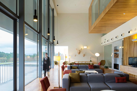
An additional storey above the lobby now accommodates a business centre and the architects also designed a new spa for a narrow space on one side of the existing building.
The minimal forms of the original structure influenced the simple additions, which are designed to blend in with the rest of the building while offering a warmer and more expressive presence.
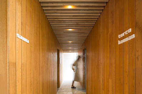
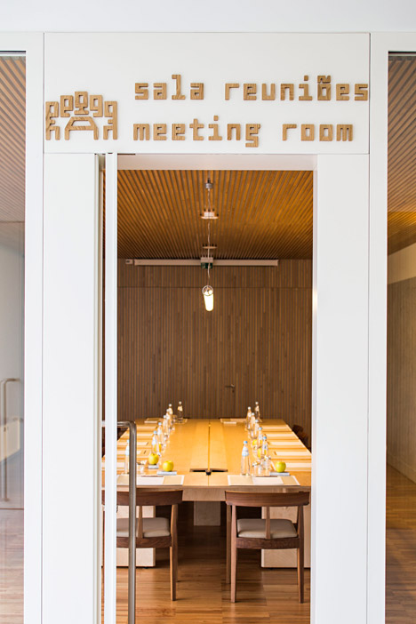
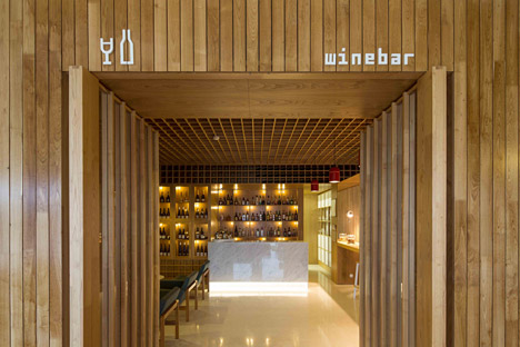
New wooden structures used to demarcate various amenities, including the reception, a lounge area, meeting room and auditorium, are clad in Iberian chestnut to enhance the building's connection with its site.
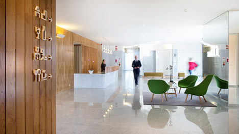
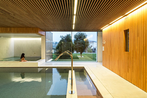
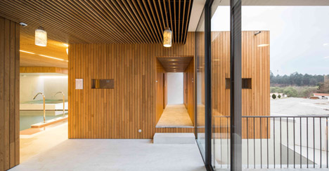
The wood is applied both internally and externally to visually link these areas, and also to create a warm contrast to the simple white walls of the existing buildings.
The material references local vernacular architecture, such as the traditional grain store known as an "espigueiro" that influenced the shape of a suite placed on top of the main spa building.
"We wanted the guest to feel the warmness of light and of the wood, as well as the rich relationship between interior and exterior, which is enhanced by the wood volumes that come from the inside to the outside," added Pereira.
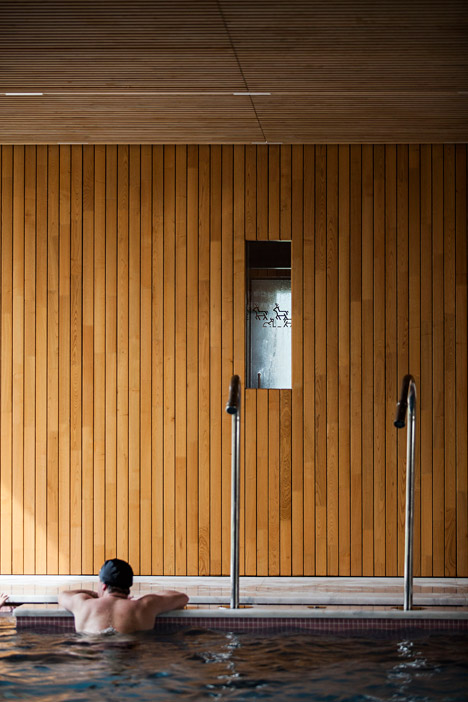
A series of inner patios flanked by glazed walls enable natural light to reach the spa's treatment rooms and pools. These spaces are lined with chestnut boards and feature ceilings made from wooden strips with fluorescent tubes fitted in the gaps.
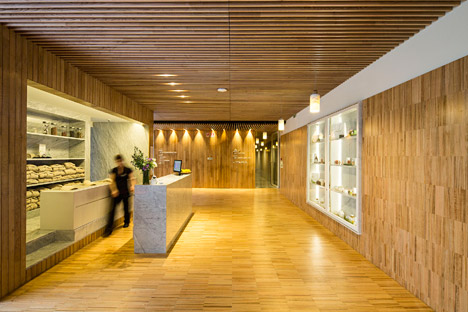
Other materials applied throughout the interior are intended to provide balance in the natural and neutral palette. Glossy white marble is used for flooring and freestanding furniture, including the reception desk and cocktail bar.
To augment the hotel's new image, Virgula I invited fellow Porto design studio R2 to develop a new visual identity that ties in with the updated interior scheme and is also used across all corporate material.
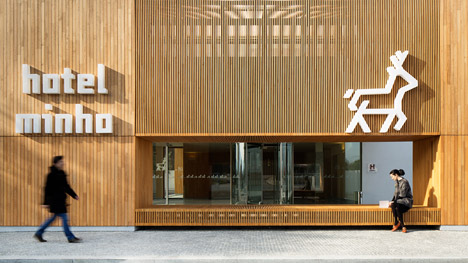
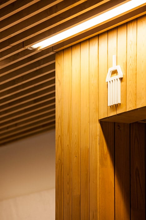
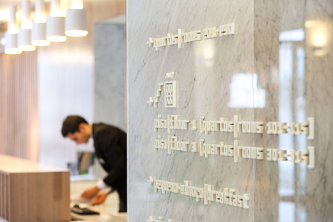
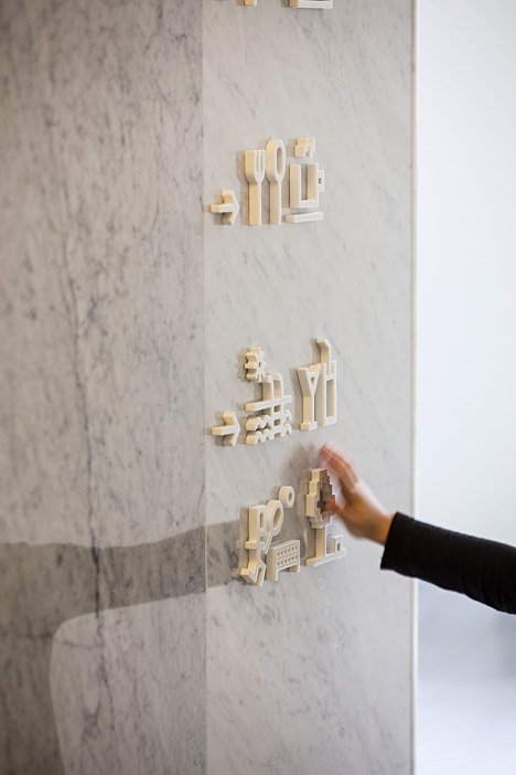
The solution includes a logo based on a stylised illustration of the region's symbol, a stag, and a signage system designed to match the interior's colour and material palette.
A series of pictograms and signs based on a font called Capibara were created to provide a fresh and unique navigation aid used in the hotel's public spaces.
Photography is by Eva Sousa and Nelson Garrido.