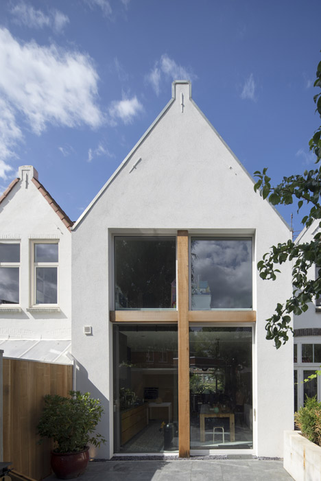
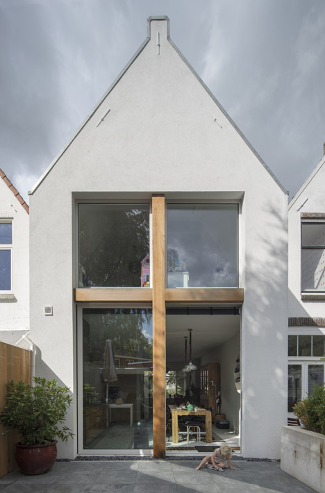
Dutch studio Ruud Visser Architecten has "stretched" the length of an early 20th-century townhouse in The Hague, and added a large window with a cross-shaped wooden frame to the new rear facade (+ slideshow).

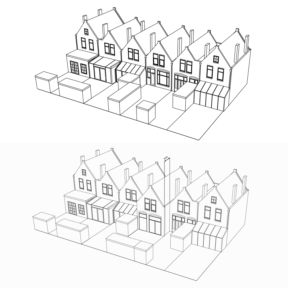
The brief was to add a simple single-storey extension to the two-storey building – similar to the other five properties that make up a row fronting the Delftweg river in Rijswijk.

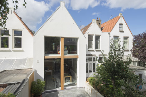
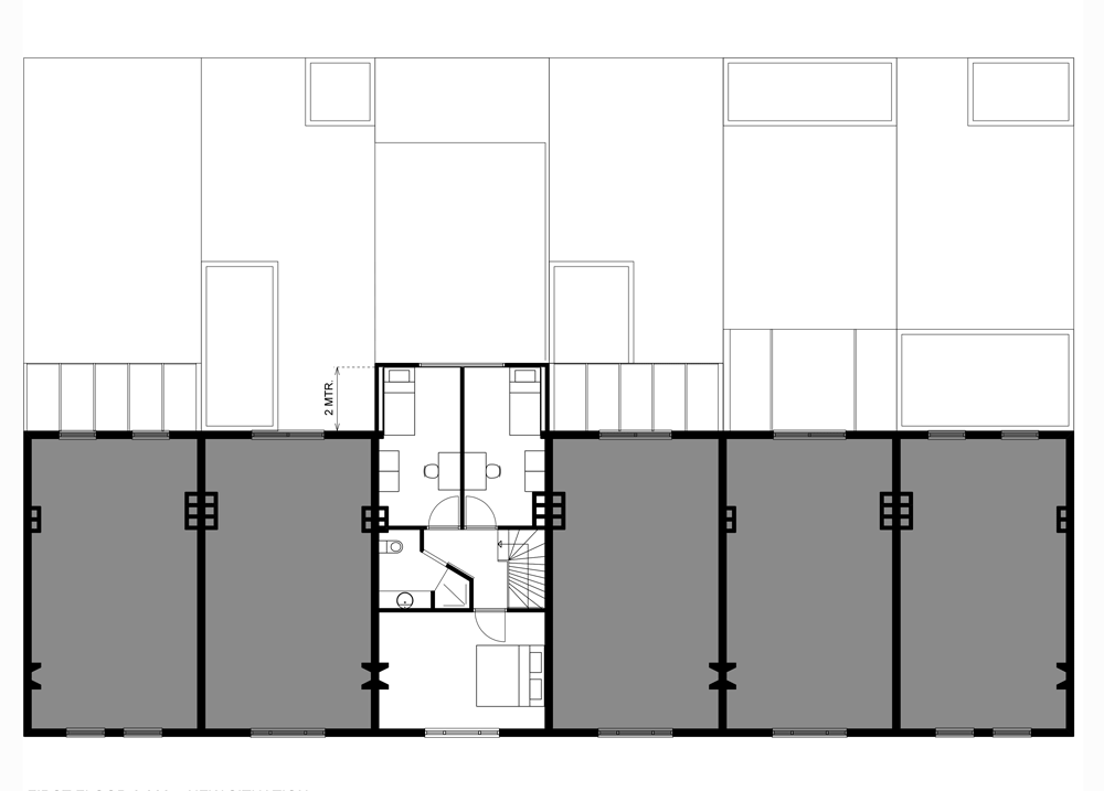
But Ruud Visser – whose past projects include a house in a converted church – felt that the residence was more in need of extra space upstairs, and proposed extending the whole building towards the garden by two metres.
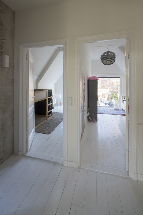
"We noticed that the lack of space was not on the ground floor, but on the first floor," explained the architect. "The sleeping rooms of the children date back to 1900, and in one of the rooms there wasn't even space for an average single bed."
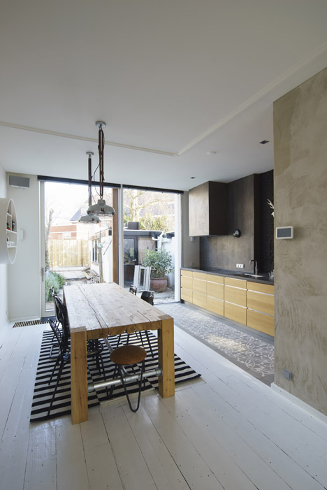
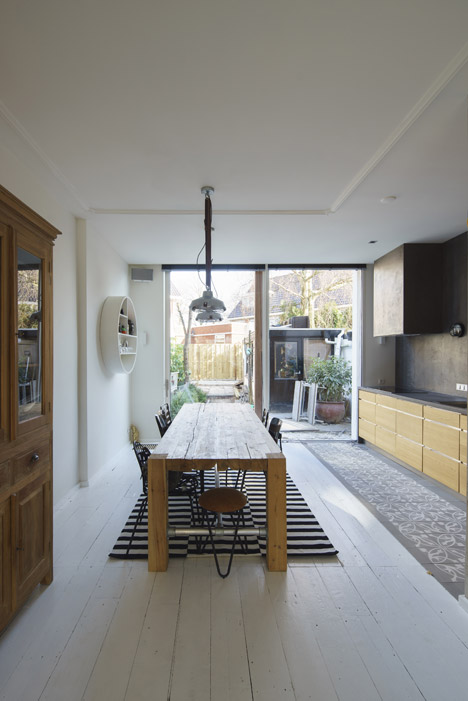
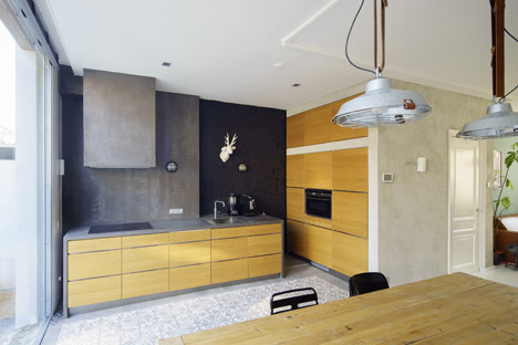
"By literally stretching the house by just two metres, we could make two average-sized children's rooms on the first floor. And by doing that we create enough space on the ground floor to make a comfortable dinner room with a kitchen," he said.
Unfortunately this idea went against local planning regulations, which stipulate that extensions can be no higher than three metres. So Visser wrote to the local council and persuaded them to make an exception. He named the project Stretched House.
"[We tried] to convince them our plans were better for the future of the neighbourhood. And it worked!" he said.
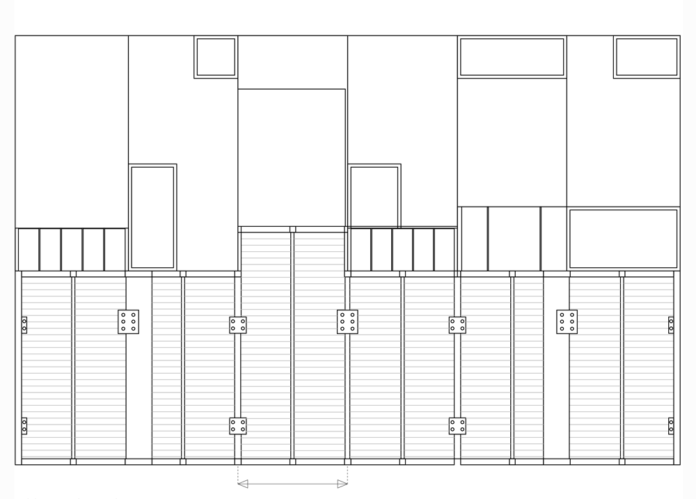
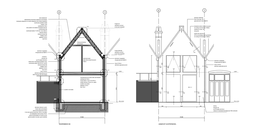
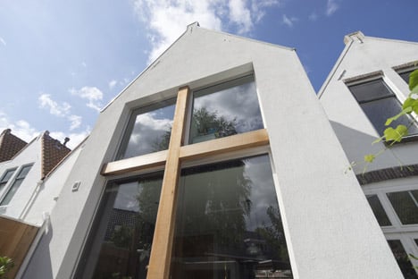
The new rear elevation has exactly the same profile as its predecessor, with a white-rendered surface, a steeply angled gable and a rectangular parapet at its peak.
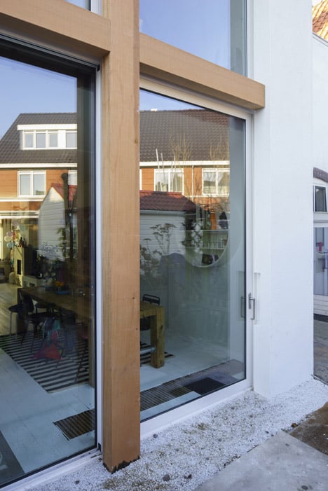
The large window that punctures the wall is more contemporary. It is divided into four by a wooden crucifix-shaped frame – the only decorative element of an otherwise simple finish. Large expanses of glazing have also been used when extending an Antwerp home, in the form of six-metre-high doors, and a London house that now features a giant corner window.

"We left the facade as it was, with its characteristic 19th-century features," said Visser. "But instead of several small windows, we made one big window separated into four parts. Every part of the window opens to a different living area."
The house's ground floor had already been open plan and fairly spacious, but the extra two metres at the back has allowed twice as much space in the kitchen, as well as room for a larger dining table.

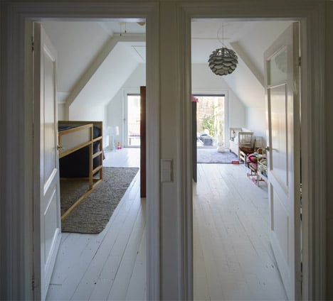
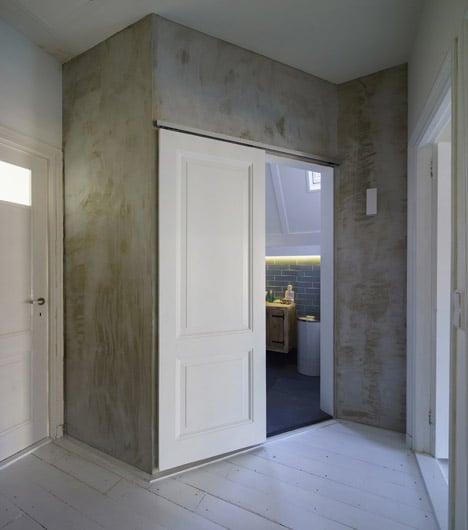
Upstairs, the two children's rooms now match one another in size, and the bathroom is also larger.

Photography is by René de Wit.
Project credits:
Architect: Ruud Visser Architecten
Project architects: Ruud Visser, Fumi Hoshino
Constructor: Schouten Bouw
Aluminium window frames: Schuco
Building cost advisor: Maarten Oosschot