Russian tourist board unveils new visual identity inspired by suprematist art
A team of five designers has created a new brand identity for Russia's tourist board, which references the graphic style of suprematist artworks.
The design was created following an open competition launched by the Federal Agency for Tourism of the Russian Federation and the Association of Branding Companies of Russia, for a new visual identity to promote tourism in the country.
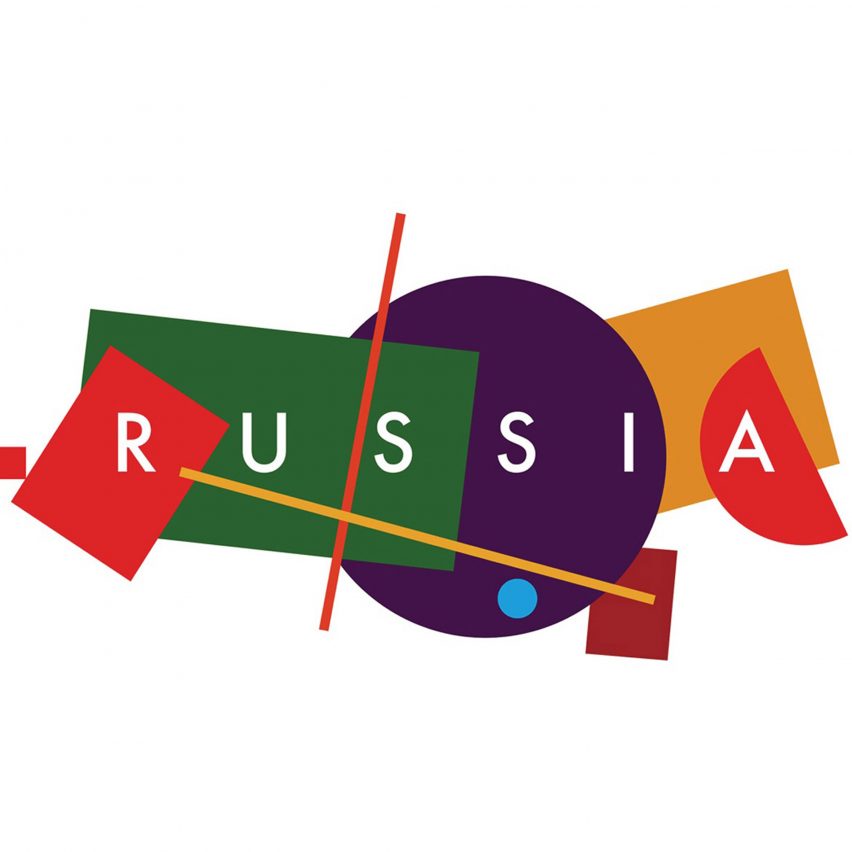
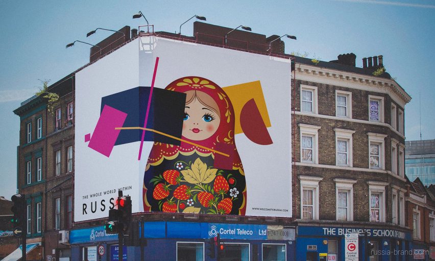
The winning identity and its slogan "the whole world within Russia" was created by a team of designers from four different Russian agencies: Supremtica, Plenum, Artonika and Art.Lebedev.
Suprematism, the avant-garde art movement developed by Russian artist Kasimir Malevich, formed the starting point for the design.
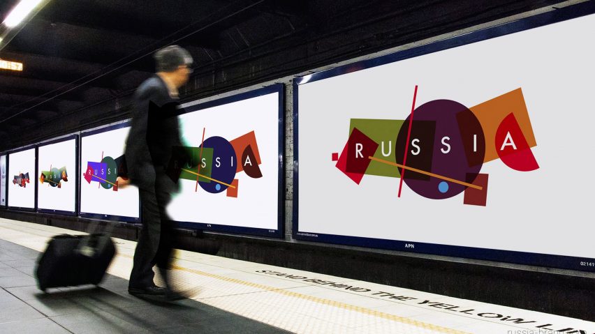
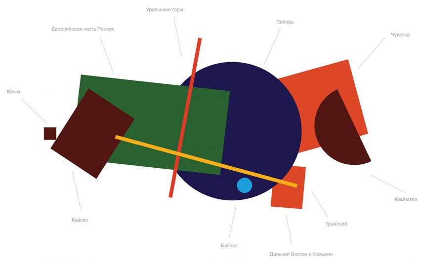
It led the designers to develop a logo made of up basic geometric shapes, which loosely form a map of Russia. Each of the 10 shapes represents a different place and territory, and they are presented in block colours of red, green, purple and orange.
Interestingly, it includes Crimea – a former part of Russia that was annexed in 2014. This territory is presented as a small square on the far left of the image.

"This is a pretty simple graphic approach that shows the country's diversity – sometimes complicated and bulked, sometimes totally empty, like an incoherent patchwork quilt," said Vladimir Lifanov, who is creative director of Supremtica.
"This concept is a good example of how anyone can express his perception of a homeland," he continued. "This is how I see it: complicated mixed with simple, monochrome and colourful, round, and angular."
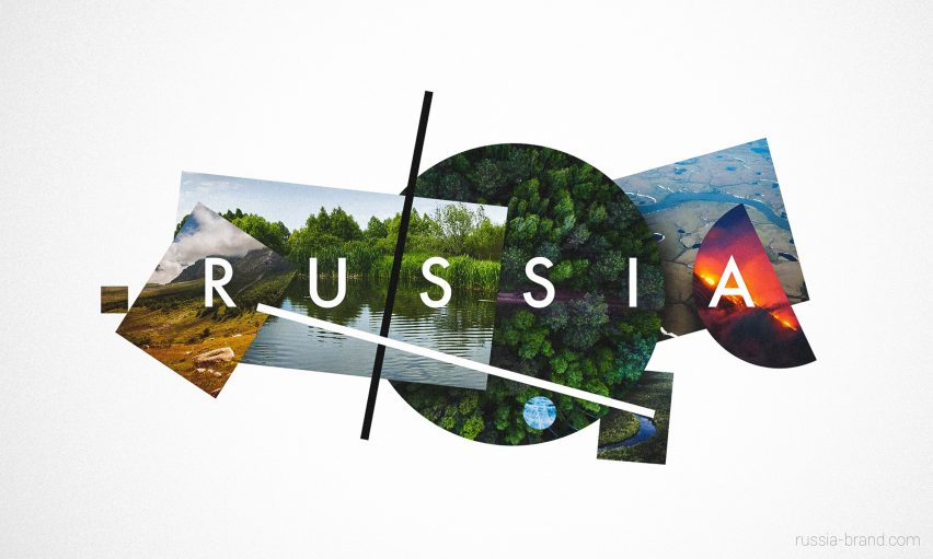
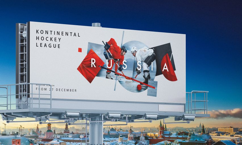
The designers also adapted the logo using photography, creating images that could be used in advertising campaigns.
In one image, the shapes are turned into platters of food that celebrate Russia's local cuisine. And in another they frame views of forests, lakes and volcanos, to exhibit the country's natural landscapes.
"What can be easier than describing your home country? In an instant, you come up with tons of significant things that you are proud of: food, art, nature, people, events," said Egor Myznik, creative director of Plenum.
"The toughest part is to describe so many things and keep it clear and simple at the same time," he continued. "The created concept elegantly solves this problem, and on top of that gives a lot of freedom in visual system development."
The identity was selected from over 480 competition entries. An online public vote was used to find a shortlist of 10, and a committee eventually chose the winner.
The new visual identity is currently only in use on the website but will be visible all over the country in the coming months. Its launch coincides with this year's FIFA World Cup, which is hosted by Russia.
A 20th-century Russian art movement also provided design cues for the footballing event – designer Igor Gurovich used 1920s-style postconstructivist graphics to create a retro poster for the event.