Rick Banks compiles a visual history of UK club culture
Manchester-based designer Rick Banks has compiled three decade's worth of nightclub graphics into a new book. In a Dezeen exclusive, he picks out five of the most important examples and explains why they were so successful.
Launched on Kickstarter earlier this year, the publication – named Clubbed – documents artwork from Britain's most iconic dance music institutions, including Manchester venue The Haçienda and London nightclub Fabric.
Banks embarked on the project after noticing a lack of books based on the visuals associated with the UK's club scene.
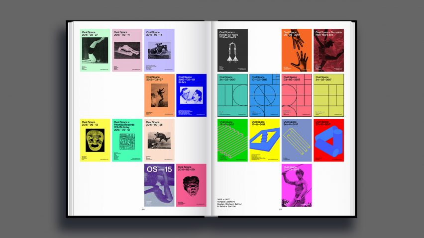
Through a range of logos, posters, photography, tickets, cover art, signage, lanyards and flyers – the designer aimed to create a "graphic record" of the country's nightclub history.
"Dance music was hugely influential to me when I was growing up; it was one of the biggest reasons I got into graphic design," he told Dezeen.
"For years, I was always amazed no one had done a modern, visual book on clubbing," he continued. "Similar types of books were published in the early 1990s and they generally featured just flyers with some 'humorous', awful pastiche design."
Banks – who heads up his own studio named Face37 – began by visiting a number of design archives in London and Manchester, including those owned by designers Peter Saville, Mark Farrow and Trevor Johnson.
"I got Peter Hook's blessing to use the Haçienda brand, and Matt Robertson, who produced the Factory Records book, gave me access to all of Peter Saville's archive," he said. "I then spent time in Manchester with legendary designer Trevor Johnson going through his amazing archive."
After thorough research, that involved accessing flyer databases BoroSix and Phatmedia, and looking through old music magazines from the 1990s, he began the process of modernising outdated digital files.
"A lot of the work had to be redrawn from scratch, especially the typography. In one case a whole font had to be digitalised for just one flyer," he explained.
Older designs from the 1980s and 1990s were converted from a discontinued Adobe software Freehand MX to Illustrator.
"We had trouble opening old file," Banks said. "For some of the Cream & Renaissance work, Phil Sims – who now runs the design studio Neighbour – had done a lot of his work in Freehand."
"Luckily, he has kept an old iMac running OS X 10.6.8 which is the last operating system that will natively run Freehand MX. This allowed him to open Freehand files from version 5 from the mid-90s to version 11 which was the last one before it got abandoned by Adobe," he continued. "He could then convert them to Illustrator files. It's nice to think that if he hadn’t done this now they would be lost forever."
Read on for Banks' pick of the five most important examples from Clubbed.
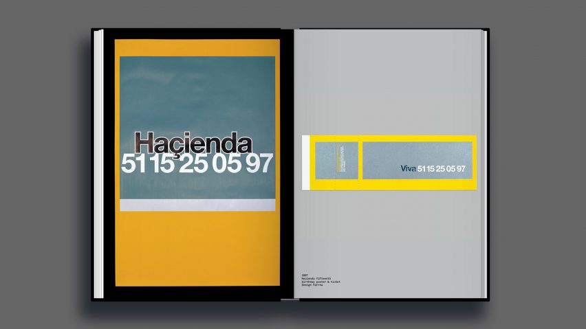
The Haçienda's 15th birthday poster
Farrow's fluorescent poster design for The Haçienda's 15th birthday is my favourite design in the book; so much so it's the first thing you see when you enter my house. The modernist minimalism, subtly and craft inspired me hugely as a young designer and influenced my own design work.
The code 51 15 25 05 97 was printed in a reflective ink onto a grey background which rendered it almost invisible in daylight. The poster only came to life at night under the glare of car headlights. The reasoning is that the message was only important to people who were out after dark.
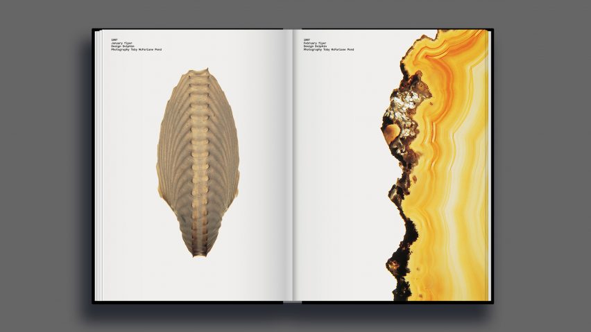
Renaissance photography
As a teenager, I vividly remember seeing the photographic campaign by Toby McFarlane Pond; art directed by Phil Sims at the now defunct Dolphin agency. I was amazed by the stunning abstraction. It went against the very graphic nature of some of the design at the time.
The typography and hierarchy were always wonderfully set and made me appreciate grids as a young designer. There was an elegant beauty about the whole campaign.
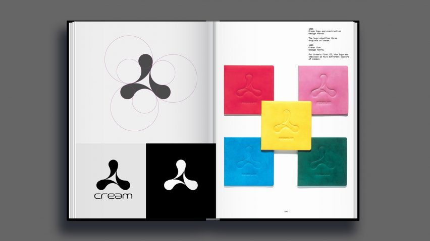
Cream's logo
This is my favourite logo in the book and one of my favourites of all time. I actually wanted to shave the Cream logo on my head as a teenager! Embarrassing looking back. But that's how strong the logo is. It's timeless.
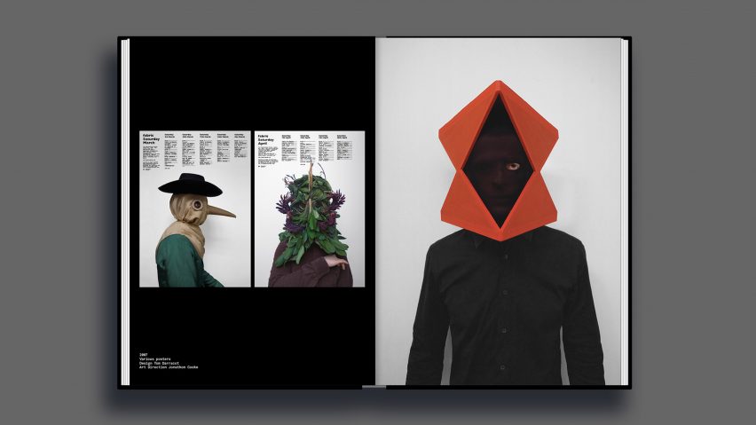
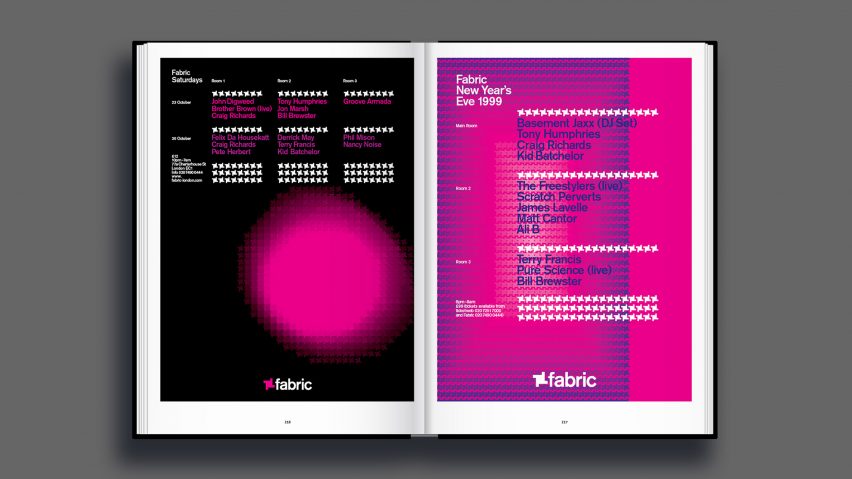
Fabric's surrealist posters
Fabric's initial designs were very graphic like a lot of the clubs at the time. However, they quickly abandoned this style in favour of a photographic approach.
Over time, under the direction of Jonathon Cooke and Roberto Rosolin, Fabric has created its own, unique surreal world which is instantly recognisable — it doesn't even need to use the logo on posters.
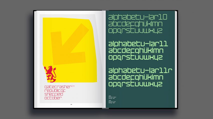
Gatecrasher's branding
I liked everything about tDR's holistic approach for Gatecrasher — the bespoke font, the tiny details, the lairy colours, intricate illustration and distinct tone of voice. It was one of my first experiences of a "brand world".
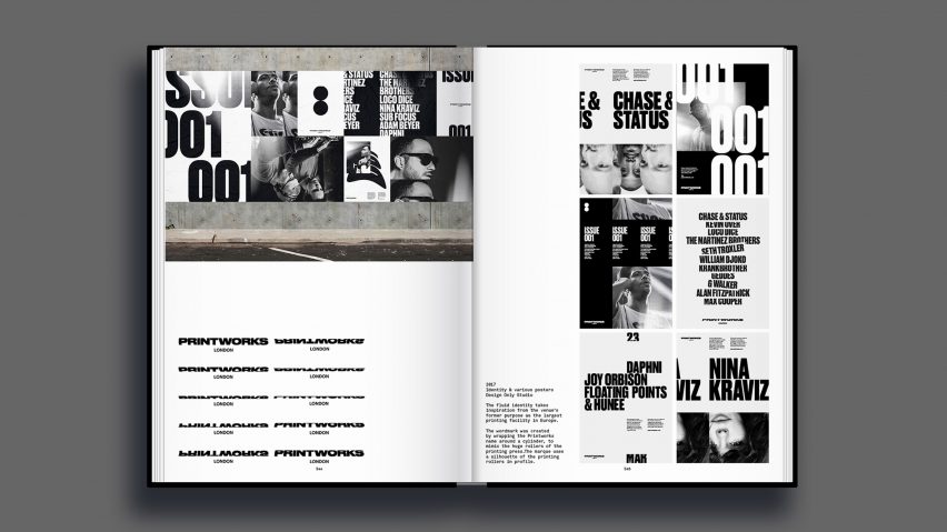
Printworks' logo
Printworks' fluid identity by design studio Only takes inspiration from the venue's former purpose as the largest printing facility in Europe.
The wordmark was created by wrapping the Printworks name around a cylinder, to mimic the huge rollers of the printing press. The marque uses a silhouette of the printing rollers in profile.