See-Eat-Through is a set of tableware that visually impaired people can perceive
Design Academy Eindhoven graduate Aurore Brard has created tableware featuring coloured accents, designed to help visually impaired people dish up the correct amount of food and drink.
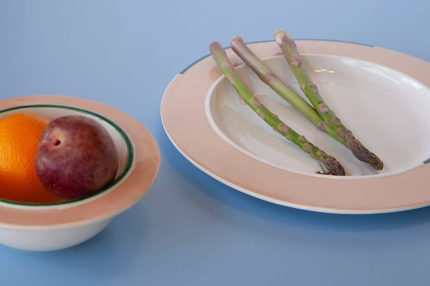
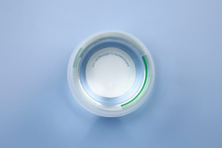
Called See-Eat-Through, the collection includes ceramic plates and bowls, marked with bands of colour that are in striking contrast with the pale ceramic surfaces.
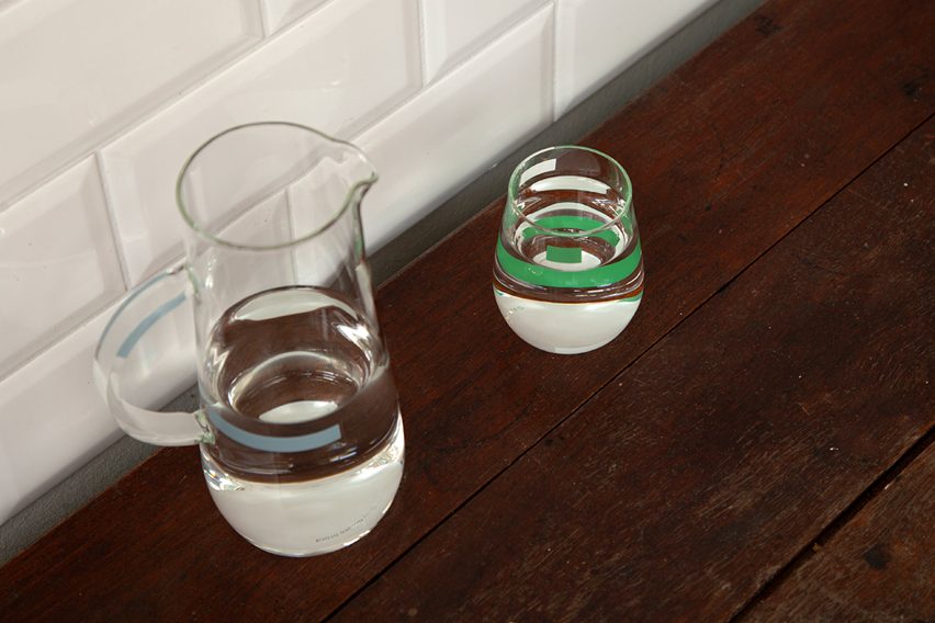
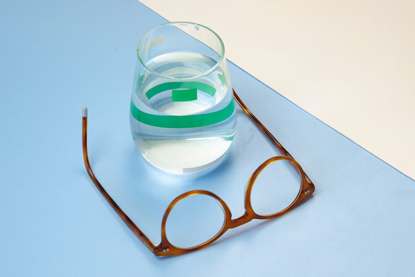
A jug and a set of glasses are marked with similar strips of colour that, thanks to light refraction, make clear drinks visible.
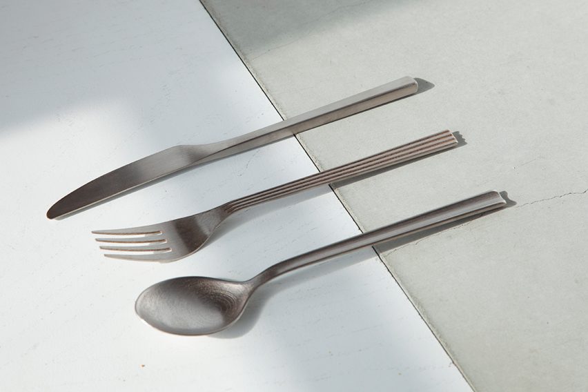
There is also a set of cutlery with tactile markings that make them easier to identify.
According to Brard, the aim was to make objects easier to detect by people who have under 30 per cent vision.
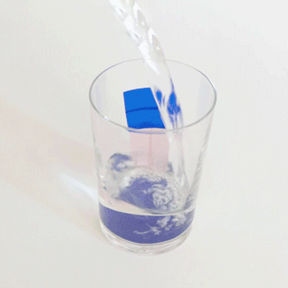
"With five per cent vision, pouring a glass of water is like pouring something invisible into something invisible," she told Dezeen.
"Visually impaired people can, however, perceive colour contrasts," she explained. It was an exciting puzzle for me to try to use colours and the refraction of light into water to give a visual signal when there is enough water in the glass."
Brard is presenting the project at the Design Academy Eindhoven graduate show as part of Dutch Design Week 2018.
The designer hopes it can offer an alternative to traditional objects for visually impaired people, which she believes are functional but lack aesthetic appeal.
"I wanted to rethink a daily action from the perspective of someone with low vision," she explained.
The project started after Brard discovered that more than 250,000 people in the Netherlands have visual impairments.
She regularly attended Visio, a centre for the blind in Eindhoven, where she found that most of the products available for visually impaired people are functional but not aesthetic.
"I met visually impaired people around Eindhoven, to get insights into their daily lives," she explained.
"I discovered a lot of functional products but I was quite shocked at how some solutions can become stigmatising objects, like a beeping electrode that is attached to a glass that gives off an alarm signal when it is full," she continued.
"I wanted each functional feature to become part of the aesthetics in this tableware set. So that it is really integrated and the collection can appeal to people without vision problems. This way it can really be an inclusive design."
Although the coloured accents serve a function, Brard hopes they will also be seen as an aesthetic feature.
"I played with coloured lines to bring a fresh and dynamic look to the glass and the plate while maintaining simplicity," she concluded.
See-Eat-Through is on show at the Design Academy Eindhoven graduate show throughout Dutch Design Week, which runs from 20 and 28 October.
Other recent graduate projects from the school include whimsical furniture items that respond to people's changing requirements and a stool informed by the "essence of a classic tin can".