Optician Sans is a font that completes the eye test chart alphabet
Creative agency Anti has produced a custom font called Optician Sans by adding to the ten letters used in historic optotype eye test charts.
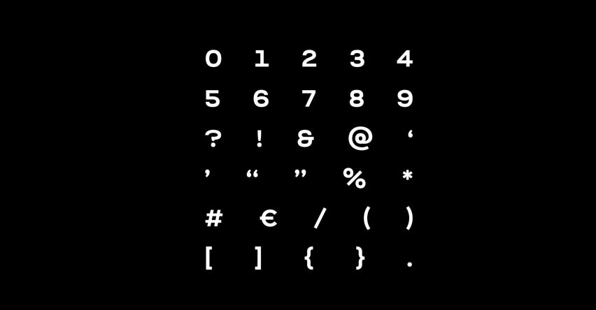
Unlike the Sloan typeface commonly used to test patients' sight, Optician Sans has a full set of 26 letters of the alphabet, as well as numbers and special characters.
The design of the lettering is based on the characters that are used on a standard eye test.
Formal eye testing began in the 19th century, with the standard chart was updated in 1959 by Louise Sloan, who gave her name to the Sloan font. These letters are the basis of the universal chart for testing visual sense, also known as the Logmar chart.
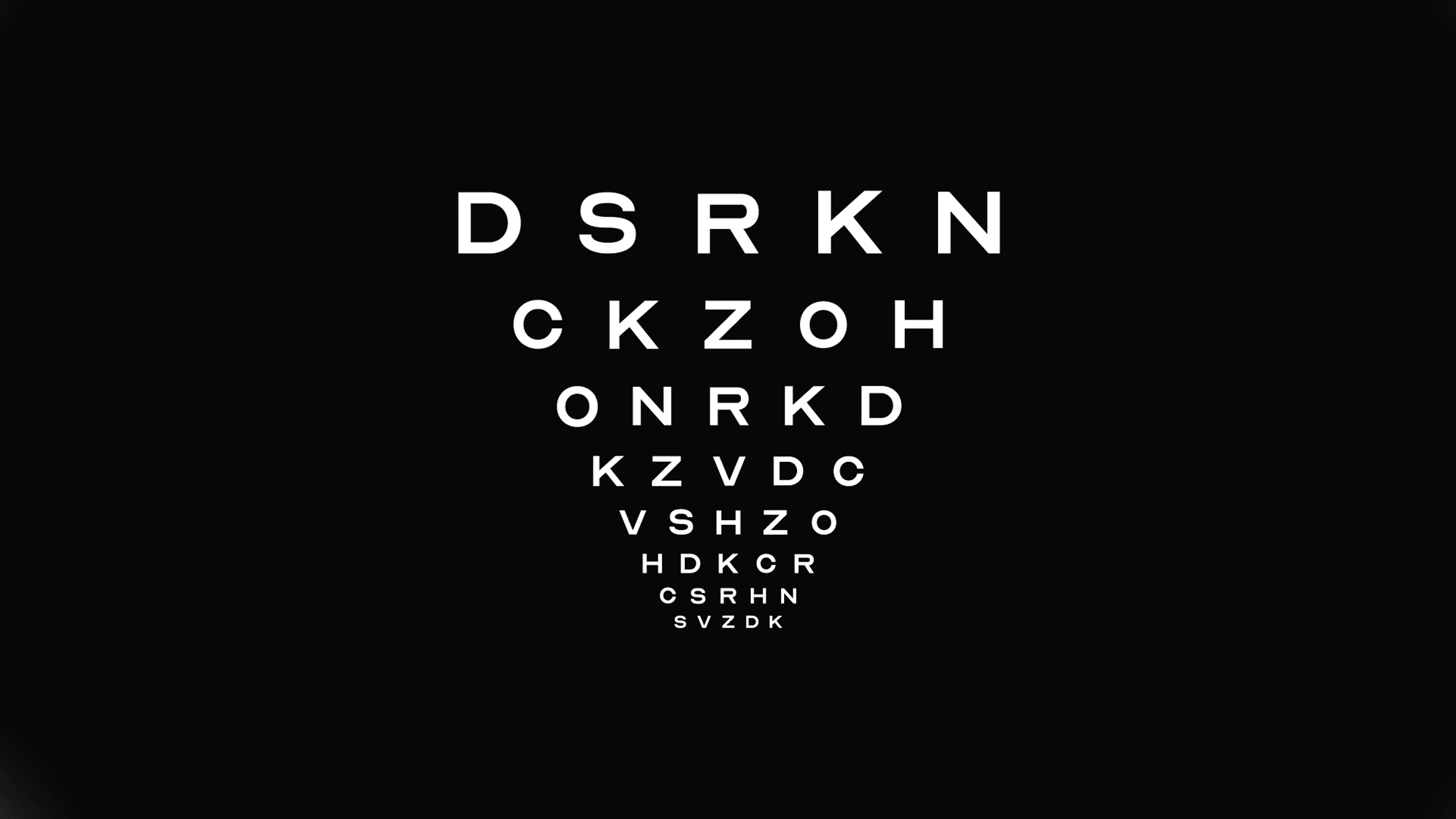
The Sloan typeface has just 10 letters – C D H K N O R S V Z – as the intention was simply to test patients' vision rather than provide a workable system of writing.
"In these charts there were also no need for the complete alphabet to measure the subject's visual acuity. The letters were never intended to be used as a font or a typeface, only as a medical tool for optometrist," said Anti creative director Kjetil Wold.
Unusually for a font, each character is the same width as they are adapted from a five by five square grid pattern, so some appear oddly proportioned compared with the characters in most typefaces.
The studio found it was difficult to make aesthetically-pleasing letters with the original characters, so they made some adjustments.
"There's a lot of optical adjustments needed to create a typeface that would actually work as a display font, so we began to do some minor changes here and there," said Wold.

In the end, they also decided to include the original letters as they would be on an eye chart, so that the user can choose the option of being closer to the original typeface.
"We made all the optical adjustments, pun intended, you'd expect in a modern typeface, while at the same time keeping things as close to the original letter forms as possible," explained Wold.
"We figured that this would probably be something people would point out, so to compensate we made alternate glyphs for some of the letters, so it's up to the user how true they want to stay to the original letter forms."

The project was initially instigated for the visual identity of a Norwegian optometrist called Optician-K, the "K" standing for the Krogh family who have been in the optometry business since 1877.
The typeface became the basis of the optometrist's visual identity and logo. Once the project was complete the creative agency decided to make the typeface publicly available.
"Optician Sans connects the optician brand Optician-K directly to the craft of the optometrist and is now made available for everyone," said the brand.
The Nobel Prize recently updated its visual identity, including a sans and serif typeface based on the lettering of the medals handed out at the first awards ceremony in 1901.