Stockholm Design Lab creates "timeless" visual identity for Nobel Prize
The medal handed out to Nobel Prize winners at the first awards in 1901 is the inspiration behind Stockholm Design Lab's rebrand for the prestigious awards.
The Swedish studio was influenced by the art nouveau design of the medal and its lettering when developing the logo, colour scheme and typography for the awards and its online platforms.

Stockholm Design Lab created two typefaces for the new visual identity. The primary typeface, called Alfred Sans after the prize's founder Alfred Nobel, takes inspiration from early twentieth-century letterings like Akzidenz-Grotesk and Futura, with the upper case letters based on classic geometric shapes.
A secondary font called Alfred Serif also features in the rebrand. "Both typefaces are designed to fit together and complement each other, functionally as well as aesthetically with a focus on readability and thus secure long-term usage," said the studio.
Presented at this year's awards, which took place on 10 December, the minimalist visual identity features an all uppercase, bespoke sans-serif logotype, taken from the letters engraved in the gold medal.
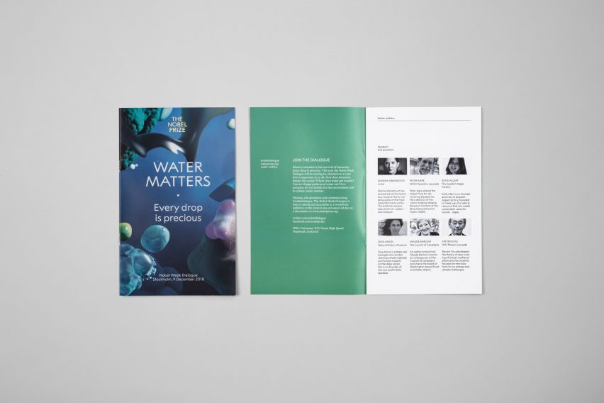
As well as a brand new logo, the "timeless" identity is complete with a white and gold colour scheme and promotional digital animations, featuring amorphous shapes in shades of blue.
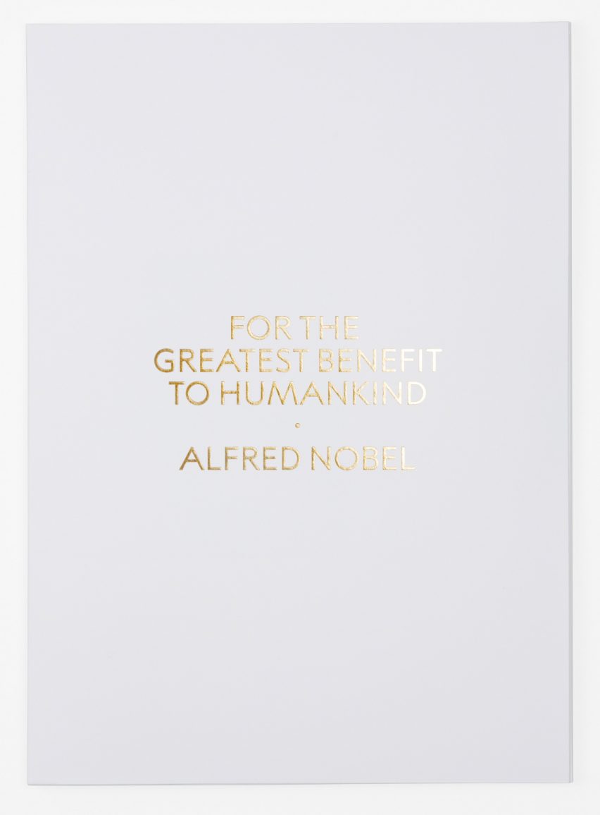
First awarded in 1901, The Nobel Prize honours those who have "conferred the greatest benefit to humankind". It is divided into six categories – chemistry, literature, peace, physics, economic sciences and physiology or medicine.
Stockholm Design Lab was asked to create a unified brand identity to "communicate one brand instead of many", and "ensure long-term preservation and strengthening of the brand's unique position".

The previous branding was made of multiple identities, each corresponding to one of The Nobel Prize's various sub-organisations. "The Nobel Prize consists of a network of organisations with different tasks and character," said Stockholm Design Lab.
"Previously, all its organisations, as well as specific events, had their own expression, thus there was a lack of consistency and clarity."
For the colour scheme, the designers opted for "elegant", muted shades with golden accents. "If any brand can rightly claim gold as its natural accent colour, it is probably the Nobel Prize," said the studio.
Increasing numbers of companies are turning to their heritage when creating new brand identities.
Examples include luxury fashion brand Celine, which removed the accent from its name, and John Lewis and Waitrose, whose new, unified identity reflects the company's 1960s "diamond pattern" branding.