Alibaba offers bespoke typeface to businesses looking to rebrand
Chinese e-commerce giant Alibaba has released a new custom typeface that its partners, sellers and consumers can use free of charge to establish their own brand identities.
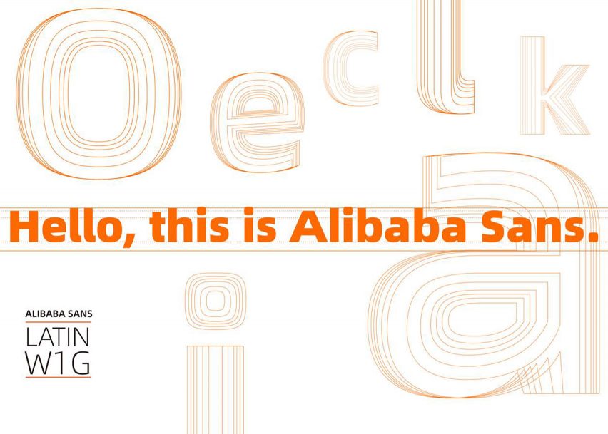
The two fonts in the typeface, Alibaba Sans (Latin W1G) and Alibaba PuHuiTi (simplified Chinese), were debuted at the company's annual UCAN design conference in Hangzhou, China, on 27 April.
The bespoke typeface will be implemented across all of Alibaba's platforms to establish a common visual identity.
Led by its aim to "make it easy to do business anywhere", Alibaba has also made the fonts available for commercial use to all of its partners, merchants and customers, who can download and use them free of charge.
The company hopes this will offer digital resources to businesses of all sizes that are struggling to access reliable and inclusive design assets with which to establish and express their brand identities.
"We would like to make this new typeface an inclusive resource for all our partners and customers across the globe, and for free," said Alibaba chief marketing officer Chris Tung.
"True to our group mission, we are taking a concrete step forward to helping small and medium-sized enterprises to participate in the digital economy through the power of design," he added.
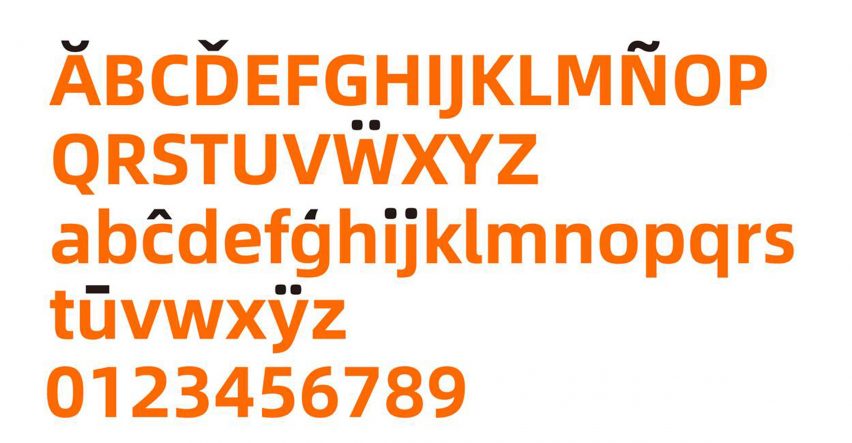
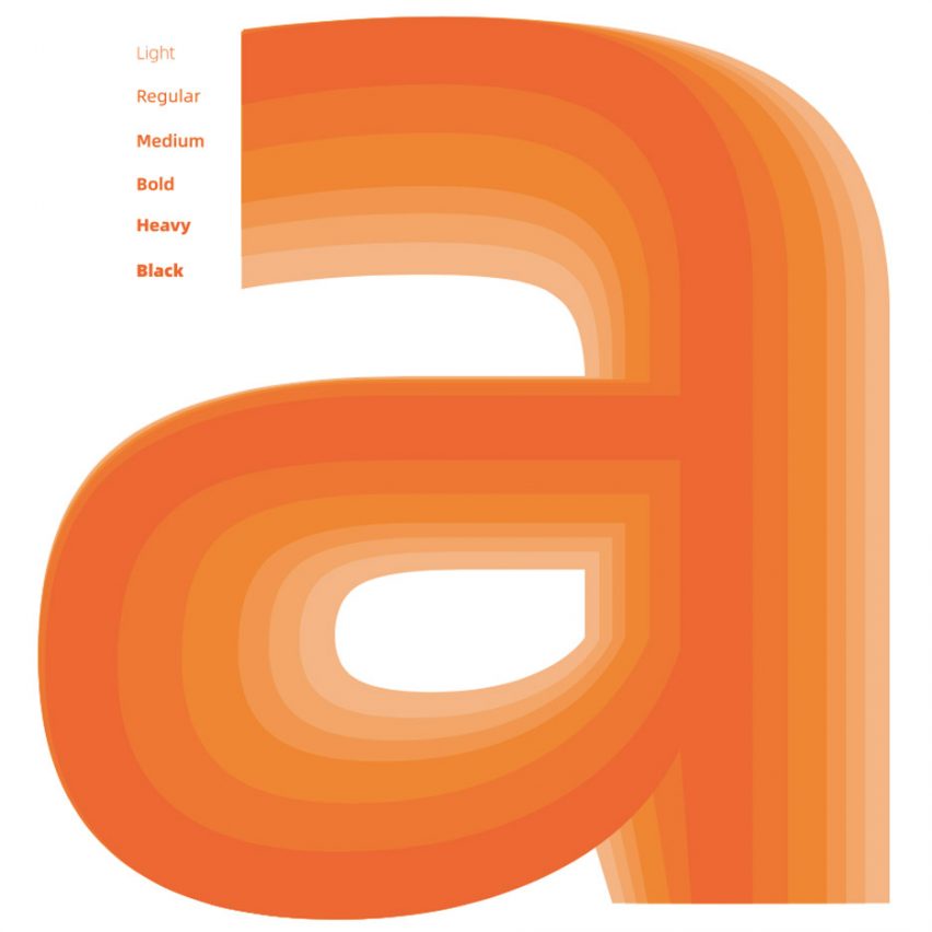
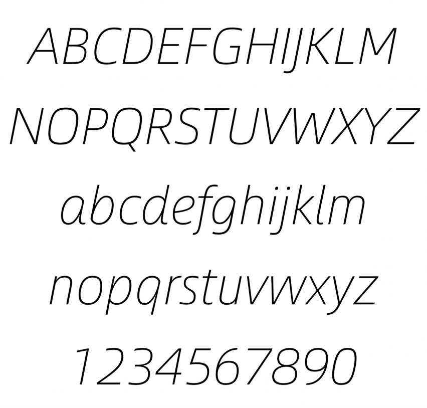
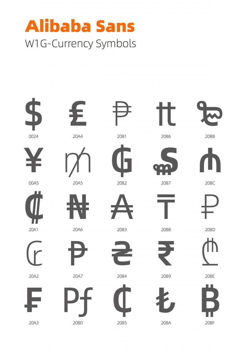
Designed by Monotype Studio's type director Akira Kobayashi, the Alibaba Sans font comprises 7,205 Latin letters in 11 different weights, and is available in 172 languages.
Alibaba worked with Kobayashi to make a font that is highly legible on small screens for shoppers using the company's e-commerce apps, while still maintaining its effect when stretched out in large formats, such as across an office building.
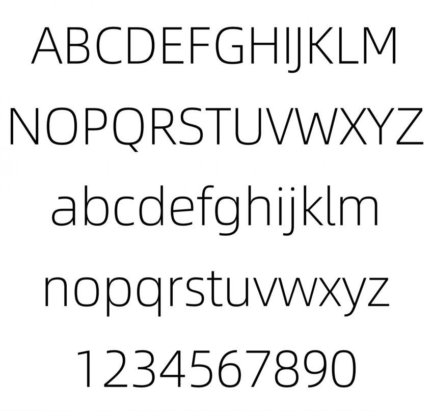
According to Chiang-Hui Lin, head of corporate branding at Alibaba Group, the Alibaba Sans font is "reliable" and "levelheaded", but also "energetic and young".
The Alibaba Sans lowercase "a", for example, features a shortened arc and an extended curve on the inner rounded part of the letter.
Lin said details like this make the font "distinctly Alibaba".
"Brand personality is a very personal feeling, but the way we summarised it to Kobayashi was to see Alibaba as a 20-year-old, who's young and bristling with energy," said Lin.
This can be seen as words are typed out, explained Lin, as the bottom half of the letters tend to be more "sturdy", while the upper half is rounder and more "rhythmic".
The Alibaba PuHuiTi typeface, on the other hand, was created by Yihong Tao from HanYi Fonts, and includes a total of 116,895 Chinese characters in five different weights.
Alibaba – the seventh most valuable company in the world – is an e-commerce platform for global wholesale trade, which often directly connects individuals around the world to factories.
Monotype was also responsible for recently overhauling the Helvetica font over 60 years after it was first created to give it a fresh new look for the 21st century.