The Washington Post's "simple simulations" showing how to slow coronavirus is its most popular story ever
Infographics that reporter Harry Stevens created to explain how coronavirus spreads have become the most-viewed story ever published on The Washington Post.
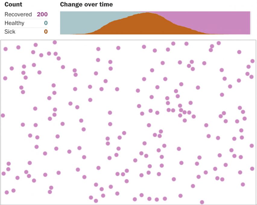
Stevens created the infographics for The Washington Post to demonstrate the impact that different conditions, known as network effects, can have on the spread of an imaginary virus in a fake town of 200 residents.
The spread is explored under a free-for-all, in which residents don't change behaviour, quarantine and self-isolation to show that the latter is the most successful way to contain the fictional disease called "simulitis".
"Even though they're very simple simulations, they help people understand how network effects work," Stevens told Dezeen. "When you see it on a computer screen, it suddenly becomes very clear, even though the simulations are so simple."
The Washington Post published the article Why outbreaks like coronavirus spread exponentially and how to "flatten the curve" on 14 March and made it available to read free of charge. It is now the newspaper's most-read online story.
Stevens believes the story was so popular because it helps people realise that their actions can have a positive impact amid the coronavirus crisis and makes them feel less powerless.
"One of the things that my friends who have read it have told me was that it actually made them feel hopeful, which is not a result that I anticipated," Stevens said. "But I can understand because people are feeling really anxious right now and what the simulations show is that by adapting our behaviour, we actually can hopefully slow this thing down."
"When people are feeling scared and powerless, it's useful to know that there's something that they can control," the graphics reporter added. "They can control their own behaviour and that will hopefully help to see people's lives and end this sooner."
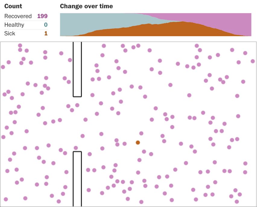
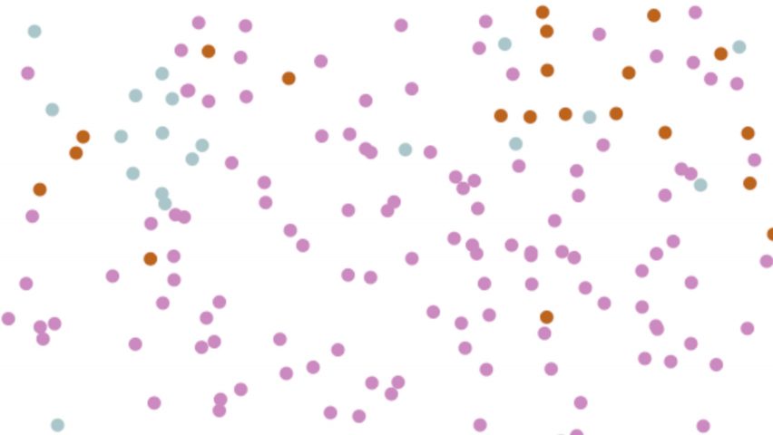
The graphics comprise dots in different colours, with a green hue used to represent healthy, an orange hue for the sick and a pink hue for recovered people. The dots move around according to the different conditions and change colour as they hit each other, representing the spread of the virus.
Stevens made the visuals using JavaScripts codes so that they start moving about as readers scroll down the article. He developed the idea to follow another model he had been working on some years before.
"I had been experimenting with collision detection about a year ago, which was just like getting circles to move around on a screen, and then when they get near each other to bounce away in the other direction," he said. "That was part of the inspiration for this."
"I never thought of it in terms of modeling a disease or even trying to simulate a network effect," Stevens added. "It was just like trying to figure out how to get these circles to bounce off of each other."
Stevens chose to base the graphics on a fake virus after consulting with Lauren Gardner, a scientist who had been producing models of outcomes of the coronavirus pandemic with a team of PhDs at Johns Hopkins University. Gardner told him it would be "too complicated" to replicate something for an interactive magazine article.
"Speaking to her and understanding how difficult it is to forecast the real disease, is what encouraged me to make a fake disease," he said. "They have to account for so many complex variables, like how people use airports and how much they travel and various potential health policies that might be put into place and so on and so forth."
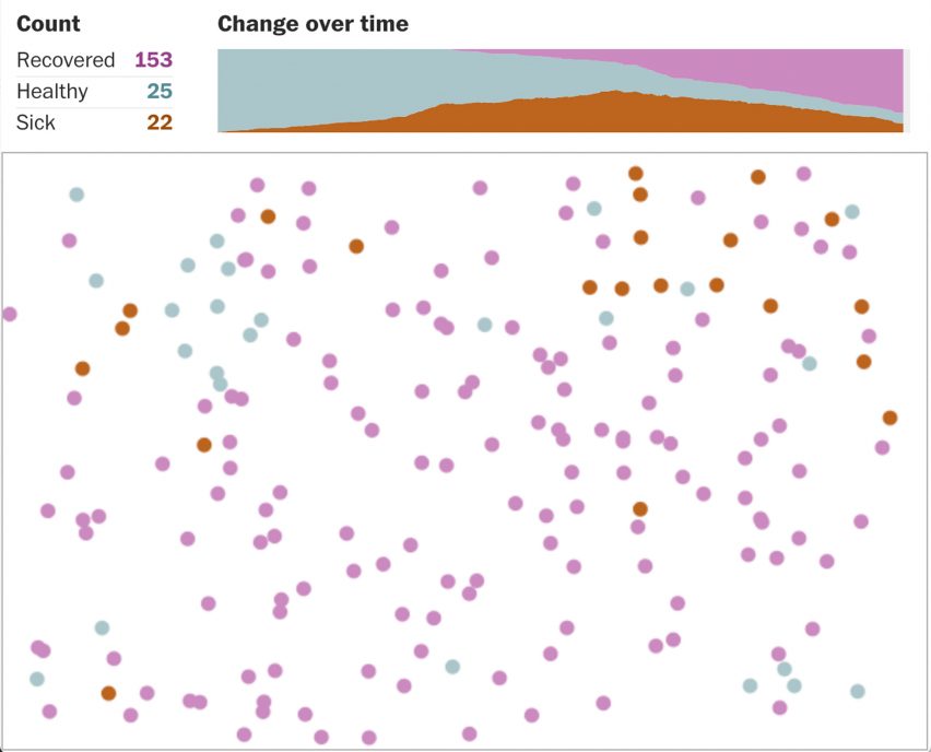
In the article, a graphic grows above each circle graphic to represent how the condition could help to "flatten the curve" – a term used to describe slowing down the rate of infection to lessen the pressure on medical services.
The first is the free-for-all, where one resident is infected and roams unawares, subsequently infecting a high number of others and causing a spike in cases. This then reduces as residents become immune.
The second network effect, attempted quarantine, is modelled on the forced quarantine that was implemented in China's Hubei province during outbreaks. It shows that it is almost impossible to keep sick people away from the healthy.
The final two present different extents of social distancing, which promotes keeping two metres away from anyone not in the same household.
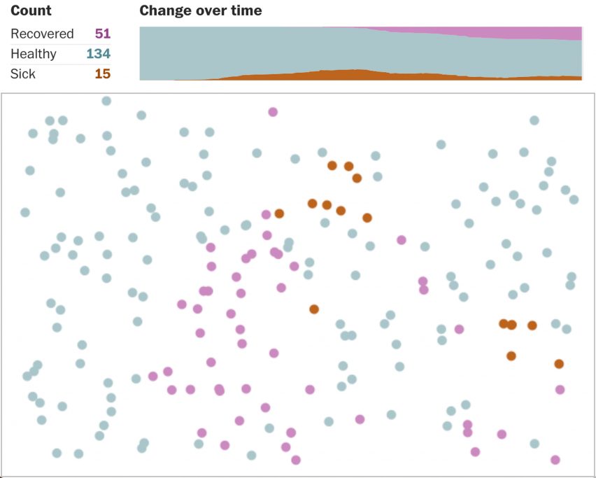
In the moderate version, one-quarter of the population are allowed to move, while the more severe version halves this amount to just one eighth. The experiment shows the latter to be the most successful in "flattening the curve".
Stevens' infographics are among a number of informative visuals that creatives have developed to circulate advice on how to slow the spread of coronavirus, which was first identified in December 2019 in Wuhan, China.
Cartoonist Toby Morris and microbiologist Siouxsie Wiles also created a series of graphics to explain the importance of social distancing during the pandemic. Their series went viral after they were published by a website in New Zealand.
Images are courtesy of The Washington Post.