Debate over New York's subway map was a "historic moment in design history" says Gary Hustwit
The legendary 1978 clash between graphic designers Massimo Vignelli and John Tauranac epitomises "the challenges that designers still face every day," according to filmmaker Gary Hustwit, who has written a book about the event.
Held at New York's Cooper Union design school, the two designers argued over the merits of Vignelli's iconic, abstract system and Tauranac's geographically accurate proposal.

Vignelli's design was "a minimalist diagram of the subway routes, designed on a grid with 45- and 90- degree angles to the lines," Hustwit said.
"It was not intended to be geographically accurate, it was more like a service diagram in the vein of London's Tube map."

By contrast, Tauranac proposal "strove for geographic realism and showed as much information as possible about the city above and its famously dysfunctional subway service."
"Vignelli hated it," added Hustwit, whose design-related movies include a documentary about Dieter Rams and who is head judge for the Dezeen Awards media categories this year.
"Later in the evening Tauranac referred to Vignelli's design as 'form follows fiasco.' So yeah, there were some insults traded"
Vignelli, who died in 2014, is regarded as one of the great graphic designers. His design for the New York subway map was introduced in 1972.
However, it proved unpopular with the public and was replaced in 1979 by the more realistic design developed by Tauranac with Michael Hertz Associates.
Even though digital technologies are making traditional maps less important, the debate over the two design approaches still has relevance today, Hustwit believes.
"To me, the debate was this historic moment in design history that should be preserved, but it's also an example of the challenges that designers still face every day," he said.
"It's a question of how to effectively present and communicate complex information, and the best methods to accomplish that will continue to be debated well into the future."
Hustwit's book, The New York Subway Map Debate, will be published in October and will include a transcript of the debate taken from a newly discovered audio recording of the event.
Below is the transcript of Dezeen's interview with Hustwit:
Marcus Fairs: Why did you decide to write this book?
Gary Hustwit: Last summer, I was doing research for a short documentary I was making called "The Map", which followed the digital redesign of the New York City subway map by Work & Co. and the Metropolitan Transportation Authority (MTA).
I knew there'd been a legendary debate about the subway map in the ‘70s between Massimo Vignelli and John Tauranac, but I couldn't find that much information about it or a transcript of what had been said.
I got in touch with the archivists at the Great Hall at Cooper Union, where the debate had taken place. And in a stroke of luck, they told me they'd just discovered an audiotape of the event in a storage space with over 4,000 other recordings. I couldn't believe it.
That same week I tracked down a photographer named Stan Ries. I'd seen a contact sheet with a few small images of the debate at the Vignelli Center for Design Studies in Rochester, and Stan's name was on it.
When I reached Stan, he said he didn't remember taking photos that night, and that all his negatives were in storage somewhere. But he told me he'd try to take a look the next time he went to his storage space.
A few days later, he got back in touch. "You're never going to believe this," he told me, "but the first box I opened up had the Subway Debate negatives in it!"
So it was the combination of discovering those two things, the tape and the photos, that gave me the idea to publish a book. I just thought it would be a great way to put all of this information together and shed more light on what happened back then.
Marcus Fairs: Describe the debate and the key figures.
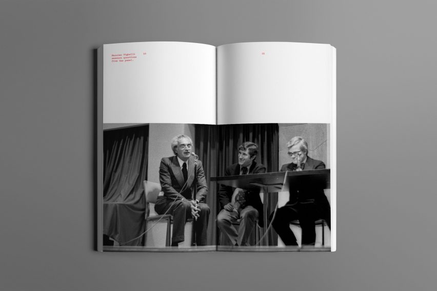
Gary Hustwit: The debate took place on 20 April 1978, in the Great Hall at Cooper Union, which has a history of hosting important public gatherings. Abraham Lincoln gave a speech there shortly after the Great Hall opened in 1858. Massimo Vignelli had overseen the design of the 1972 subway map, and John Tauranac was the head of the MTA's Map Committee.
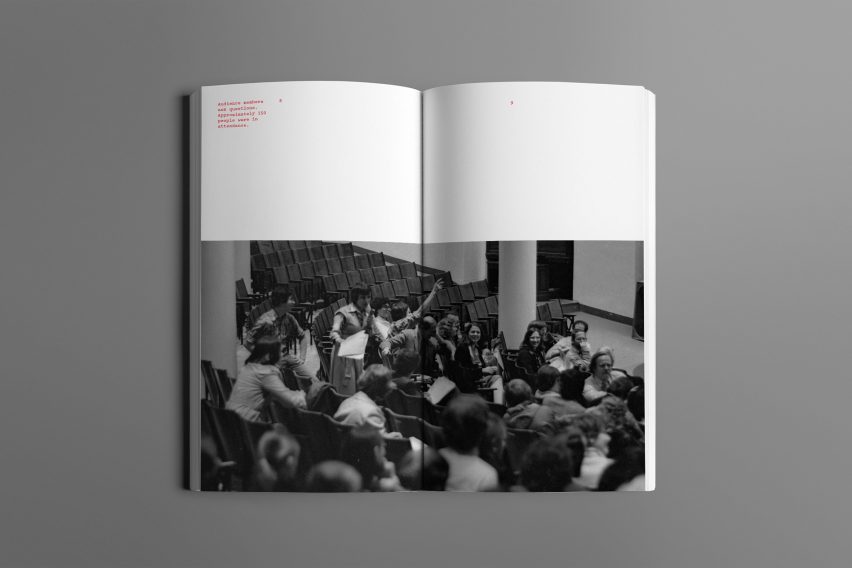
Tauranac was critical of Vignelli's designs and had spent several years designing a new map. Each side stated the case for their design during the debate, with a panel discussion following. There were six other experts on the panel, ranging from graphic designers like Peter Laundy to transportation planners like Aviva Goldstein.
They're both still alive, as is John Tauranac, so I've interviewed them about the memories of the evening. I've also tracked down some audience members who spoke up during the Q&A portion of the event.
Marcus Fairs: What was the difference between the two approaches to map-making?
Gary Hustwit: Vignelli's map was executed by a young designer on his staff named Joan Charysyn. It was a minimalist diagram of the subway routes, designed on a grid with 45- and 90- degree angles to the lines.
It was not intended to be geographically accurate, it was more like a service diagram in the vein of London's Tube map. So Vignelli and Charysyn moved the location of certain stations on the map in order to fit their grid. This is what really made some people angry because the map didn't correspond exactly to the city above ground.
Also in Vignelli's map, the water was coloured beige, and the area of Central Park was grey. In the debate, Vignelli explained, "The water here and the parks, they have not been done in blue and green, as would be natural, because there is no intention of representing nature there as a natural element."
But Tauranac replied that it was a simple cartographic truth that water should be blue and parks should be green. "Showing parks in grey and water in beige might reflect, I guess, a certain cynical reality, but this is a cartographic reality," he said.
Tauranac's proposed replacement map strove for geographic realism and showed as much information as possible about the city above and its famously dysfunctional subway service.
Vignelli hated it. "It seems to me that the total lack of methodology, which this map shows, reveals that the basic philosophy is the more you add, the better your communication will be," he said. "As it happens in communication, it's just the other way around."
Later in the evening, Tauranac referred to Vignelli's design as "form follows fiasco." So yeah, there were some insults traded.
But the city transit authorities had already given Tauranac's new map their blessing, so in a way, the debate was moot. A year later in 1979, the Tauranac/Hertz map was released and 40 years later it's still in use, with some revisions.
Marcus Fairs: Who won?
Gary Hustwit: But I was just thinking about this and in a weird way they both "won". Vignelli's map is seen as an icon of modern graphic design and still revered today. And Tauranac's map has lasted over 40 years and is in use in NYC subway cars right now.
Marcus Fairs: Why was the debate important and what is its relevance today? Do we still need subway maps?
Gary Hustwit: To me, the debate was this historic moment in design history that should be preserved, but it's also an example of the challenges that designers still face every day. Simplicity versus complexity, form versus content. It was Vignelli's minimal abstract diagram versus Tauranac's info-rich geographic realism.
And while it's true that we don't use paper maps as much today, every webpage or phone screen we look at has been designed by someone, and the hierarchy of information that is displayed is crucial to being able to navigate our digital and physical lives. How big should the type be, where's the navigation, what colours are used where, etc.
It's a question of how to effectively present and communicate complex information, and the best methods to accomplish that will continue to be debated well into the future.
Marcus Fairs: Who else worked on the book?
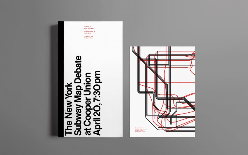
Gary Hustwit: Well, if it's a book about the subway system, Jesse Reed and Hamish Smyth at Standards Manual are obviously the people to collaborate with! They designed the book, and the cover design is adapted from the original invite to the event.
Stan Ries's photographs are showcased throughout the book, and Paula Scher wrote the foreword. We've interspersed the full transcript of the debate with contextual details, examples of the maps, and excerpts from new interviews with the surviving participants.
Hamish Smyth also designed a letterpress print that's a mashup of the two maps, a graphic distillation of the opposing philosophies. I've started calling that print the "Map Battle"… which of course should also be the title of the fiction film that gets made about this whole story someday! I'd watch that!
Marcus Fairs: When does it come out?
Gary Hustwit: The book will be published in October and is available for pre-order now. All pre-orders include the exclusive letterpress print, free.