Bright Skies named Colour of the Year 2022
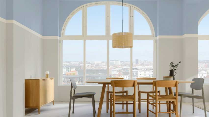
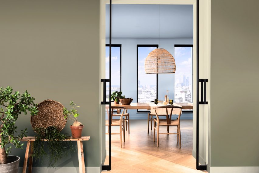
A cool blue paint colour called Bright Skies has been named Colour of the Year 2022 by paint brand Dulux.
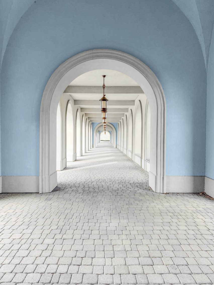
Described by Dulux as "an airy, light blue" the colour was chosen as it "perfectly captures the optimism and desire for a fresh start that is the mood of the moment".
"The shared experience of feeling trapped inside and a growing concern for the future of our beautiful yet fragile planet are linked closely to Bright Skies," said Marianne Shilingford, creative director at Dulux UK.
"Right now, people want to feel revitalised and enjoy the freedoms that are returning to them, to look out and bring in new ideas," she told Dezeen.
Bright Skies is the 19th colour to be chosen as a Dulux Colour of the Year. It was selected by a range of experts within the design, fashion, interiors, social economics and architecture industries for its "soulful" qualities.
The colour was also recognised for its flexibility, especially at a time when people are navigating hybrid workspaces and adapting to new conditions of travel.
"It gives us a much-needed breath of fresh air in the places we live and work," said Shilingford. "For the past year, we have mostly been shut inside, staring out of the window at this colour whilst dreaming of holidays cancelled," she continued.
"Our desire to reconnect with nature and a greater appreciation of the health benefits we get from simply being outdoors has drawn us towards a more biophilic palette in interior design."
According to the panel, the colour choice is part of a trend towards vibrant colours and light tones. This is a move away from previous colours of the year such as Brave Ground, an earthy, neutral colour.
"This year, vibrant colours and light tones are re-emerging – a reflection, perhaps of our need for positivity and a fresh approach," explained Heleen van Gent, head of Dulux's parent company AkzoNobel's Global Aesthetics Centre.
Dulux has also developed a variety of complementary colour palettes that can compliment Bright Skies. Among them are bright greens and blues which similarly reflect the current desire for colours associated with nature and the outdoors.
Bright Skies signals a return to pastel colours such as the calming green Tranquil Dawn, a cool-green shade that Dulux selected as its colour of the year for 2020. The colour choice was questioned by interiors editor Michelle Ogundehin, who deemed it a "laconic misty green".