Commenter calls Dubai Expo pavilion "scandalous"
In this week's comments update, readers are confused by the UK's contribution to the Dubai Expo 2020 and debating other top stories.
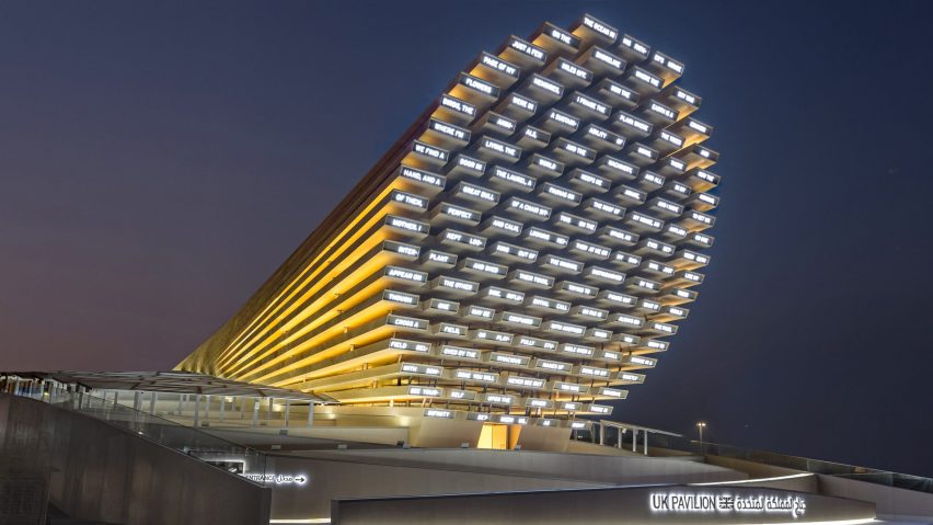
British designer Es Devlin has unveiled a cross-laminated timber pavilion, which is the UK's contribution to the Dubai Expo 2020.
The UK Pavilion has been designed to display a series of AI-generated poems during the international event, which opened in Dubai this week.
Poems created from words submitted by visitors and generated by AI are written in English and Arabic using LED lights on the facade.
"A giant ice cream cone spouting gobbledygook"
Commenters are baffled. "The poem in these photos is an utterly nonsensical list of words," said Rupert. "Surely the UK could have come up with something a bit more dynamic and engaging than a giant wooden ice cream cone on its side spouting gobbledygook."
"Another classic example of an 'Instagram' project," added Daniel Pex. "A superficial project devised purely so it looks good on social media."
Guy continued: "It reportedly cost £44 million! It's scandalous. Who oversaw this and allowed taxpayers to be so misled? Heads most definitely need to roll!"
"What are the chances a single visitor will ever stand there, read the 'poem', and be emotionally moved by its machine-generated content?" asked Ali March.
"Slim to zero I'd wager. This pavilion is pointless and meaningless, a cacophony of random shapes and awkward spaces that promise to confuse and underwhelm."
Are readers missing the point? Join the discussion ›
"How would you know the building is in Porto?" asks commenter
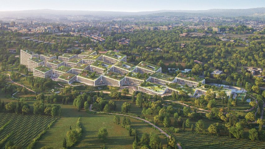
Readers aren't sold on BIG's design for the Fuse Valley development in Porto, which will house the headquarters of luxury fashion platform Farfetch.
"At what point did we stop building cities?" asked Jane.
"Would you know it's Porto?" continued Jacopo. "I love modern architecture, but this is so anonymous – it could be anywhere. Where are the bright contrasting colours? BIG probably had this idea for Vancouver or Seattle but it got refused and reused for Porto."
JOM agreed: "A missed opportunity for having a great project from a great Portuguese architect."
What do you think of the Fuse Valley development? Join the discussion ›
Reader says Volvo's new logo is "disingenuous"
Commenters are debating Swedish car manufacturer Volvo's logo redesign, which has been revealed as a flat, less colourful version of its longstanding Iron Mark logo.
"I prefer the new version," said Pleez Donsumi. "The old looked a bit tacky."
"The old logo was dated," continued Marc Sicard, "but who made the circle and arrow drawing? That's an awful combination of thicknesses, bad proportions, etc. In this kind of work, execution is key, and this execution is really bad."
Darin Kirschner agreed: "The traditional slab serif type isn't harmonious with the very simple circle and arrowhead. The thicks and thins of the font aren't represented in the surround and make this logo unbalanced. Volvo cars are very meticulous, so to rebrand their identity in this way is disingenuous."
Are you impressed by the logo? Join the discussion ›
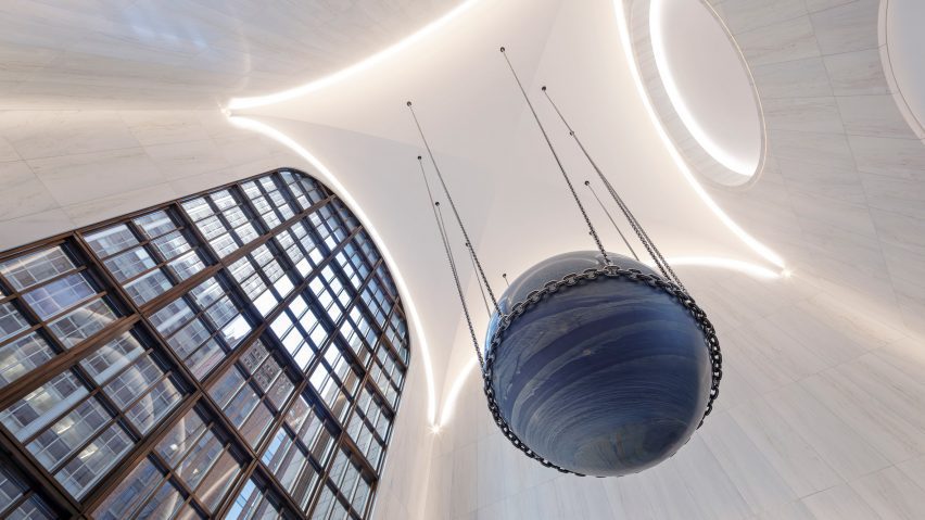
Commenters think redesign of the AT&T's lobby is "James Bond-ish"
Readers are debating Gensler's redesign of the lobby inside the postmodernist AT&T building in Midtown Manhattan. It aims to pay homage to the existing structure, but commenters aren't convinced.
"Anonymous, sterile and derivative," said Enter Ranting. "The original space had so much character. This is basic. The ominous Ball of Damocles looks like it's ready to slip out of its chains at any second."
"That ridiculous sphere really pretty much kills it," added Vead F. "No idea what anyone, client, artist, or architect was thinking with that one. It looks like something that belongs in a Bond villain's headquarters, like a world in chains."
"The one saving move is this astonishing piece of stone hanging in what almost could be a space designed for it alone," replied Frank. "There is something special about it that is both James Bond-ish and profoundly experiential all at the same time."
Do you think commenters are being harsh? Join the discussion ›
Read more Dezeen comments
Dezeen is the world's most commented architecture and design magazine, receiving thousands of comments each month from readers. Keep up to date on the latest discussions on our comments page.