Volvo latest car brand to reveal flat logo
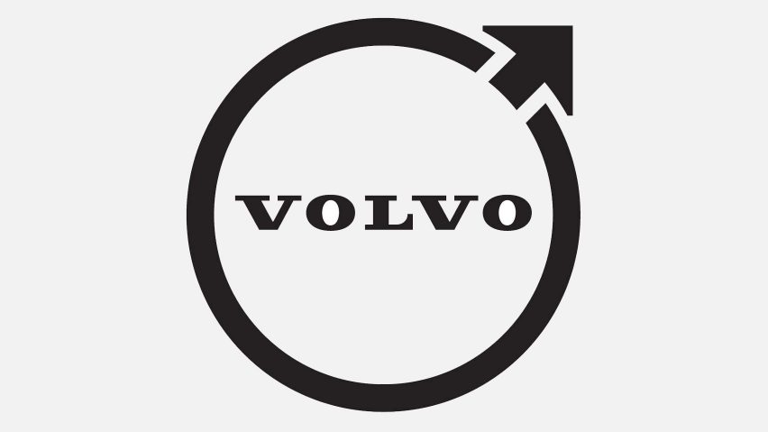
Swedish car manufacturer Volvo has revealed a flat, less colourful version of its longstanding Iron Mark logo.
According to Volvo, the redesign is a "modern" reinterpretation of the original logo that aims to maintain its essence.
The new logo is an all-black, flat design that retains the same circular shape and upward-pointing arrow first used by the brand in 1927.
Volvo is the latest car manufacturer to ditch a 3D logo in favour of a flat design. Recently Nissan, MINI and Toyota have all adopted flat logos.

Named Volvo Iron Mark, the logo is the same shape as both the male symbol and the scientific symbol for iron.
"The iron badge on the car was supposed to take up this symbolism and create associations with the honoured traditions of the Swedish iron industry: steel and strength with properties such as safety, quality and durability," a statement released by the brand explained.
First rebrand in seven years
Alongside the move to a two-dimensional design, the banner which typically runs around the middle of the logo has been removed.
The revamped logo also has a slimmer circle than previous designs, which adds to its streamlined look.
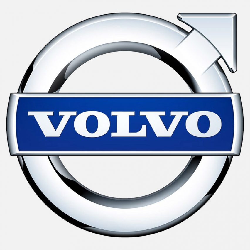
This is the first time in seven years that Volvo has given its logo a major change. The last update saw it produce a three-dimensional logo with a silver circle and blue banner.
The logo was designed in collaboration with Volvo Group and Volvo Car Group, the owner of Polestar, Volvo's electric performance car brand.
Volvo latest company to reveal flat logo
It will be used on all new Volvo models in the centre of the steering wheel and the wheel hubs. It will also appear in all marketing and social communication materials.
Volvo's logo redesign is part of a trend that has seen multiple car brands switch from 3D to flat designs for their logos. This includes Nissan, which released a 2D logo last year. The simplified logo has basic, block lines and a refined font.
British car manufacturer Vauxhall similarly moved to a flat, minimal logo design, opting for a smoother and more modern design without the classic griffin's wing.