
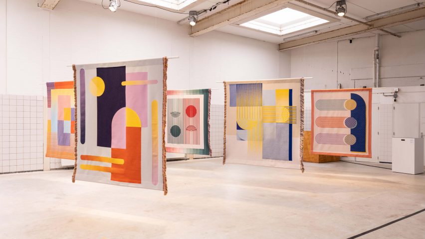
Chromarama is a collection of vibrant tapestries designed for people with colour blindness
Textile-and surface-design studio Kukka has designed five graphic, woven tapestries that can be experienced by people with different forms of colour vision deficiency (CVD).
The Chromarama collection aims to increase awareness of the daily obstacles faced by those with colour vision deficiency (CVD) by taking visual limitations into account in not just functional design but also decorative design.
The tapestries, which have been shortlisted in the homeware design category of Dezeen Awards 2021, were developed in the TextielMuseum's professional workshop, TextielLab, in Tilburg, the Netherlands.
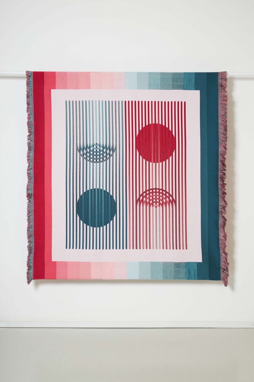
Featuring bold lines and geometric shapes that often change hue as they overlap, the tapestry designs take cues from the modern works and colour studies of artist and Bauhaus professor Josef Albers.
The patterns are also based on the principles of the well-known Ishihara colour perception test, which derived from the discovery that people with colour blindness see different patterns than those without.
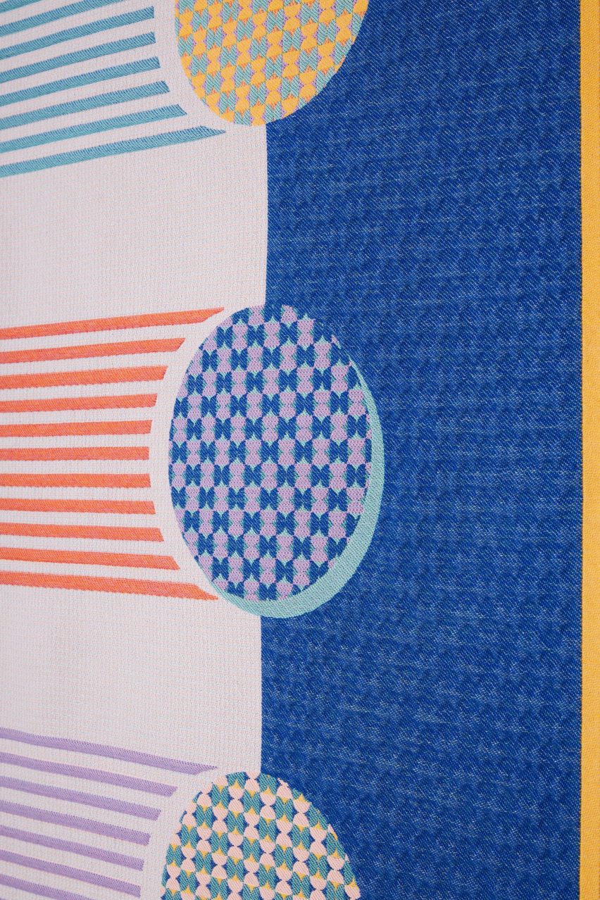
Kukka founder, Laura Luchtman, worked with a group of five colour blind people to better understand CVD and the different rules that apply to its various forms.
For example, the designer told Dezeen, people with red-green blindness see the opposite of those with blue-yellow blindness, and vice versa.
This collaboration enabled Luchtman to distinguish between colours that are difficult or impossible for people with CVD to see and colours that are easily confused with each other, in order to create a final colour palette to work from.
For viewers without colour blindness, the tapestries aim to convey what it may be like to have the vision deficiency.
As a result, each tapestry is designed for a specific form of colour blindness. However, they are all united by the common aim that they can be equally well-perceived by colour blind people – even if some hues may appear differently to each viewer.
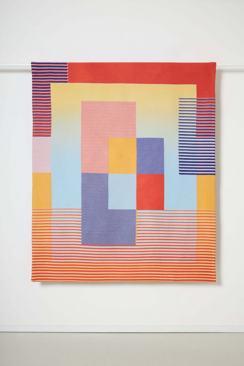
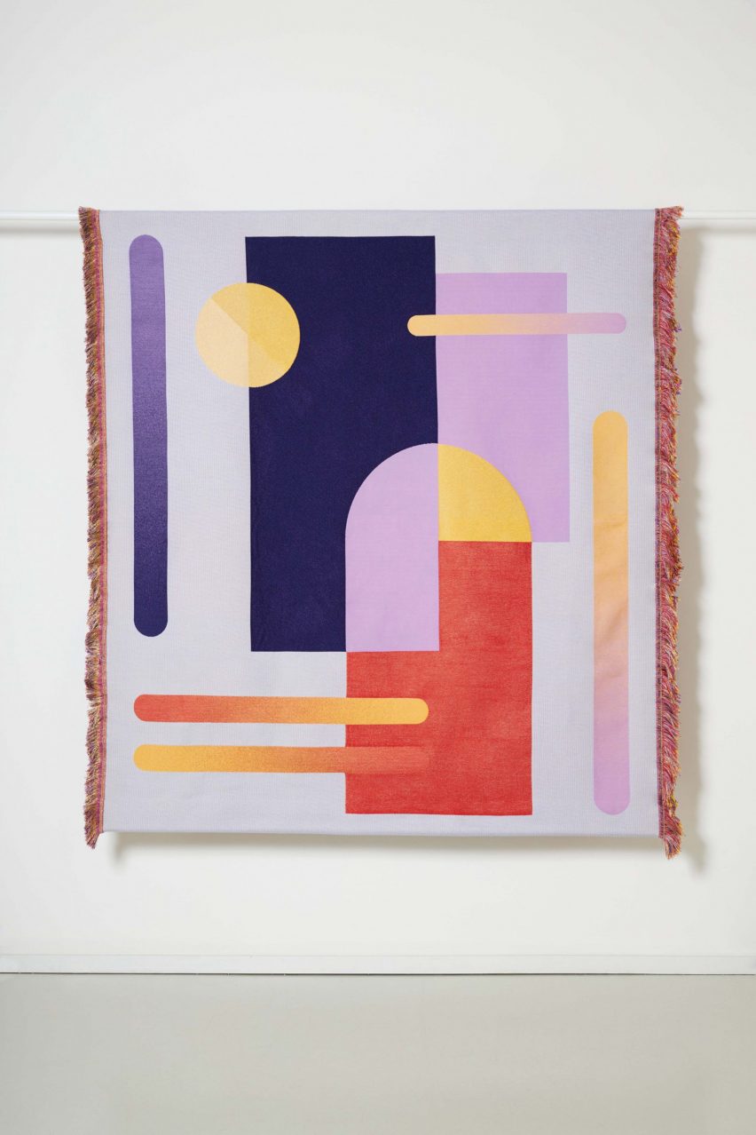
For example, the tapestry titled Chromarama I is tailored to red-green colour weakness, which is a "light form" of CVD and also the most common.
Chromarama II, meanwhile, is made for both red-green and blue-yellow blindness.
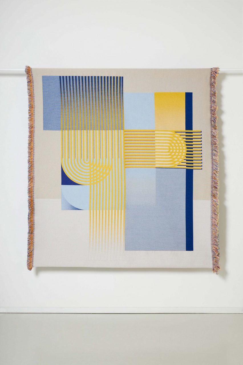
Both the design and colours of Chromarama III and Chromarama IV are perceived the same by people with and without impaired colour vision.
Chromarama III only uses colours that people with red-green blindness can perceive without any problems, while Chromarama IV only uses colours that people with blue-yellow blindness can perceive.
"A general rule that applies to all CVD varieties is that there must be sufficient contrast between juxtaposed colours," Luchtman told Dezeen.
"Contrast can be achieved by placing colours with a sufficient difference in lightness (value) next to each other, but also by the size of a design element, distance to the design and incidence of light," she continued.
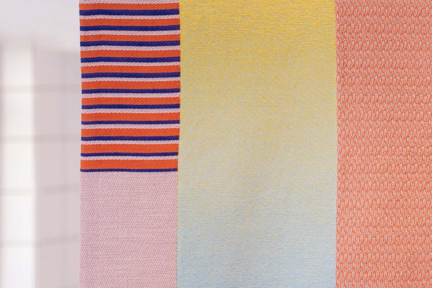
Using weaving as her medium allowed Luchtman to incorporate a variety of textures and yarn types, such as matte and shiny, which helped to increase the contrast in each tapestry.
The large scale of the works also enabled her to include more detail into each design, she told Dezeen, while the premise of the project gave her more license to incorporate bolder colours than those she would typically opt for.
"What I find so special about the tapestries is that they are much more colourful than you might expect when designing for people with limited colour vision," said the designer.
"Even if you don't know the story behind the tapestries, they are distinct and surprising designs that both people with and without a colour vision impairment can enjoy."
Other projects that have been shortlisted in the homeware design category of this year's Dezeen Awards include a range of eco-friendly tiles made from eggshells by Nature Squared, and a collection of rugs that incorporate textile dyes made from botanical and metal waste.