Seth Rogen's cannabis brand Houseplant unveils collectable lego-like packaging
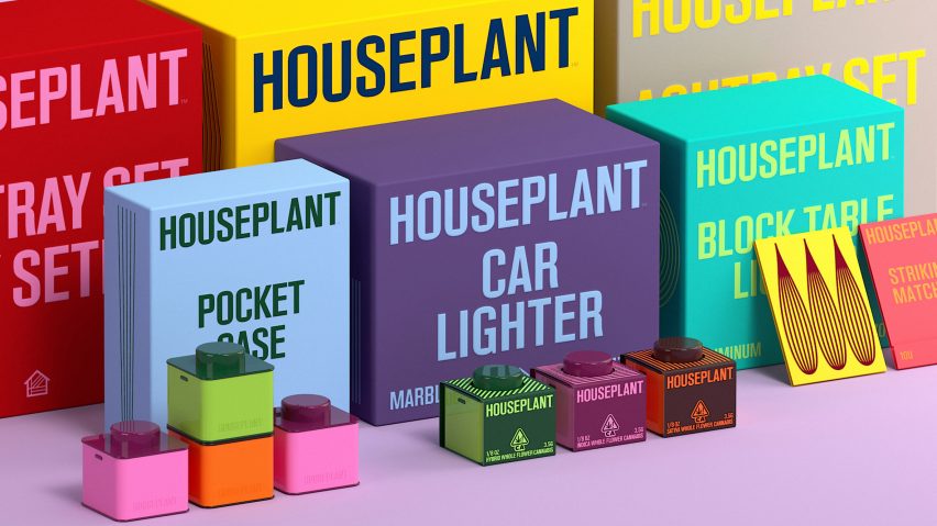
Design studios MA-MA and Pràctica have collaborated on the rebranding of Canadian cannabis company Houseplant to create stackable containers that resemble Lego bricks.
The redesign of Houseplant's cannabis product packaging marks the launch of the brand, which was founded by actor Seth Rogen, in the US.
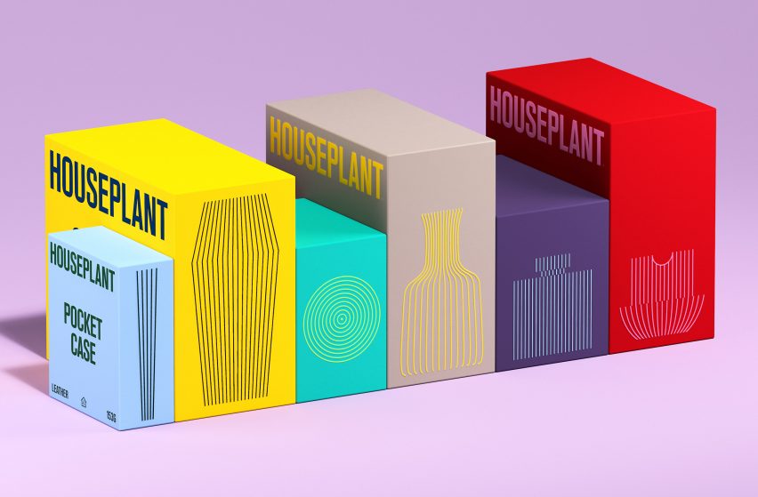
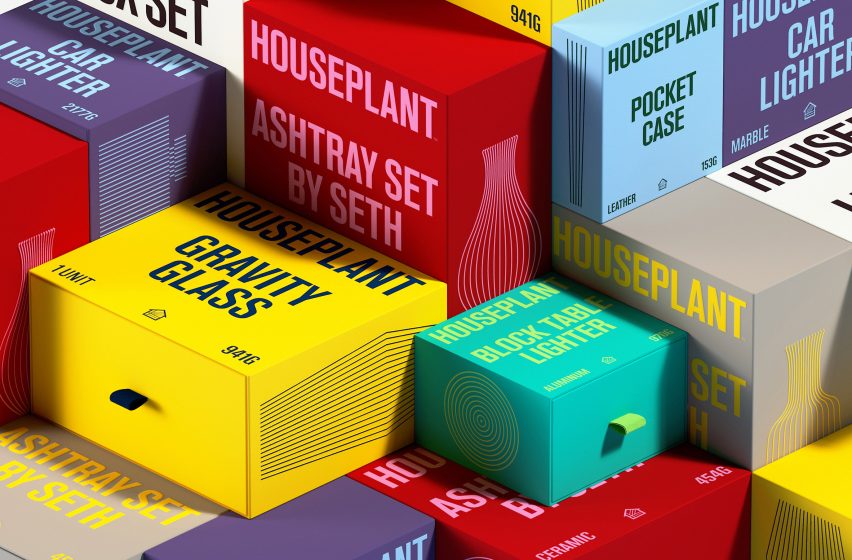
Along with the lego-like cannabis containers, MA-MA and Pràctica designed a custom typeface and modernist line illustrations of Houseplant products for the package rebranding.
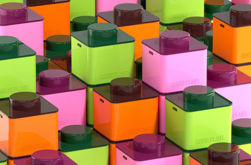
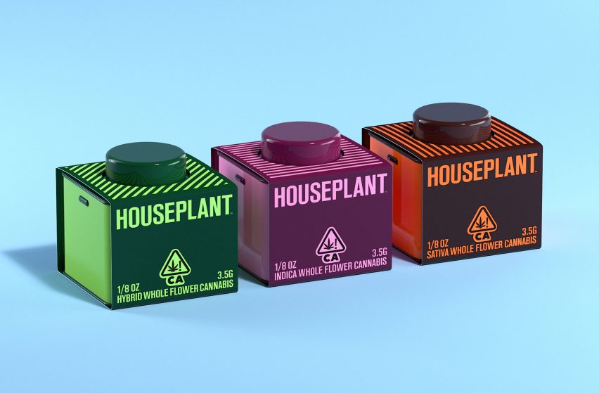
The cube-shaped containers come in three bold colours corresponding to the different strains of cannabis they contain. The lids have a circular protrusion, making them stackable like Lego.
"We wanted to leverage Houseplant's playful identity and design something that could be collected and reused over time," said Javier Arizu, co-founder of Pràctica.
"The idea is that you can try all of the strains and display their containers together in a punchy way," Arizu told Dezeen.
"This was important for the Houseplant too. They were keen on having the flower container be something people would want to display on their shelves as a design keepsake," he continued.
According to Ma-Ma and Pràctica, the structural design of the packaging is simple with the collectable cannabis jars and cases for pre-rolled joints are made from tin and wrapped in cardstock paper with graphics printed in complementary colours.
Other Houseplant products are packaged in cardboard using a drawer system and pull tab, with minimalist line drawings on the side of the box.
Rather than a complete redesign, Arizu describes the rebranding project as an "evolution" from the original.
"Taking Houseplant's existing logotype and symbol as the starting point, we developed a typographic and illustration system that helped unify and revamp the brand's new wide range of products and overall communications," he told Dezeen.
As a nod to modernism, the outer packaging features line illustrations depicting the shape of Houseplant products.
"We are subtly referencing the nostalgic imagery of classic modernist product design packaging, with product shapes dictating the visuals," said Arizu.
"This plays back to Houseplant's affinity towards that era of design, which is reflected in the products they sell."
Based in New York City, MA-MA is a design studio co-founded by Sanam Salek and Laylee Salek. Pràctica is a design studio based in Barcelona and New York.
Other cannabis-related projects include a cannabis dispensary designed to look like a retro grocery store, and a liquid cannabis product with packaging informed by aerospace design.
The photography is by MA-MA and Pràctica.
Project credits:
Client: Houseplant
Structural Packaging Design: MA-MA
Identity and Packaging System Design: Pràctica
Product Design for Tin Jars and Pre-Roll: MA-MA
Typeface Creative Direction: Pràctica
Typeface Design and Production: Tipografies
Animations and 3D Renders: Dani Avila