Road Research Society digitises hand-drawn Hong Kong road signs for Prison Gothic font
Non-profit organisation Road Research Society has digitalised the text from old road signs in Hong Kong to create a font called Prison Gothic as part of its effort to preserve "visual cultural memories of the city".
The font, which so far includes 8,000 commonly used Chinese characters, is modelled on 600 characters collected from road signs on the city's streets.
"Since the 1970s, Hong Kong's road signs have all been handmade by prisoners," said Road Research Society president Gary Yau.
"As the road signs before May 1997 were handcrafted by persons in custody, the text on the road signs was carved by hand, creating its unique look and feel," he told Dezeen.
Yau came up with the idea to digitise the characters after spending time photographing road signs in the city. He noticed that many of the older handmade signs were being replaced or in some cases patched up with newly printed characters."Since 2015, I started to take photos of the old road signs, racing to record the forgotten visual memories of the city," said Yau.
"In 2016, we launched the Prison Gothic Revival Programme, aiming to digitise the Prison Gothic into a computer font. This way, we think we can reanimate the old style of Chinese characters and preserve one of the visual cultural memories of Hong Kong."
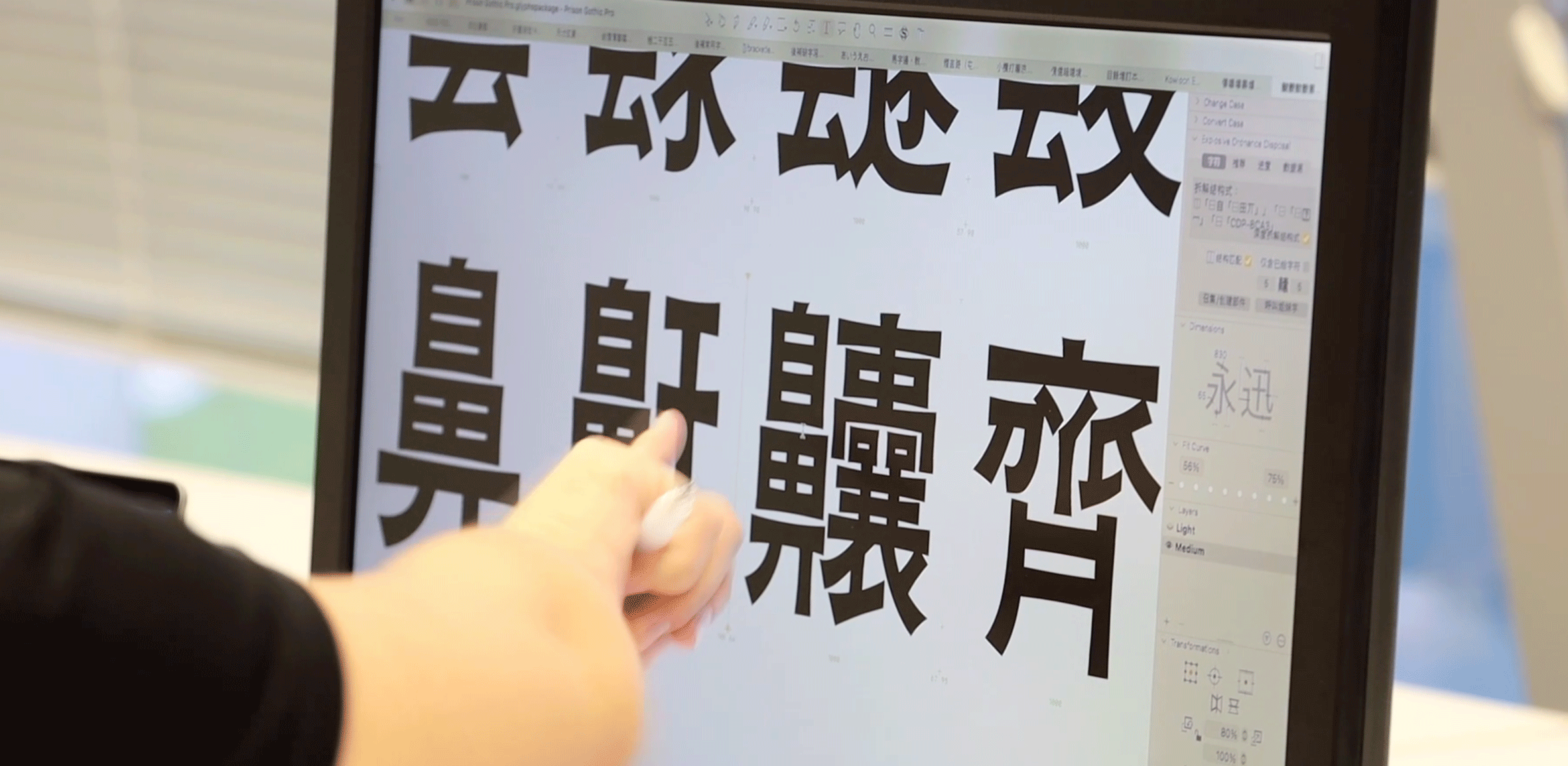
To create Prison Gothic, the Road Research Society scoured the city in search of old street signs. The team photographed each sign and then imported the images into the font design software Glyphs.
Using the software, the team focused on converting the signs' unique stylistic traits such as their varying line thicknesses into a uniform, modern font.
They decided to name the font Prison Gothic or Gaam Juk Tai 監獄體 in Chinese to commemorate the prisoners, while gothic refers to a type of sans serif font that does not have small lines or strokes attached to the end of letters.
"After photographing the road signs, the shapes of the captured glyphs are traced and imported into Glyphs," Yau explained.
"In the process, we also encode and fine-tune the characters to make sure they work well with all other characters we have drawn."
According to Yau, old signs in Hong Kong are being replaced by the Chinese government's highway department because it believes that some of the handwritten text is incorrect.
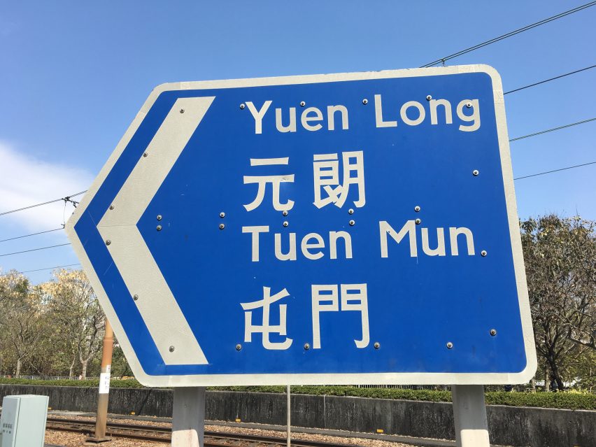
As a consequence, the original signs are becoming harder to find. He cites the debate over how to write the Chinese character Long 朗 as an example.
"In 2010, there was controversy surrounding the correct writing of the character Long 朗 in a sign for Yuen Long 元朗, one of the towns in the New Territories," Yau said."In a government correspondence, a district councillor complained that Long 朗 was miswritten on older road signs. In fact, the character was just fabricated in the old, traditional writing style seen on many different older manually typeset books," he continued.
"However, the Highways Department covered all the road signs with the old character of Long 朗 by newly printed patches, in order to show progress to the district council."
Alongside digitising the text found on roadsigns, the team decided to create additional characters used outside road language so that people would be able to use Prison Gothic like a regular font.
"The biggest challenge is to expand the character set to cover some 98 per cent of the most-used words in Chinese," said Yau.
"The original characters on road signs are usually place names and regulatory messages with approximately 500 characters, which make up less than 10 per cent of the generally used character set. Therefore, we took time and effort to expand the character set to 8,000 Chinese characters."
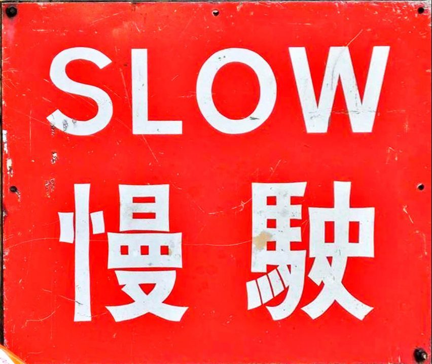
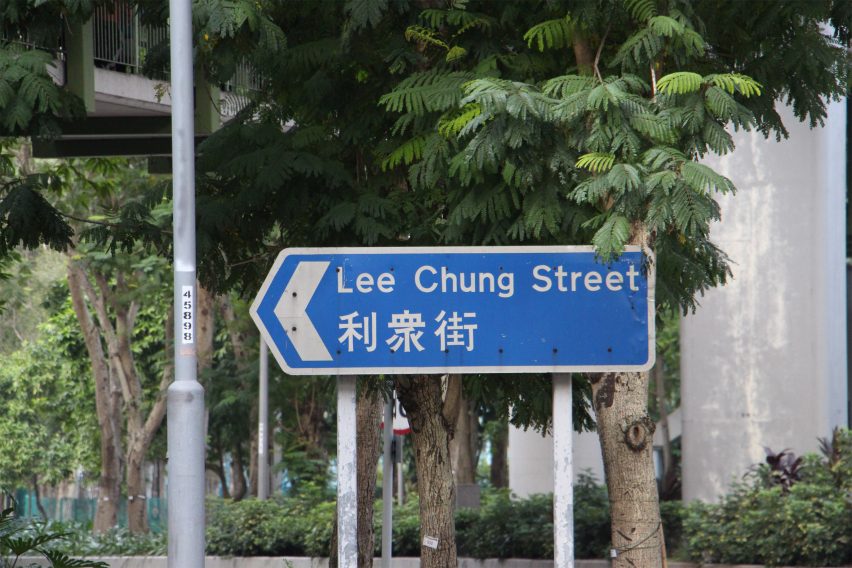
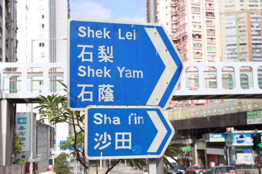
In Hong Kong, which is a former crown colony of the United Kingdom, all official road signs are written in English and Chinese. Signs show the English name first, with traditional Chinese characters underneath.
Like road signs in the UK, they use the Jock Kinneir and Margaret Calvert-designed typeface Transport for their English language text and numbers.
Road Research Society is currently crowdsourcing the funds to make the font available to web users around the world.
Other designers and studios that have recently developed road-sign typefaces include graphic designer Calvert, who devised a customised typeface named Rail Alphabet 2 for signage across rail stations in the UK.
Meanwhile, the South Korean branch of Dutch design studio Studio Dumbar created a new font for the national road signage system in South Korea.
The photographs are courtesy of Road Research Society.