Durex rebrands with flat logo and "sex positive" campaign
Creative agency Havas has designed a new brand identity for British condom manufacturer Durex, which features a flattened logo written in One Night Sans typeface in a bid to challenge "repressive" sexual norms.
Havas has designed the visual identity to accompany its updated brand strategy of showcasing the "positive reality" of sex.
The rebrand includes a refined logo and sans-serif typeface – wittily named One Night Sans as a play on words of the term "one night stand" – alongside posters advertising honest facts and figures about sexual health.
The new campaign aims to reposition the condom company as a "mainstream activist" against sexual stigmas and taboos.
"This might be the most important piece of work we ever do," said Elliot Harris, creative director at Havas.
"Durex is a huge brand with a unique and vital role in culture. It has genuine influence, and the capability to enact real change. And make no mistake, this is a proper commitment."
"This new brand purpose will lead to healthier conversations around, and attitudes towards, sex, but also greater inclusion and acceptance for those who might not always experience it," he added.
"To have a brand like Durex publicly and proudly on your side makes a difference."
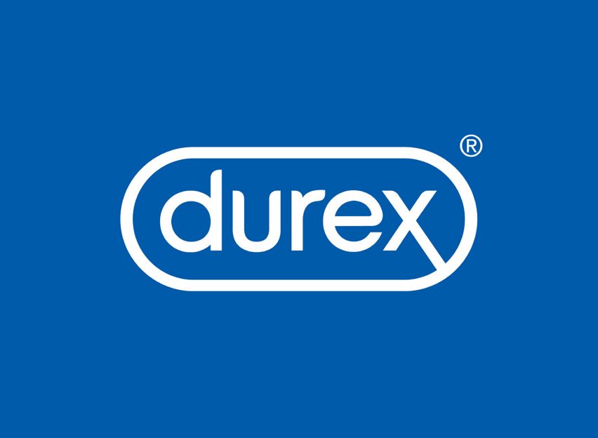
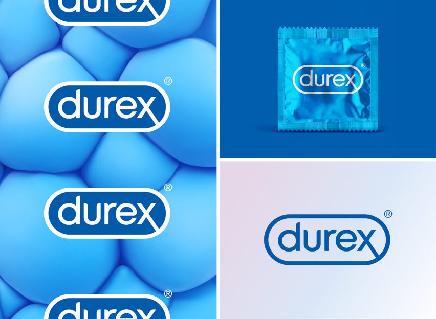
The former three-dimensional Durex logo featured a light-reflective effect, used to make the symbol look convex, encapsulated in a lozenge-shaped border.
The new emblem has done away with the raised effect in favour of a flat design, but still retains the brand's classic blue and white colourway fronted on a pill-shaped form.

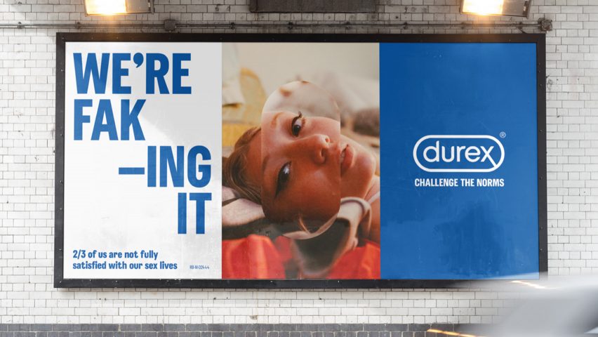
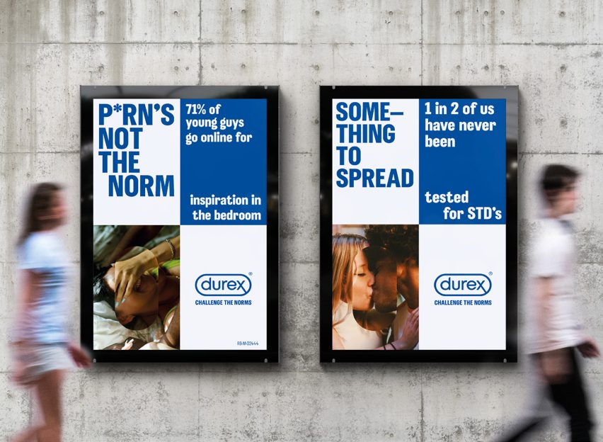
This lozenge design has been extended across the Durex campaign posters, which feature photographs of couples kissing and people lying on beds.
Laid over the top of the faces in each image is a pill-shaped cut-out depicting an enlarged version of the section it is covering.
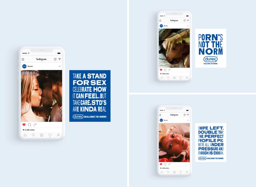
The posters also include facts informed by the brand's 2017 Global Sex Survey, including "2/3 of us are not fully satisfied with our sex lives", "1 in 2 of us have never been tested for STD's" and "71 per cent of young guys go online for inspiration in the bedroom".
These facts have also been made into more catchy, rhyming phrases, like "porn's not the norm".
Durex specifically chose the launch date as 14 February – Valentine's Day – as it is on this occasion that these sexual conventions and misconceptions are endorsed the most.

"While the exponential growth of the internet has brought positives including openness, discussion, exploration and access, its consequences, including misconnection, myths, lack of education and confusion, are substantial," said the brand.
"Ultimately, the findings pointed to an underlying sexual anxiousness, driven primarily by unrealistic representations of sex throughout culture."
"It is those unrealistic representations – as well as the stigma and taboos they exacerbate – that Durex is rallying against," it added.
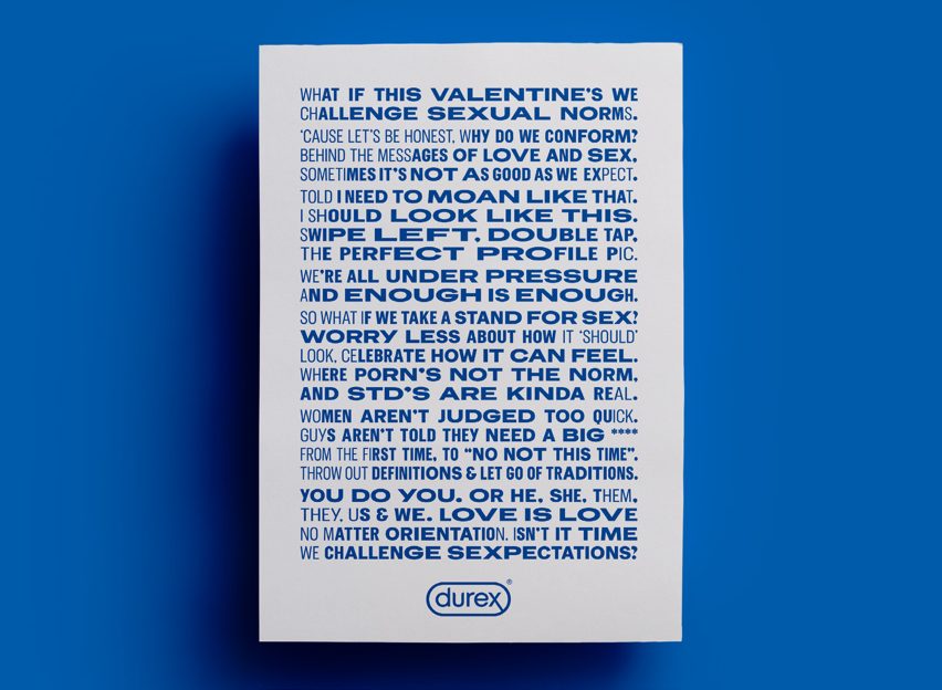
According to the 91-year-old brand, the campaign is centred around an "inclusive open letter to all", which writes about the need to challenge unrealistic sexual expectations.
"So what if we take a stand for sex? Worry less about how it 'should' look. Celebrate how it can feel. Where porn's not the norm. And STDs are kinda real." the poem-style letter reads.
"Throw out definitions and let go of traditions. You do you. Or he, she, them, they, us and we. Love is love, no matter orientation. Isn’t it time we challenge sexpectations?"
Sex-toy designers Polly Rodriguez and Alexandra Fine also aimed to call out the taboos placed on sexual health by launching a campaign to raise awareness about the bias selection process of adverts.
Called Approved, Not Approved, the campaign included an online quiz that aims to help the public understand how ad guidelines are "selectively enforced" when it comes to sex-related content – particularly those targeted at women.
Durex is just one of the brands following the trend of flat graphic design. Volkswagen recently rebranded to a two-dimensional logo to mark the launch of a new line of fully electric cars, alongside Mozilla's minimal overhaul in 2017.