Ten residential interiors that make the most of narrow spaces
Including tight living areas, kitchens wedged into corridors and interiors in skinny Japanese houses, this lookbook features 10 homes that make clever use of narrow spaces.
Projects on constricted urban sites or working within historical buildings often must contend with long-and-narrow interior layouts.
Here are 10 examples of interiors where narrow spaces have been utilised to their full potential thanks to intelligent design.
This is the latest in our lookbooks series, which provides visual inspiration from Dezeen's archive. For more inspiration see previous lookbooks featuring mezzanine bedrooms, creative built-in furniture and homes that make a highlight of their corridors.
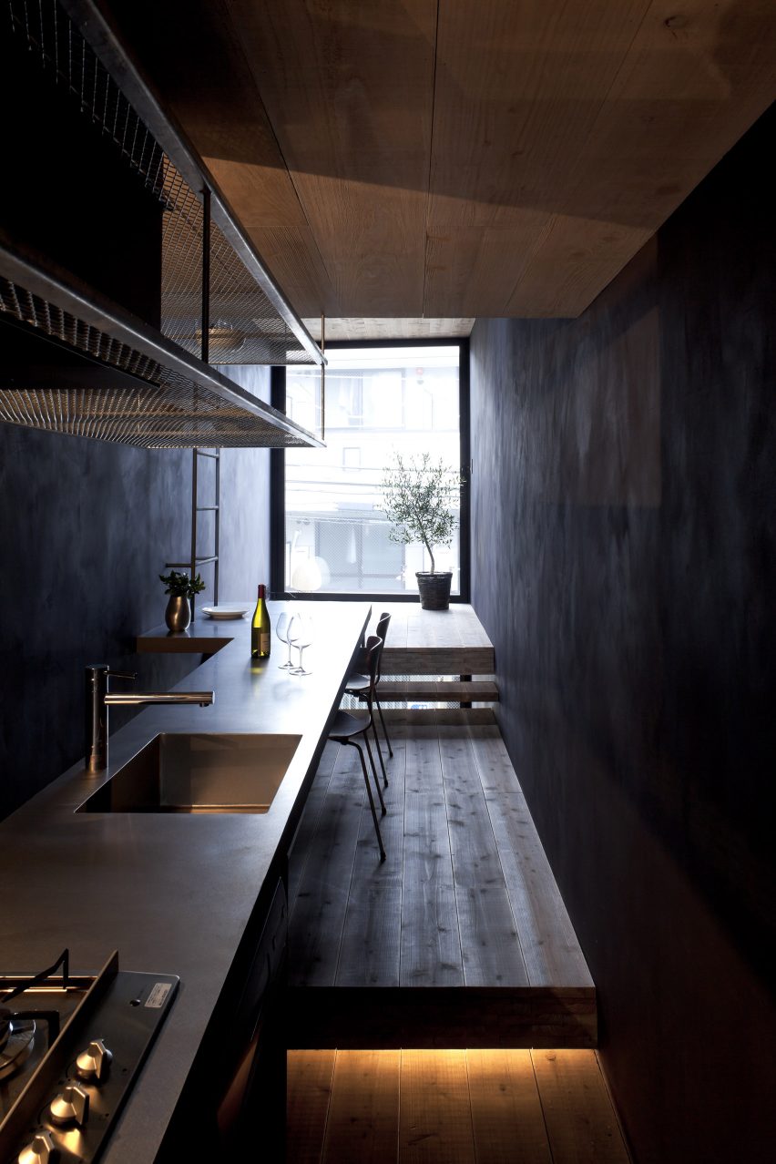
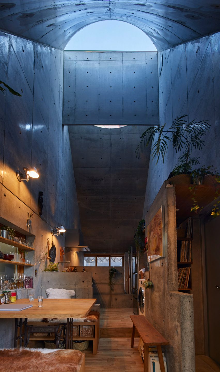
1.8m Width House, Japan, by YUUA Architects & Associates
As its name suggests, the rooms in this house in central Tokyo are just 1.8 metres wide, so Japanese studio YUUA Architects & Associates had to plan the interior with meticulous care.
They used split-level floors to create natural partitions between different spaces, with a kitchen and dining area lined up along a single wall, while a dark colour scheme is intended to provide "a sense of depth".
Find out more about 1.8m Width House ›
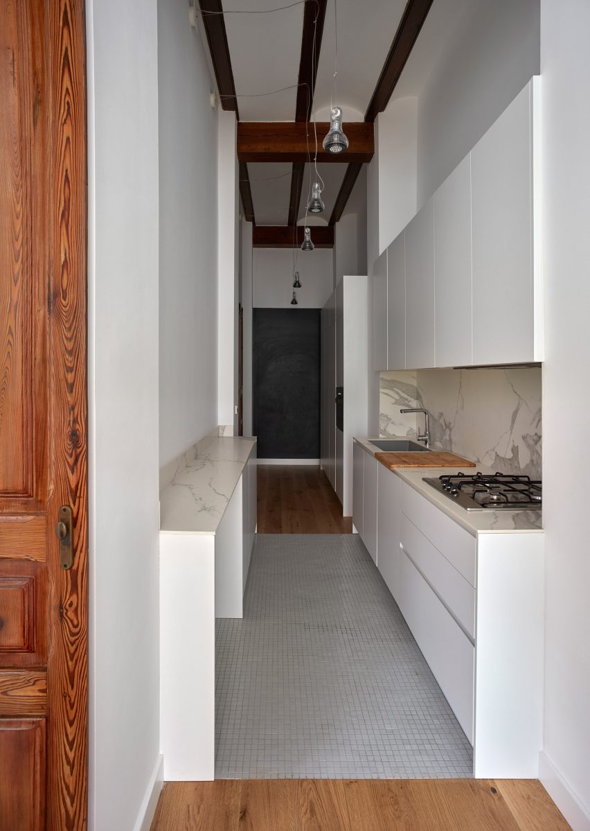
Horta Nord townhouse, Spain, by DG Arquitecto Valencia
DG Arquitecto Valencia sneaked a kitchen into a passageway in this Valencian townhouse as part of a renovation project for a young family.
White floor tiles and downlighting hanging from the high ceiling help the space maintain a sense of generous scale despite the narrow proportions.
Find out more about this Horta Nord townhouse ›
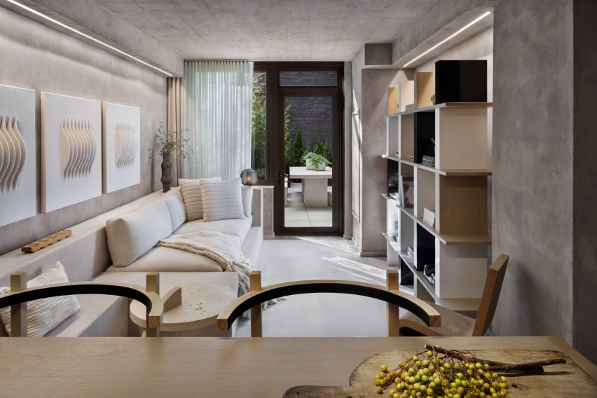
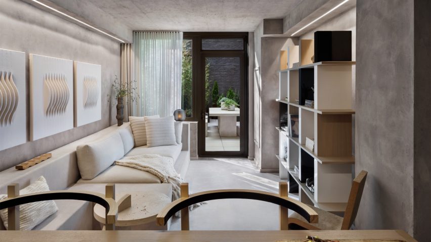
196 Orchard apartment, USA, by Alex P White
American designer Alex P White created a model unit for a high-end condominium building in Manhattan's Lower East Side characterised by exposed calming concrete ceilings, grey plaster walls and neutral-toned decor.
In the narrow living room, a mix of shapes and textures combine with built-in furniture to provide added visual depth, from a series of ivory wall hangings by Los Angeles artist Mary Little to a large walnut shelving unit designed by White and a cardboard chair by Frank Gehry.
Find out more about this 196 Orchard apartment ›
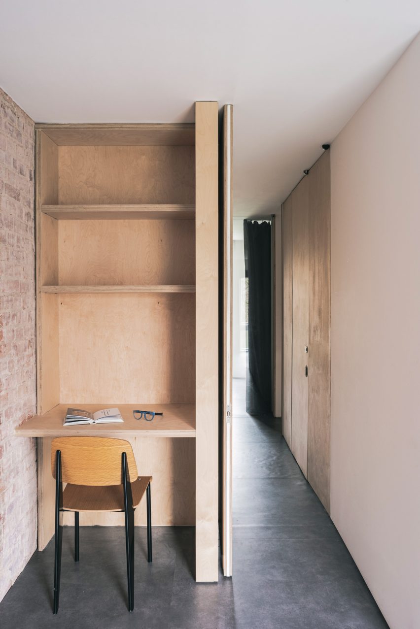
Notting Hill maisonette, UK, by Francesco Pierazzi Architects
A petite plywood study space was nestled into a hallway in this London maisonette overhauled by Francesco Pierazzi Architects.
To emphasise the home's sense of height, the studio placed floor-to-ceiling doorways in all of its narrower rooms and left the brick shell exposed, offset by dark flooring.
Find out more about this Notting Hill maisonette ›
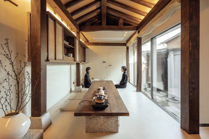
Seochon micro guesthouse, South Korea, by Z_Lab
Z_Lab's serene interiors for this tiny guesthouse tucked down an alleyway in northern Seoul occupy a former traditional Korean home, otherwise known as a hanok.
In the main space, long and rectilinear, different functions are lined up from a cosy reading area on a timber bench to a lengthy walnut table for enjoying tea that sits directly beside a sunken water bath.
Find out more about this Seochan micro guesthouse ›
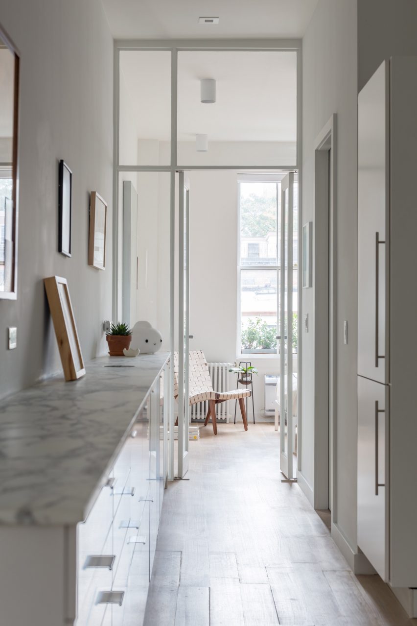
West Chelsea Apartment, USA, by BoND
This long and narrow apartment in New York's Chelsea neighbourhood was overhauled by architecture studio BoND, which replaced partition walls with glass doors to allow more light to reach the middle section while also "celebrating the apartment's elongated proportions and maximising the illusion of depth".
All utilities, including kitchen and bathroom fixtures, were moved to one wall to leave the other free for displaying art, while the direction of the floorboards and linear lighting fixtures help to emphasise the length of the interior.
Find out more about West Chelsea Apartment ›
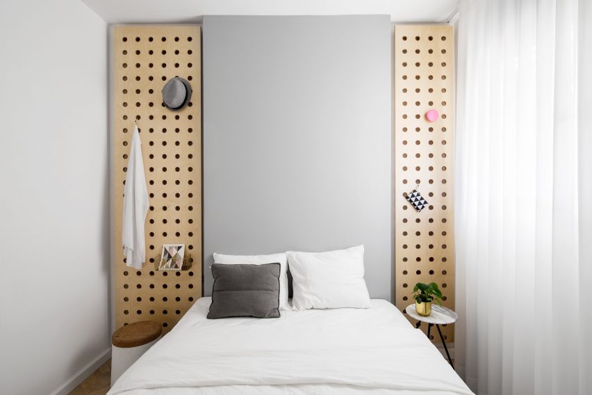
Bauhaus Tel Aviv apartment, Israel, by Amir Navon and Maayan Zusman
A "safe room" was turned into a snug spare bedroom as part of a refurbishment of this Tel Aviv apartment by architect Amir Navon and interior designer Maayan Zusman, who worked alongside graduates Dana Sagive and Naama Tison Vilotsky.
To compensate for a lack of width a light-toned oak herringbone floor was paired with pale colours, while two wooden plates with holes pierced in them to support brass hooks are a space-saving storage solution.
Find out more about this Bauhaus Tel Aviv apartment ›
Love2 House, Japan, by Takeshi Hosaka
This Tokyo micro home designed by architect Takeshi Hosaka for himself and his wife gathers household amenities into a linear floorplan spanning just 19 square metres.
Borrowing principles from the architecture of villas in ancient Roman villas, Hosaka divided up spaces for sleeping, bathing, eating and study using seven partitions that extend out from the concrete walls.
Find out more about Love2 House ›
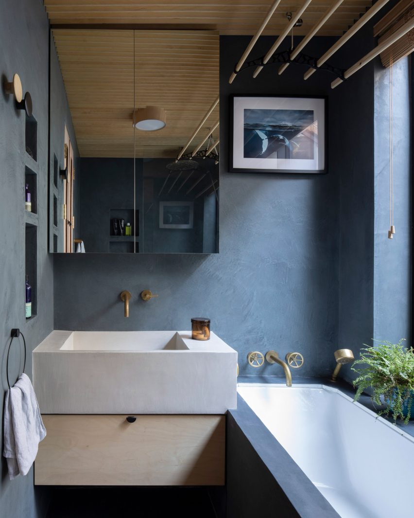
Birch and Clay Refugio, UK, by Rise Design Studio
By cutting shelving into one wall, retaining a generous window sill and subtly overlapping the chunky sink and bathtub, Rise Design Studio was able to make the most of limited lateral space in this bathroom.
The room's proportions were chosen to match an adjacent lightwell in the remodelled London flat, while the dark blue tadelakt walls and floor contrast with a birch plywood ceiling to convey an impression of solidity.
Find out more about Birch and Clay Refugio ›
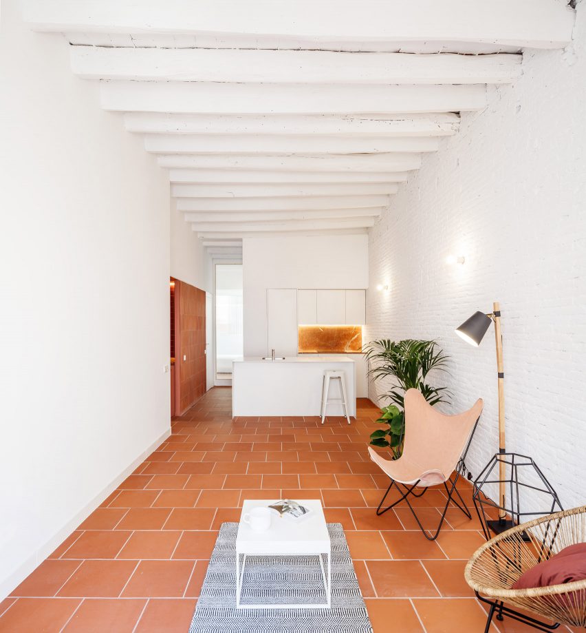
Architecture studio CRÜ was tasked with transforming this Barcelona apartment from a cramped three-bedroom home into a spacious two-bed while optimising the use of space.
In the kitchen-living area, it removed the partition walls to create an open-plan space, with large terracotta floor tiles and white-painted brick walls.
Find out more about La Odette ›
This is the latest in our lookbooks series, which provides visual inspiration from Dezeen's archive. For more inspiration see previous lookbooks featuring mezzanine bedrooms, creative built-in furniture and homes that make a highlight of their corridors.