
"The recognisable but exaggerated form is sublime" says commenter
In this week's comments update, readers discussed Specht Architects' glass pavilion house in the Berkshires and debated a toilet made from wood chips.
Specht Architects has designed a residential, symmetrical glass pavilion in The Berkshires, Massachusetts, as a place to showcase antiques.
Commenters saw echoes of Mies van der Rohe's Farnsworth House, a glass house in Illinois completed in 1951 by the 20th century modernist architect.
"I'd love to have a client like this"
Archi thought it was simultaneously a "tired Farnsworth concept, but this is really well done. The roof almost magically floats with its thin profile. Hidden structure and system is brilliant."
Betty Rubble agreed. "Yes, it feels Farnsworth, but it's still gorgeous."
The studio told Dezeen how they rarely get the chance "to design an 'object' house on a completely open site without neighbouring buildings" and commenter Meesh concurred, saying "I'd love to have a client like this".
Alfred Hitchcock was upvoted for commenting "beautiful exhibition display cabinet – or is it meant to be a home?"
What do you think of the project? Join the discussion ›
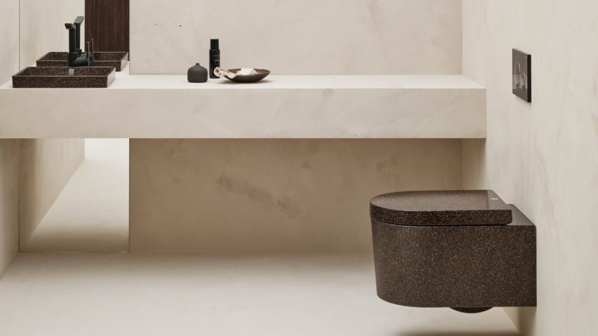
"Another plastic object with some wood stirred-in, claiming to be sustainable"
Finnish design company Woodio launched a toilet made from wood chips mixed with fossil-based polyester and bioplastic resins, which they claim generates 99 per cent fewer emissions than the production of traditional ceramic sanitaryware.
Commenters were sceptical about the product's credentials and functionality.
"You had me until 'fossil-based polyester and bioplastic resins'," commented Youreastar.
JoeBob was similarly underwhelmed, asking "wood bound together with resin, or plastic with wood bits in?"
"Another plastic object with some wood stirred-in, claiming to be sustainable. File this under greenwashed future-microplastics and move on," said Al Ki.
Upvoted by half a dozen other commenters was Walter Astor for explaining "the beauty of white porcelain is that you immediately know if the toilet is or is not clean".
"I'm not sure I would feel the same way about this mottled product whose surface seems almost designed to conceal a world of stains and other undesirable human waste," they continued.
Would you want this toilet in your home? Join the discussion ›
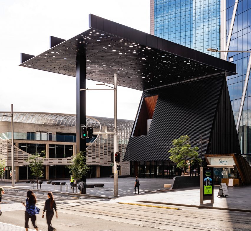
"Just a large-scale pointless bit of mall art'
A giant canopy filters light through circular openings above this public plaza in Sydney, which Ghanaian-British architect David Adjaye's studio has created with artist Daniel Boyd.
Readers debated how successful the project was at highlighting the site's heritage, once the land of the Eora nation – a group of Aboriginal Australians.
Anthony Sully called it "yet another example of material and form having nothing to do with an indigenous culture".
"It is up to Aboriginal people to choose how they represent their culture, and contemporary representations should be celebrated," countered Ron.
Meanwhile, JZ admired "the visual effects of the perforated plane – that works really well. And the recognisable but exaggerated form of the building is sublime."
However, local resident IW didn't agree, saying "I live in Sydney and walk past this most days. It's awful – that canopy is just a large-scale pointless bit of mall art."
What do you think? Join the discussion ›
"How long did it take them to come up with that?"
The City of New York released an updated version of its unofficial emblem – Milton Glaser's iconic "I ♥ NY" logo – as part of a citywide campaign to "inspire optimism and civic action" post-pandemic.
The updated wordmark, created by graphic designer Graham Clifford, reads "WE ♥ NYC" in a blocky sans serif typeface. Readers were quick to head to the comments section.
Darin Kirschner felt that the new logo "doesn't lock up, it doesn't balance, and the type and the heart icon look from different worlds so it lacks cohesion."
"How long did it take them to come up with that?" asked Alex. "I would like to see what else was on the drawing board to get an idea of how much the clients had their say," they added.
ScuffedShoes was damning: "As a life-long New Yorker I can say with some confidence that this is an awful design in pretty much every way: concept, design, history, or any other criterion."
Do you like the new logo? Join the discussion ›
Comments update
Dezeen is the world's most commented architecture and design magazine, receiving thousands of comments each month from readers. Keep up to date on the latest discussions on our comments page and subscribe to our weekly Debate newsletter, where we feature the best reader comments from stories in the last seven days.