


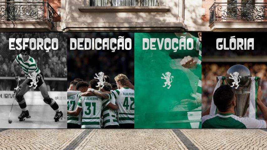
Lisbon football club Sporting Clube de Portugal has unveiled an updated badge and identity, designed by branding agency Jones Knowles Ritchie to mark its 120th anniversary.
Jones Knowles Ritchie (JKR) aimed to create an identity for Sporting CP that, while being directly tied to the Primeira Liga club's history, would also attract new, younger fans.

"This was not a case of starting from scratch," said JKR global executive creative director Sean Thomas. "It was about staying faithful to the club's legacy and true to its loyal fans, while attracting and remaining relevant to the next generation and wider culture."
"Our job was to build a brand system that carries the spirit of Sporting CP forward without limits, a visual language as distinctive and ambitious as the club itself."
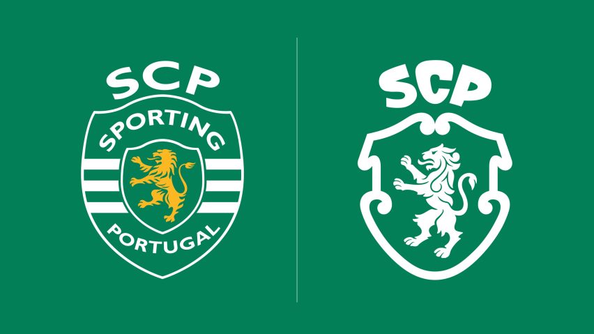
The rebrand simplifies the club's logo, removing the outer shield to place the focus directly on the lion.
This helped to simplify the design, effectively removing the words Sporting Lisbon and the white bars of the outer shield, while the lion was recoloured from yellow to white to focus on the club's primary colours.
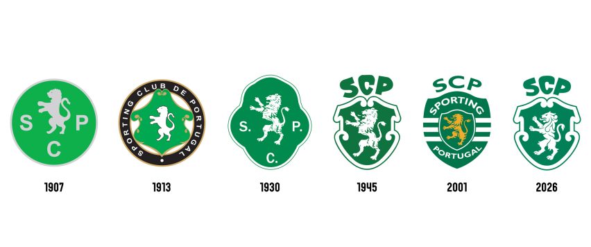
The mascot itself was redrawn with more curved, flowing hair, while its tail was formed into an S shape as a nod to the club's name. Overall, the final design draws heavily from the club's 1940s identity.

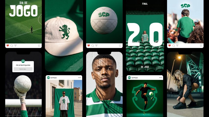
Along with redesigning the club's crest, JKR also revamped the club's graphic identity with a custom typeface named Sporting Sans, created together with font foundry F37.
This typeface, along with the redesigned lion, are now heavily present across Sporting CP merchandise.
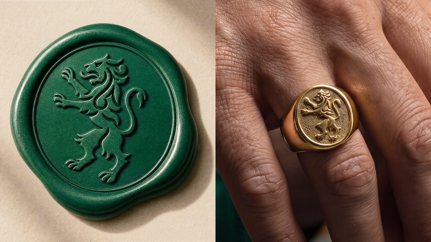
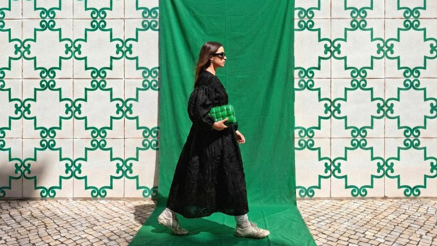
The rebrand aims to combine five symbols that have significance for the club – the lion, shield, crown, stripes and Porta 10-A.
Some of these are self-evident, like the lion and shield, while others like the patterned ironwork on Porta 10-A, the wrought-iron entrance to the club's stadium, are worked into patterns used within the graphics and merchandise.
According to the club, the rebrand aims to build on its "code", which focuses on people rather than sports.
"The Code has always rested on one principle: develop the human, then the athlete," said Sporting Clube de Portugal chief strategy and operations officer André Bernardo.
"Our new identity flows from that belief," he continued. "We needed people to feel this through the brand itself. Creating an experience that could expand beyond the category, attracting those who connect to what we stand for."
JKR, originally founded in London in 1990 by designers Joe Jones, Andy Knowles and Ian Ritchie, is known for rebranding several well-known consumer brands including Burger King and Fanta.
The photography is courtesy of JKR.