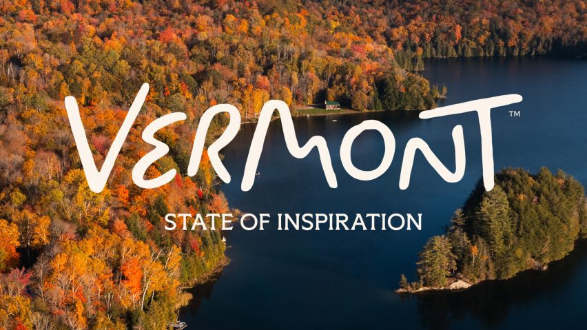
DNCO brings "handmade quality" to Vermont's revamped logo
Undulating hills and winding rivers are translated into the letters of Vermont's updated tourism logo, designed by creative agency DNCO as part of a wider rebrand for the US state.
The Vermont Department of Tourism and Marketing asked DNCO to create a dedicated consumer tourism brand to reposition and strengthen awareness of the state, which is often overlooked in favour of other New England states like Maine and Massachusetts.
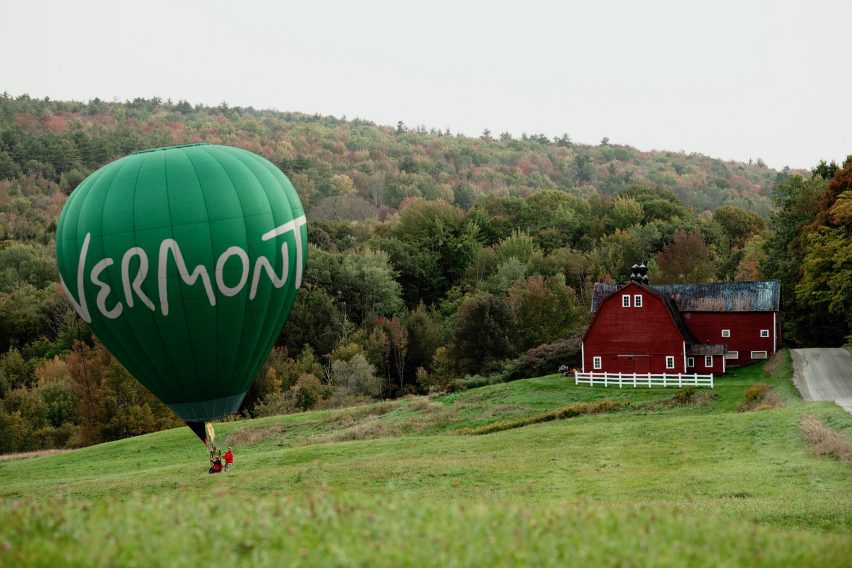
The agency formulated a brand platform around the tagline "State of Inspiration", which refers both to Vermont's natural beauty and to its creative energy, explained DNCO North America's managing director Luis Mendoza.
"The idea of a State of Inspiration captures what Vermont gives people," he told Dezeen.
"It might be learning a new skill, hearing an unexpected story or simply noticing the world differently. The identity presents Vermont not only as somewhere beautiful to visit, but as somewhere you leave having gained something."
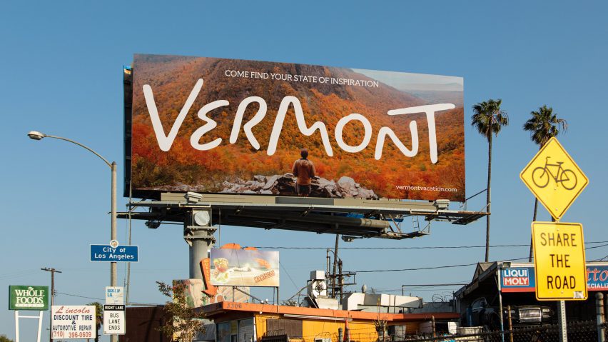
A key element of the new identity is a logo based on the hand-painted signs found on roadsides, storefronts and farm stands across the state – a dramatic departure from its previous serif typeface.

The wordmark, which was developed in-house and refined by lettering artist Rob Clarke, features letterforms referencing aspects of Vermont's landscape, such as an 'e' that evokes a winding road, an 'm' that traces the outline of hills, and an 'o' that echoes the state administrative logo of a moon over mountains.
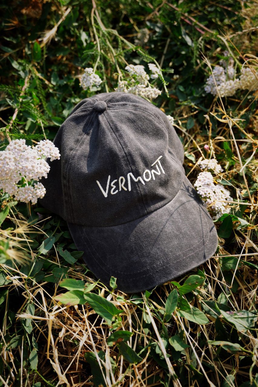
The brand identity utilises a single typeface in varying weights to adapt to different contexts. A colour palette that mirrors the natural environment can also change with the seasons, just like Vermont's landscape.
DNCO also developed a library of custom icons in collaboration with local illustrator Alyssa McCabe, references specific Vermont subjects including food, landscape, culture and local lore.
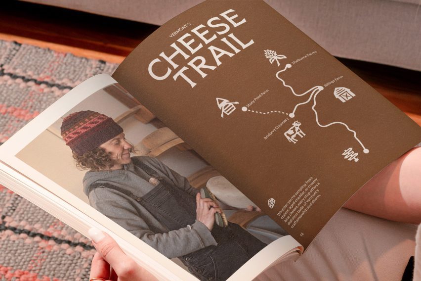
Mendoza hopes the "warm and playful" branding evokes not just the state's familiar qualities but also the unexpected experiences visitors may discover.
"We wanted the identity to feel unmistakably Vermont: rooted in the state's natural beauty and enduring charm, but also alive with creativity and possibility," he said.
"There's a handmade quality to it that reflects the people and culture of the state, balanced with enough energy and flexibility to feel contemporary," Mendoza added
The State of Inspiration concept launched at the 2026 Vermont Tourism Summit. DNCO also developed brand guidelines and onboarding workshops to help roll out the identity across the state's marketing materials and collateral, including a refreshed tourism website.
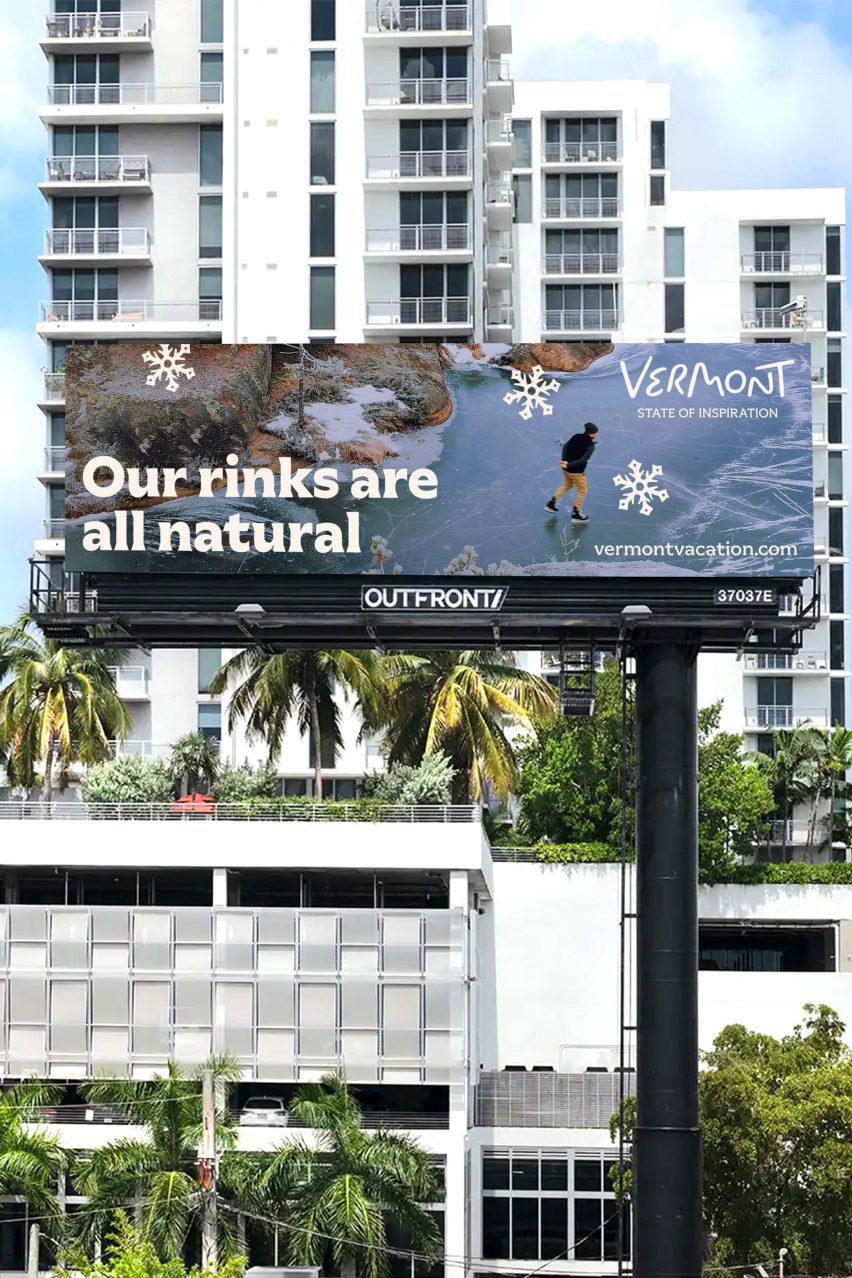
"Our hope is that people see Vermont as more than a picturesque escape or a seasonal destination," Mendoza said.
"It is a place of discovery, creativity and new experiences, a place that can change your perspective and send you home feeling refreshed and inspired."

DNCO was founded in 2006 by Ben Dale and Joy Nazzari. Originally known as dn&co, the firm, which now has offices in New York and London, specialises in creating brands for global destinations including DUMBO in New York, St James's in London and Westbund Central in Shanghai.
Other branding projects recently featured on Dezeen include the updated wordmark for social media platform Instagram and a rebranded badge for Lisbon football club.
The images are courtesy of DNCO.