"A disaster on a monumental scale"
Comments update: BIG's proposal for the Battersea Power Station development in London, a billboard by Zaha Hadid and the Comic Sans typeface have all made Dezeen readers irate this week.
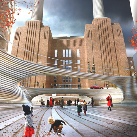
BIG no-no: Bjarke Ingels' architecture company BIG was this week confirmed as the firm behind designs for a new public square in front of the iconic Battersea Power Station building in London, currently the focus of a multi-million pound redevelopment.
BIG's work often divides opinion, but this time the verdict from Dezeen readers was unanimous.
"Poor, poor Battersea," wrote Marco Lammers, succinctly summing up a number of the responses. Leo said the design ignored principles of public space pioneered by Danish architect and urbanist Jan Gehl: "Why these bridges? Why two levels? Why a pedestrianised high street? Does the building need entrances in two levels?" he asked.
"I usually love BIG's work and its approach to design, which is both logical and unique. However, this is a disaster on a monumental scale," wrote James, who said he was "upset and extremely disappointed" by the proposal.
"The station was not meant to be approached from a sunken 'urban canyon'," added regular commenter Bassel. "Those cavernous bridges obstruct the front view, which renders the preservation of the station pointless." Read the comments on this story »
No joke: Comic Sans designer Vincent Connare once described the much-hated typeface as his "best joke", but some readers felt his defence of the typeface in an exclusive interview with Dezeen wasn't funny.
Simon Vinther took issue with the idea that compliance with a brief would automatically class something as "good" design. "So as long as a design matches its brief, you cannot dislike it? Most primitive criteria for good design I have ever heard," he wrote.
"What we 'judge' is the end product. The process that led to that product is secondary," agreed Kalum.
Others took offence at Connare's description of typography as "more technical than other fields of design".
"Architecture is far more technical. That is a hilarious statement," wrote omnicrom.
But the most popular comment of the week was posted by Innes, who quoted the first-person monologue by Timothy McSweeney as Comic Sans:
"You think I’m a malformed, pathetic excuse for a font. Well think again, nerdhole, because I’m Comic Sans, and I’m the best thing to happen to typography since Johannes f**king Gutenberg," it read. "Sorry I’m standing in the way of your minimalist Bauhaus-esque fascist snoozefest. Maybe sometime you should take off your black turtleneck, stop compulsively adjusting your Tumblr theme, and lighten the f**k up for once." Read the comments on this story »
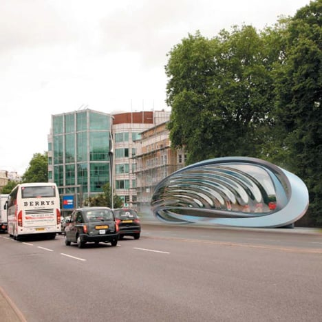
Highway to Hadid: British architect Zaha Hadid submitted a roadside billboard for planning approval on a site alongside the main route into central London from Heathrow airport. Consisting of two twisting "ribbons" that house a digital screen, the structure was described by the architects as "the development of an architectural form that will create a new genre in the roadside advertising canon."
"Good to know all I have to do to create a new genre is design some wasteful ornamentation around a big-screen telly," wrote orangeeli. Oyster felt the eye-catching shape would cause trouble, writing: "This is going to cause car crashes."
"Considering one of the main arguments against billboard advertising is the glaring amount of space they take up, I don't see how this is any sort of improvement," added stephanie.
But davidd defended the design. "If it were a bus shelter, everyone would love it," he wrote. Read the comments on this story »
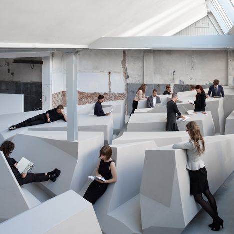
All work and no play: the first trial of a concept design for a future office with no chairs, to help workers avoid myriad health problems associated with spending too long sitting, was revolutionary to some and impractical to others.
"This could be one of the biggest changes in office design, if it proves to be effective," wrote arhmatic. "This is not just ergonomically, but socially attractive."
"To me it looks like a (formal) design idea which later gets adopted to a purpose," responded Dikkie Smabers. "Putting stuff (like pens, cups filled with coffee or tea) on an inclined plane just doesn't work as long as there is gravity."
But rjochum felt that the designers were tackling the wrong problem. "I believe that it is not the sitting that causes the health-related issues, but rather what the individuals do, while they are sitting. If society was an entity built on fairness, respect, compassion and other health-inducing qualities, then our researchers would also possess more wisdom." Read the comments on this story »
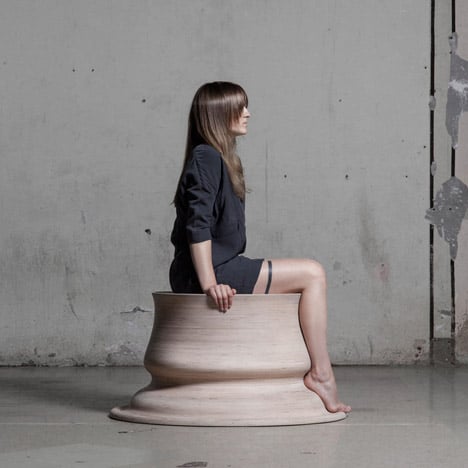
An idea with legs: a series of chairs by Lithuanian designer Marija Puipaitė, who created the forms based on the outline of her own legs, won praise for both the novelty and execution of the idea and its presentation.
"Did she just solve the origins of the classical order?" asked The Liberty Disciple, comparing Puipaitė's shapes with the assemblage of parts used in Classical architecture.
"Wonderful and seductive," wrote Felix Tannenbaum. "It's not just her legs. This beats Demi Moore playing with clay in Ghost," added Marcus Des.
But not everyone was completely enamoured with the design. "What if you have shorts legs or longer feet?" asked Pickaname. Read the comments on this story »