
Long Tall House is a residential project in Tokyo, Japan, by Kagawa Takanori and Tappei Ito of Spacespace.

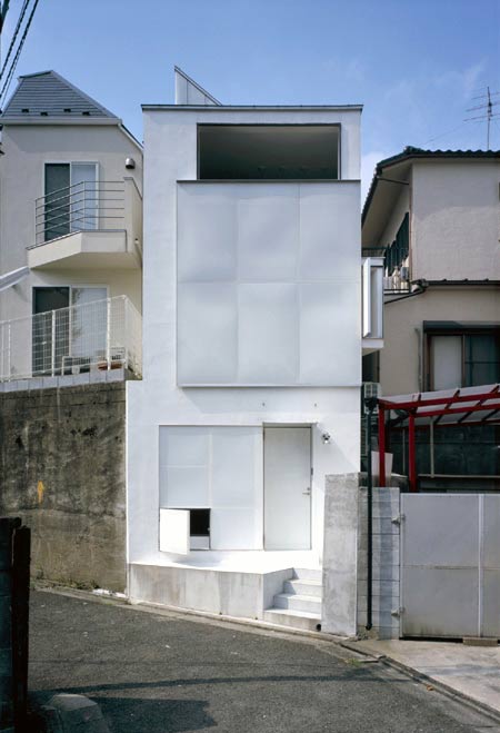
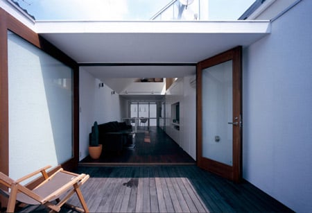
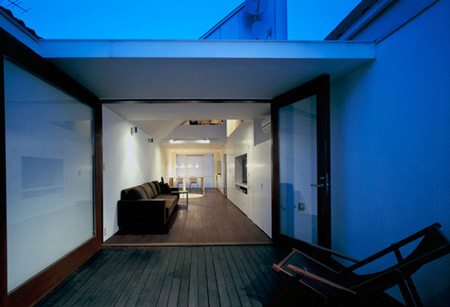
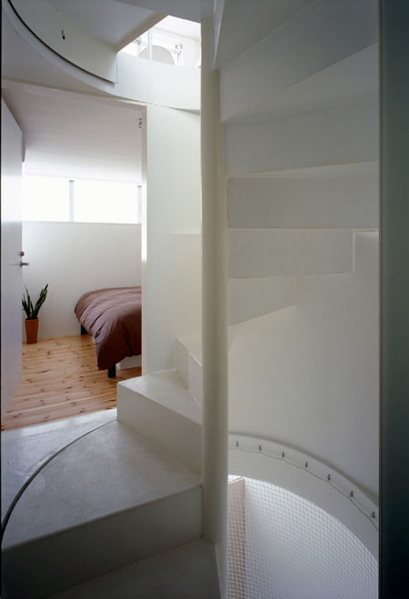
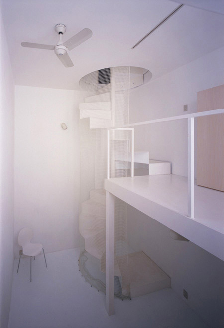
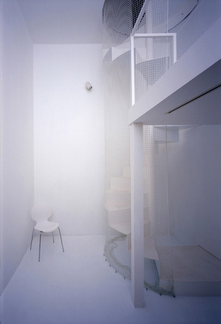
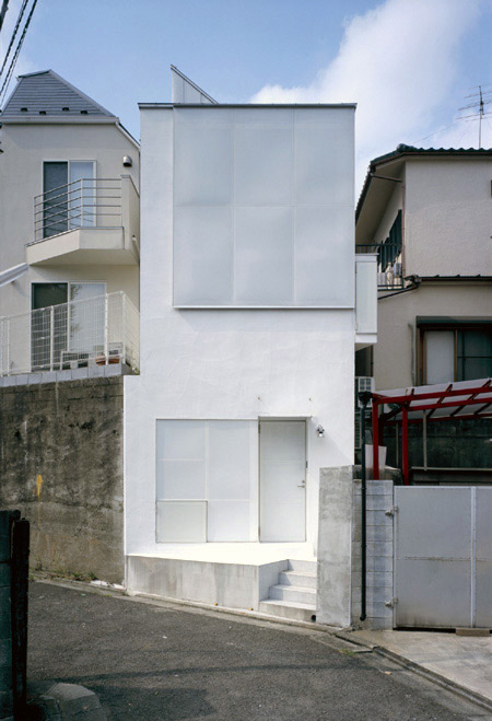
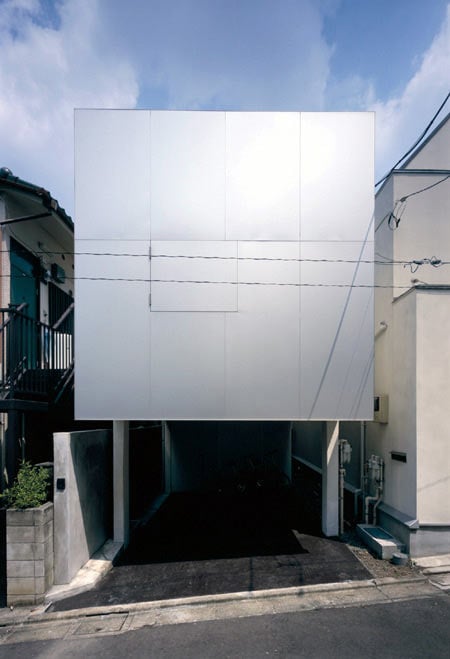
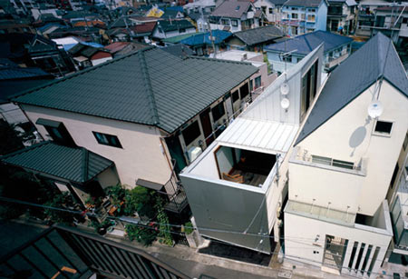
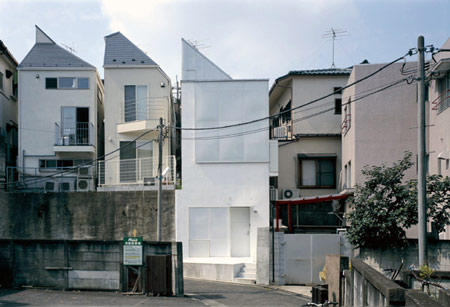
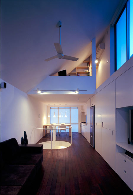
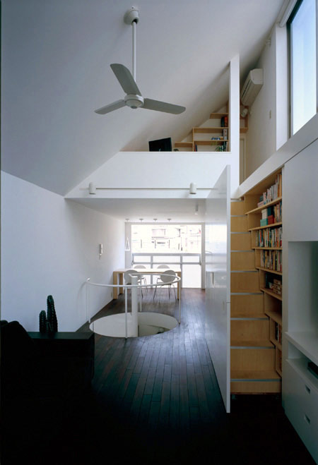
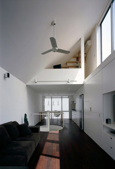
The five-storey house occupies a narrow plot and comprises a long building and a tall tower.

The two basement floors are built in concrete, while the three upper stories are made of timber.

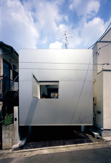
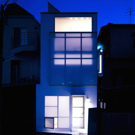
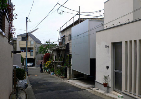
Large, aluminium panels on the north and south facades can be raised and lowered to cover or reveal the windows.

The project was completed in 2006 but has not been widely published.

Photographs by Koichi Torimura.

Here’s some more information from Spacespace:
–
LONG TALL HOUSE
The site is located in a typical Japanese crowded residential area, just middle between two stations near to Shibuya.
The house of a young married couple is on a strip of land subdivided for sale (about 4m*16m). It adjoins two paths at north and south sides, and locates on a very old retaining wall which runs along the north path and forms 3.5m height cliff. The path were too narrow to comply the current regulations, so we needed removing a part of the wall so that it could be widened.

The old wall was partially to be replaced with a new structure to firm periphery, so we tried to merge the house with it. Our structural adjustment to actual condition brought 2 basement stories which trace old topography older than the wall. The house got a link between two different ground levels and a profound continuity of it and surroundings.

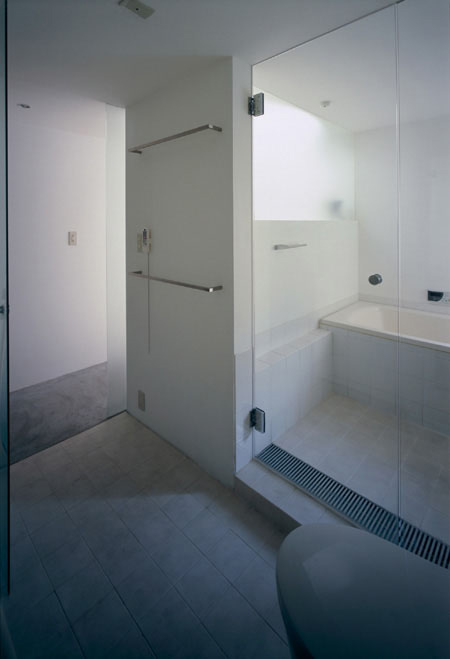
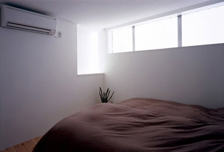
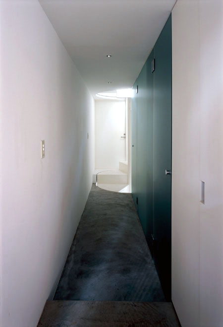
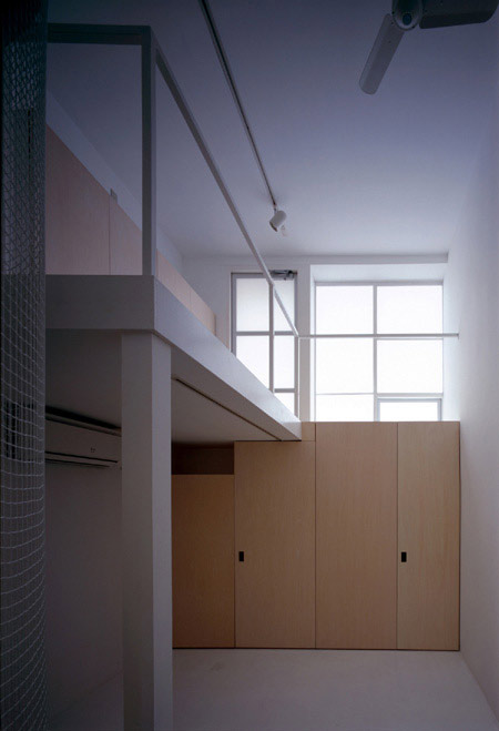
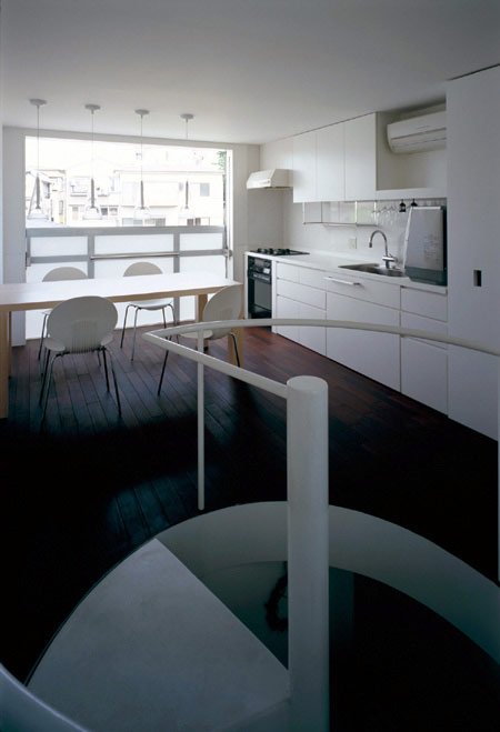
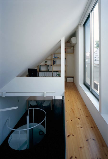
The house has 5 stories. The lower 2 floors are made of RC to resist soil pressure. The upper 3 floors are made of wood for lightness and economy. The 1st floor has bed room, bath room, parking and others compactly. The 2nd floor has terrace, living and dining room and kitchen in a narrow (but airy) space responded distinctive shape of the plot.

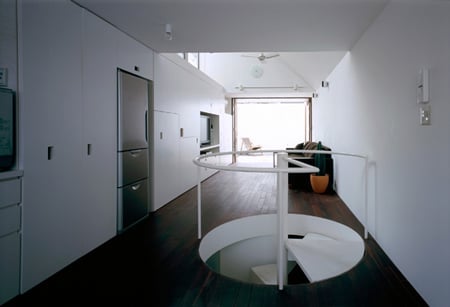
This house includes two buildings; one is like a long row house, the other is like a tall tower.

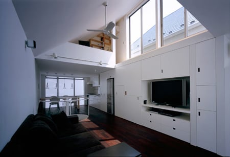
The south and north facades have a large translucent window and a aluminum wall which slide “up and down” manually by counter weight mechanics.

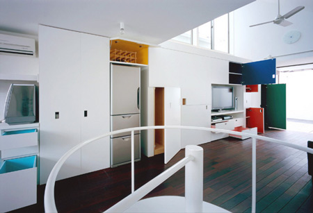
Clients wanted storages to be built-in and memorable, so we give each space a different color to share memory between them.

Site/ Meguro-ku, Tokyo, Japan
Completion/ December, 2006
Structure/ RC+wood, 2B+3stories
Site area/ 66.49m2 (about 4m*16m)
Gross floor area/ 102.69m2

Client/ private (a young married couple)
Structural engineer/ Nobutaka Kashimoto
Architect/ SPACESPACE (Kagawa Takanori, Tappei Ito)


–
Posted by Rose Etherington


April 8th, 2009 at 4:54 am
They stuffed a whole world into that little house. Fantastic project, great use of space.
Plan? / Sections? / Elevations?
April 8th, 2009 at 6:18 am
There is minimal but very functionally…..ideal solution!
April 8th, 2009 at 7:56 am
beautiful…pure…
just perfect!
April 8th, 2009 at 9:03 am
Japanese architecture is the Best!!!
April 8th, 2009 at 9:25 am
japanese and spanish are architecture gods
April 8th, 2009 at 12:55 pm
very japanice
April 8th, 2009 at 1:51 pm
they make the best most clever things
April 8th, 2009 at 2:19 pm
great spatial awarness can be acheived in japanese projects, like it alot.
April 8th, 2009 at 3:34 pm
Eugene is right: plans, sections and elevations would add up to the enjoyment.
Interestingly, the spatial richness and density present in the new wave of Japanese residential architecture has not touched yet the European architecture. It’s always a pleasure to see how Japanese architects are freestylin’ within small confinements: picayune plots, tight budgets, restraint vocabulary…
April 8th, 2009 at 4:41 pm
stunning! It’s just the perfection… they really work with the space.
April 8th, 2009 at 7:51 pm
I held my breath, expecting a fairly suffocating space, but with the use of some color I find it quite liveable. My objection would be the staircase. Though it must be so, I would quickly tire of having to travel between floors this way.
April 8th, 2009 at 10:37 pm
i would love to live there!
April 9th, 2009 at 6:54 am
The surrounding houses looked so banal as compared to this little gem.
Though I have some reservation about the sliding alumn wall at the back. Seems like an overkill manouvre just for the opening of a little window.
But the space planning is simply ingenious, and kudos to the team for packing in all the programmatic requirements for the needs of a family within such a tiny plot.
April 9th, 2009 at 3:02 pm
would love to see some section drawings….
April 9th, 2009 at 5:32 pm
Gotto like the clever compact design!!
April 9th, 2009 at 6:34 pm
@ macy , I think the sliding alumn wall acts as a garage door and slides up to allow access, I don’t think it is intended to slide to allow the window to then be opened. Maybe I’m wrong.
April 10th, 2009 at 9:47 am
I want plans, and sections!
April 10th, 2009 at 5:04 pm
I agree with Matteo about the garage door. Love the slide-out staircase. That would NEVER be allowed here in Australia. Too many regulations.
April 28th, 2009 at 7:59 pm
funny no one caught that stair porn! The pull out wall that reveals steps