
House of Diffusion is a residence in Shiga, Japan, designed by FORM/Kouichi Kimura Architects.

FORM/Kouichi Kimura Architects also designed the House of Inclusion and House of Vision in our previous stories.

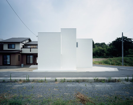
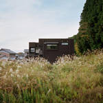
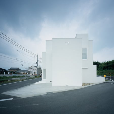
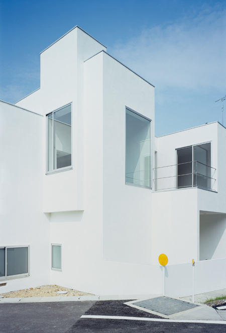
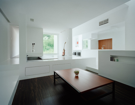
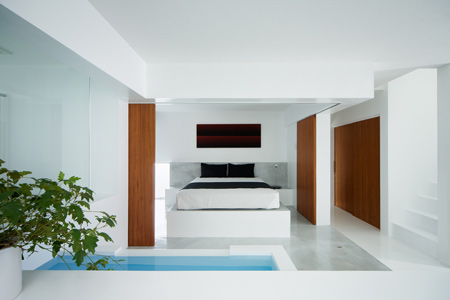
The windows of the home are positioned to afford views of the nearby hills but restrict views of the immediate neighbourhood.

Photographs by Takumi Ot.

The following text is from FORM/Kouichi Kimura Architects:
–
House of diffusion
This project was requested from a 30-something couple.

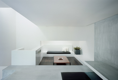
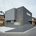
The client desired an open and varied space. The lot is located at a part of subdivision lots where idyllic scenery still remains. The east side of the lot faces a hilly area.

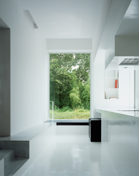
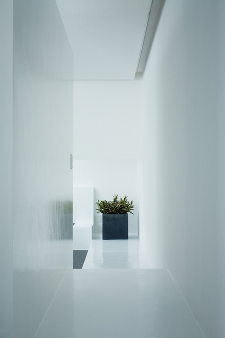
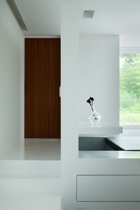
The plan has been designed to incorporate the scenery as well as to protect privacy from neighborhood, resulting in the composition of being connected with the outward world while closed inward at the same time.

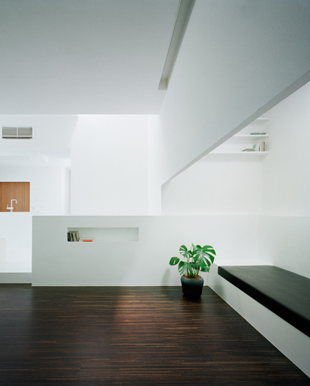
The “diffused space”, which is neither single nor too much divided, provides to the owner a variety of living spaces produced with the views clipped from landscapes, introduced lights, and flexible spaces.

Architects: FORM/Kouichi Kimura Architects
Location: Shiga, Japan
Client: Private
Construction Year: 2008
Site Area: 150,24m2
Constructed Area: 150,52m2
Photographs: Takumi Ota

More Dezeen stories about FORM/Kouichi Kimura Architects:
.
House of Inclusion House


May 1st, 2009 at 12:58 am
Neat, but seems like the exact same idea as house of vision and house of inclusion. It is set up to give good views and block bad- and give privacy from neighbors. The outside seems like it had little thought to it. I like the inside, very japanese with the dark wood and white walls, but also looks very similar to the other projects by this firm.
May 1st, 2009 at 3:44 pm
Thank you dezeen for confirming my point, the purity of these volumes are valued at their best by white paint. Corbu realized it 90+ years ago.
May 1st, 2009 at 3:47 pm
Great house, needless to say.
May 1st, 2009 at 3:51 pm
To be picky, the railing on the second picture could have been better.
May 1st, 2009 at 6:54 pm
perfect balance
May 1st, 2009 at 7:44 pm
Zed got it right. There is nothing new here or between the illustrated projects. Appears to be formula-driven design – although well done. Could be an early Mies or Bauhaus-inspired project, conceptually. The few highlighted expressed material surfaces are powerful in the neutral environment. I’m always interested to see or project what these ’sculptures’ look like on a daily lived-in basis. Here’s an idea – a coffee table photo book of architectural icons in real world daily use mode.
May 2nd, 2009 at 6:11 pm
??? this is not early mies-like at all, not even conceptually. something very different.
May 2nd, 2009 at 10:23 pm
Very cold! The house seems like a museum where you can’t touch anything. It’s time to think upon content insted of the conteiner. At the end the most important part of architecture should be the people!
May 4th, 2009 at 7:34 am
There isn’t anything new in this arh.product, but this arhitect or arhitect office is great including all their works.
May 6th, 2009 at 4:02 pm
love the modesty
May 9th, 2009 at 6:22 pm
This building really stand out with its white colour walls and its structure. The reflection of light also brings good light effects to this whole building. Simple and cool.
May 10th, 2009 at 5:07 pm
i’m missing plans :) )) so i can’t tell how comfortable the house is, … but this ‘too much’ whiteness cuts my eyes so much, i don’t know if i could resist being in such an atmosphere for too long..
— but oh, the forms and space itself are so perfect, that any picture or anything else additional would be just extra :)