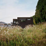
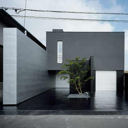
Here’s a fourth house by FORM/Kouichi Kimura Architects: House of Depth in Shiga, Japan.

FORM/Kouichi Kimura Architects also designed the House of Diffusion, House of Inclusion and House of Vision in our previous stories.

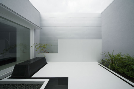
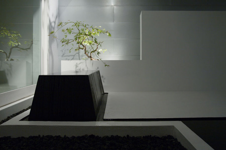
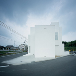
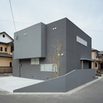
This house is built on a deep plot, with open space in front sheltered from neighbouring houses on one side by a high wall.

Photographs by Takumi Ota.

Here’s some text from FORM/Kouichi Kimura Architects:
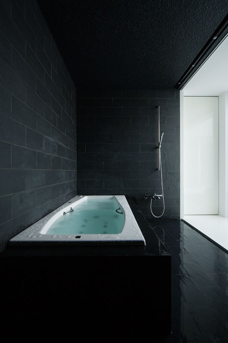
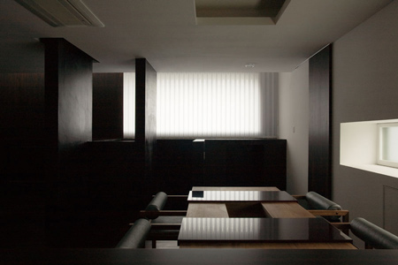
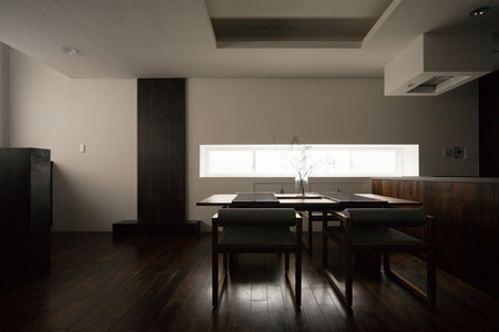
–
House of depth
This house is built on the lot 10 meters wide and 23 meters deep.

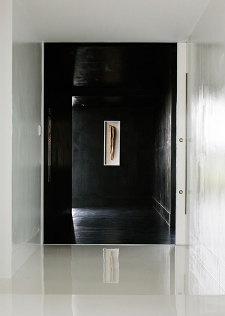
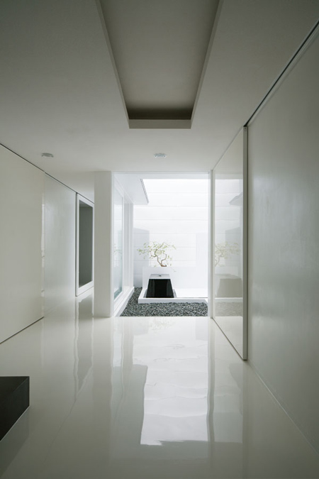
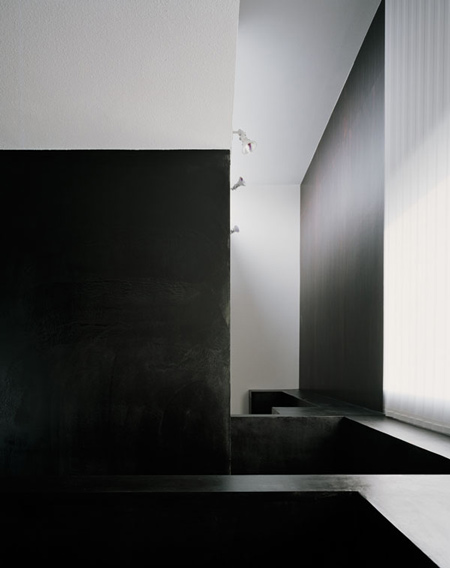
Despite its urban, closed appearance, the house has between the exterior and the interior a long approach that can be regarded as the intermediate zone relating to the surrounding environment.

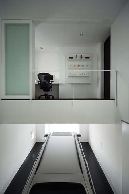
Several areas where the line of sight is uninterrupted are provided inside the building, aiming to enhance visual depth.

Architects: FORM/Kouichi Kimura Architects
Location: Shiga, Japan
Client: Private
Construction Year: 2007
Site Area: 237,28m2
Constructed Area: 189,82m2
Photographs: Takumi Ota


More Dezeen stories about FORM/Kouichi Kimura Architects:
.
House of Inclusion House
–
Posted by Rose Etherington


May 7th, 2009 at 1:08 pm
i find all of these hermetic and isolating japanese houses that have been widely publicised in the past few years to be vaguely depressing actually. the quality of design is high but i can’t seperate it from what seems to be a highly unnerving trend.
May 7th, 2009 at 2:30 pm
its a spotless house…wonder how they keep is so clean….great job with the design too!!
May 7th, 2009 at 4:29 pm
Despite being highly stylized I do question the amount of light that really comes into these homes. There is a very suffocating quality to them – a bit like being in a luxurious coffin…
May 7th, 2009 at 5:27 pm
nice expresion!
a very luxurious coffin!
May 7th, 2009 at 9:38 pm
I love it and wouldn’t mind living in one, only if I had a housekeeper to keep it clean and tidy. It’s clean and calming — I really hate clutter.
Americans tend to collect a lot of stuff so I could see why it’s not fitting for our typical lifestyle.
May 8th, 2009 at 2:34 am
maximum expression of minimalism…
May 8th, 2009 at 5:44 am
coffin? cage? cubicle?
a circle/square drawn on the sand? suffocating? limiting? constraining?
it is space and how we define it, by giving it meaning, feelings and associations.
May 8th, 2009 at 10:03 am
an office overlooking the garage? so you can admire the limousine? It all feels very constrained. slightly james bond.
Can’t help but wonder why so many of these have been featured in dezeen recently….?
May 8th, 2009 at 8:02 pm
Fantastic! Yes it is a little sterile, but what nice lines/forms, materials, and overall expression. I’d love to see a little more softness to it though, a home should feel a bit more comfortable than this “mueseum” of a home….but I still love it.
May 9th, 2009 at 4:22 am
hermosos espacios y excelente eleccion de materiales……..
gran obra
May 10th, 2009 at 7:31 pm
art gallery maybe
May 11th, 2009 at 6:57 am
some sections would help us understand better, and maybe it might not be as bad if we understood it.