
New York architecture and design practice Axis Mundi have designed a conceptual alternative to French architect Jean Nouvel’s design for a 73-storey tower next to the Museum of Modern Art in New York (see our previous story).
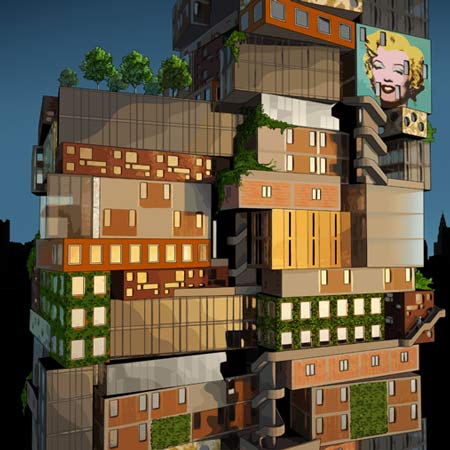
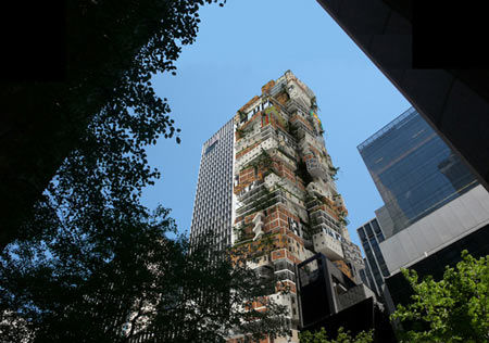
Axis Mundi’s design is an attempt to rethink the New York skyscraper for the post-boom era, expressing the diversity of uses within instead of “one-note architecture that makes a singular visual image and little else.”

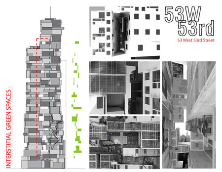
The surface of the facade would be broken up by the varying depths of these residences, allowing for balconies and gardens.

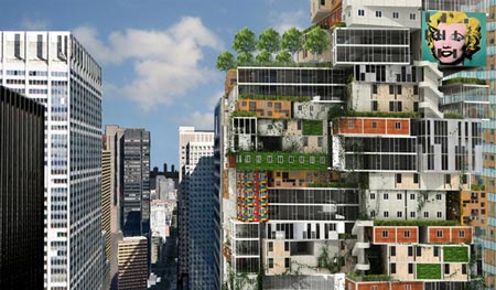
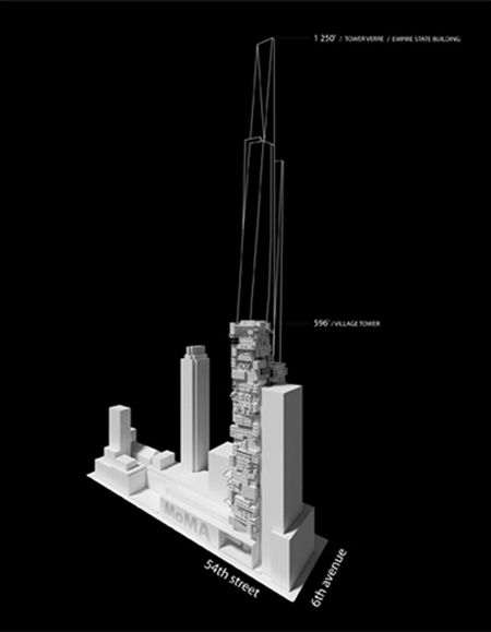
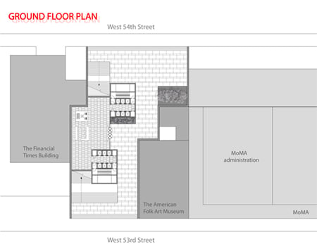
An arcade through the ground floor would connect W 53rd and W 54th Streets.

New galleries for the MoMA would occupy three floors above this, with a three-storey volume above the galleries set aside for community activities.

Here’s some more information from Axis Mundi:
–
Axis Mundi Unveils Conceptual Alternative Design for MoMA Tower at 53 W 53
As the city takes stock in a post-boom era, architect John Beckmann sees this as the time to rethink the tall buildings that have become synonymous with New York City’s identity.

“Instead of disguising the rich potential of towers that have a mix of uses, we looked for a way to express that diversity,” Beckmann noted. The firm used parametric computer-modeling software to test a wide range of possibilities. Out of this iterative process, Beckmann and his firm, Axis Mundi, proposes a new way to organize and express tall buildings: the Vertical Neighborhood.

“A more diverse, complex, heterogeneous, and environmentally minded city need no longer be represented on its skyline by one-note architecture that makes a singular visual image and little else,” explained John Beckmann, the founder of Axis Mundi, a Manhattan-based architecture firm.

Rethinking Hines Tower Site
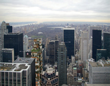
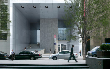
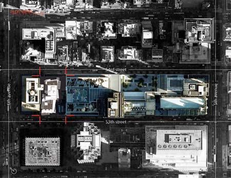
Beckmann proposes a conceptual alternative to business-as-usual, choosing the site of the proposed 53W53rd, among the city’s largest skyscraper proposals in one of the most overbuilt parts of Midtown. Hines, the developer, engaged Paris architect Jean Nouvel, who designed an 82-story hotel and residential tower higher than the Chrysler Building. The site was purchased from the Museum of Modern Art with the proviso that the project would house additional gallery space for the museum.

The Axis Mundi proposal is timely since the Hines MoMA tower is currently moving through the city’s Urban Land Use Review Process (ULURP).

Flexible Floors, Open to Views
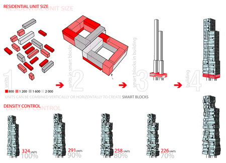
The architectural diversity Beckmann envisions starts with a double-ring, multi-level floor-plan unit, anchored by two cores that run the full height of the building, containing elevators, stairs and other vertical services.
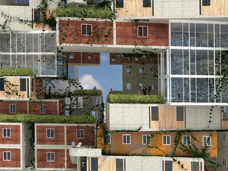
The ring units called “SmartBlocks” make possible a wide variety of floor plans. Single-unit layouts can mix with duplex, or triplex layouts. The units can shift in and out, adding rich texture to the surface, creating vertical garden space, and linking the units in unique ways.

The malleability of the ring units accommodates living and working, extended families, and new forms of tenancy and ownership. Any grouping of these could be purposed for a hotel. The building is enriched by the multiplicity of forms and textures people create within their vertical neighborhoods.

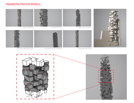
By varying the mix of the floor plan units, the Axis Mundi design leaves space for vertical fissures that move irregularly up the tower. These bring light and breezes into the open centers of the double-ring units and frame spectacular, theatrical vistas to the city through the building’s own structure. Neighbors can see and greet each other along spacious bridges and balconies rather than scurry by each other in long, dark hallways.

Fitting In With Porous, Richly Variegated Surface
“Historically, the skyscraper was a unitary, homogeneous form that reflected the generic, flexible office space it contained,” Beckmann says. “The Vertical Neighborhood is more organic and more flexible–an assemblage of disparate architectural languages. It reflects an emerging reality for tall buildings as collections of domestic elements: dwellings, neighborhoods, streets.”

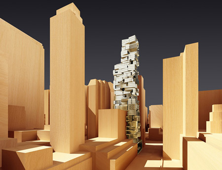
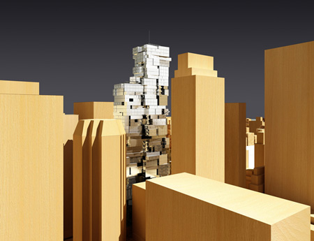
Axis Mundi has conceived the tower at a scale akin to, rather than dramatically exceeding, the heights of this very densely built-up Midtown neighborhood. The richly modeled surface and the fissures of space help to reduce the structure’s apparent scale and join it more seamlessly to a neighborhood that mixes offices and residential towers, brownstones, apartment buildings, hotels, and clubs.

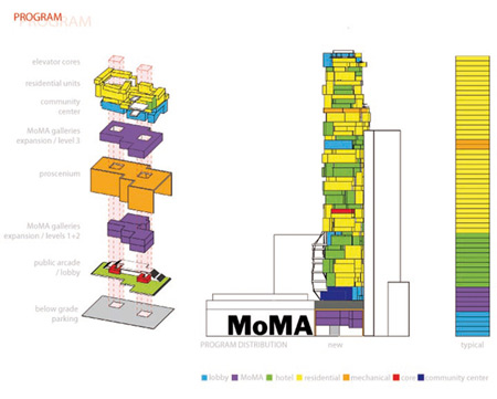
A dramatic through-block public arcade connects W. 53rd and W. 54th streets, offering access to new MoMA galleries on up to three levels above. Contiguous with the museums’ existing exhibit space, the galleries twine back on themselves, like a Möbius strip.

Above that, Axis Mundi sets aside a three-story-high volume that can be developed as a community-gathering space. Their proposal seeks to inform the discussion of it and other tall buildings. “The design reinforces the urban identity of tall buildings,” observes Beckmann. “It suggests new expressive possibilities in an urbanism of difference rather than of homogeneity.

In a city where more than 300 languages are spoken, architecture can celebrate that diversity rather than see it as a problem that must be solved.”

Height: approx. 600 ft
Floors: 50 above (2 below)
Building Footprint: 17,000 square feet
MoMA Expansion Galleries: 32,500 square feet
Axis Mundi is an interdisciplinary architecture and design firm based in New York City. (www.axismundi.com)
Concept and Lead Designer: John Beckmann
Design Team: John Beckmann, CarloMaria Ciampoli, James Coleman (LAN), Nick Messerlian, Richard Rosenbloom, Margaret Janik, Pauline Marie d’Avigneau, and Taina Pichon
Parametric modeling: CarloMaria Ciampoli, James Coleman (LAN)
Renderings: Orchid 3D
Illustration: Michael Wartella


July 16th, 2009 at 12:40 pm
Great! Strange but great. A lot better than J.N´s “building”. This building is New York! Good Job.
July 16th, 2009 at 12:52 pm
a homage to slum, favella in vertical form, for nyc. osama will love it.
July 16th, 2009 at 12:55 pm
They should visit slums in Rio and see if they still find this scheme that exciting – architecture should be socially-aware.
July 16th, 2009 at 1:47 pm
LOVE IT!!!!
BEAUUUUUTIFUL!!!!!!!!!!!
July 16th, 2009 at 1:47 pm
an organised caos!
just beautiful…
July 16th, 2009 at 1:50 pm
i agree with vasco. new york doesn’t need a building like this.
July 16th, 2009 at 2:18 pm
Living that high up would not be comfortable with such intense winds.
July 16th, 2009 at 2:43 pm
i don’t know about this axis mundi!?
July 16th, 2009 at 3:26 pm
congratulate the design team on making such a good attempt to a new design concept for vertical towers, a fresh wave for something which has been long awaited.
July 16th, 2009 at 4:19 pm
parametricaly stacked blocks? that seems like a bit of an overeach… more like sketch up stacked blocks.
July 16th, 2009 at 4:30 pm
Are there elevators? or do you have to take the stairs?….
July 16th, 2009 at 4:37 pm
this looks like a project i saw for a central bank for mexico city……… i think it was done “bb” architects…….
July 16th, 2009 at 4:44 pm
Seems like I’ve seen quite a few of these “stacked-box” type of towers in the last few years. I like it better than Nouvel’s, but 56 Leonard, by Herzog and de Meuron is a better example of the stacked tower.
http://www.56leonardtribeca.com/#/global-landmark-by-herzog-and-de-meuron
July 16th, 2009 at 4:49 pm
fresh; i dig it.
it’s about time we stopped designing phallic symbols that pass for towers/skyscrapers…
July 16th, 2009 at 5:29 pm
sometims u need not to shout so loud. sorry but this is too much
July 16th, 2009 at 5:38 pm
Isn’t this where Bruce Willis lived in the Fifth Element?
July 16th, 2009 at 5:40 pm
The balkanization of architecture.
July 16th, 2009 at 5:41 pm
as the recession bites, architects find themselves with more and more time on their hands….
July 16th, 2009 at 6:22 pm
BRILLIANT !!!!!!!!!!!!!!!!!!!
July 16th, 2009 at 7:03 pm
It’s a bit like a Yankee Hundertwasser…don’t like it.
July 16th, 2009 at 7:33 pm
don’t like it at all.
it looks like a vertical shanti town of shipping crates and trailor homes.
The windows are really small, and in the Manhattan light the interior will look like a prison cell. The random in-and-out forms would be a maintanence nightmare and a nesting ground for pigeons.
Stict local building codes would never let this tower to be built.
Luckily this is just an architect’s unpaid concept.
July 16th, 2009 at 8:39 pm
I personally think that New York can stand more structures like this. We are missing a huge piece of what New York City stands for by these steel and glass structures that are going up all over the place. We are starting to look like every other city in the world. I say do it!
July 16th, 2009 at 9:28 pm
this is more patchwork than a quilt. frugality may be the new black, but this is going a little too far, especially considering the neighborhood this would be going into.
July 16th, 2009 at 10:57 pm
like living in vertical Caracas
July 16th, 2009 at 11:10 pm
I like how it looks, the loopy playfulness of it. But I do think neuhaus makes some pretty strong points about the practicality (or im-) of such a structure.
July 16th, 2009 at 11:58 pm
I cannot fathom how followers of architecture can see this as BRILLIANT. This is the epitome of 1st year undergraduate work. Simply taking a slum aesthetic (which can be beautiful within its own context) and stuffing it into vertically stacked boxes in NYC is lame. I understand it is a social commentary, but its laughable how much time and effort it must have taken to make such a dim-witted statement.
July 17th, 2009 at 12:41 am
While I do love that the project literally exposes the necessities of future tower structures, I feel that there are better interpretations of it. Nice project.
July 17th, 2009 at 12:49 am
Ridiculous! I love it.
July 17th, 2009 at 1:21 am
shoe-boxes-unevenly-stacked-up look = played out.
just because a tower is “green” doesn’t mean that it has to look like it was built by a team hippies.
July 17th, 2009 at 3:20 am
Wasn’t this a SITE a few recessions ago?
July 17th, 2009 at 6:00 am
I don’t no if I love it or hate, so I guess at the very least it is pretty provocative. It sure would be interesting to see it build somewhere in the city.
July 17th, 2009 at 8:06 am
look there is some good here, but the “design” creates soooooo many other problems….alot of work here still…
July 17th, 2009 at 10:52 am
Great”!
It still looks like this type of design of 70`s, but soon it would be more pophisticated
July 17th, 2009 at 10:55 am
Neighbors can see and greet each other along spacious bridges and balconies rather than scurry by each other in long, dark hallways.
Yeah right
July 17th, 2009 at 2:28 pm
huh…
Construction? elevators? circulation? facade costs? operating costs? facade cleaning installations per unit? …
and it’s ugly!
July 17th, 2009 at 4:29 pm
The new Dark Ages are about to descend on America. This looks like an Indian slum stacked on top of itself.
July 17th, 2009 at 9:02 pm
Revit makes this stuff so easy to design and impossible to build.
July 17th, 2009 at 9:07 pm
whatever. doing ‘funny’ is much much easier than doing ‘elegant’ – go nouvel!!
July 17th, 2009 at 9:40 pm
WOW!!! Totally wacked-out. Gotta love it for it’s sheer madness! It’s like a ruin from the future. Glad to know somebody can still “think different”.
July 18th, 2009 at 12:20 pm
I like some of the thinking – “expressing the diversity of uses within instead of “one-note architecture” – sounds very inspiring, & “varying depths of these residences, allowing for balconies and gardens,” – “green” and good for people who live there . “New galleries for the MoMA” etc sounds good too.
But the visual actuality of the building?
For some reason it does remind me of some of Martino’s furniture pieces in the Wouldn’t it be Nice, Somerset House exhibition. This particular work he exhibited had a certain elegance to it. For me this building lacks that kind of thing. Also this building seems to disassociate itself – quite harshly in my view, from its surrounding environment.
July 20th, 2009 at 3:24 am
I think the intention here is a moderate cost – straight forward concrete building. Only the floor plans and facades are varied-you could make this economical by limiting the window types. As a reflection of the new economy it works well. The idea of Super Duversity is a smart move right now because nothing too engineered is going to get built-the developers won’t touch as the financing is not there.
July 20th, 2009 at 8:21 am
I much prefer the John Nouvel building over this one!
July 20th, 2009 at 8:57 pm
I, for one, am sick and tired of buildings getting so much credit for being “elegant”. Glad to see any that aren’t trying to be.
July 20th, 2009 at 9:32 pm
I guess the appeal here is that the design recalls a dorm room. Like all homey looking designs this one scores high, but as someone pointed out it already exists in a horizontal form in Rio
July 21st, 2009 at 12:02 pm
Bout time architect’s step out of the sterile anonymity of the “concrete box” and start representing the variety so intrinsically inherent to life on Earth. Big up your self’s MoMA.
dUFFY
July 26th, 2009 at 5:49 pm
This is a highly charged political statement about power and place in the post-bust era. All other discussion and comments are irrelevant. I don’t think this is about form-it’s about politics.
July 29th, 2009 at 2:01 pm
The ground floor is much more friendly that in JN tower. It’s integrated with the street