
Architectural photography agency VIEW have sent us these photos by Christian Richters of a wooden house in Utrecht, Netherlands, by Amsterdam architects Rocha Tombal.

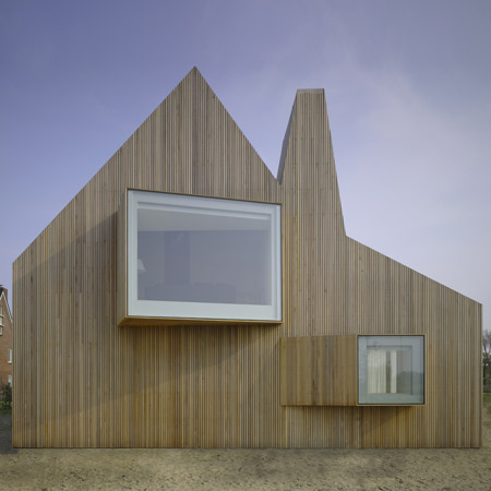
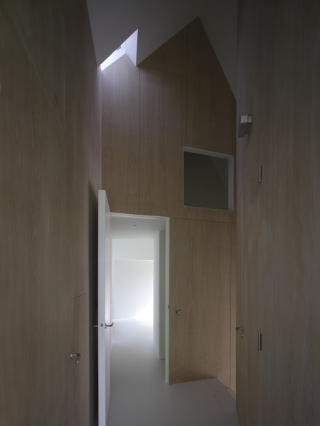
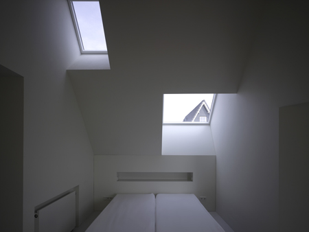
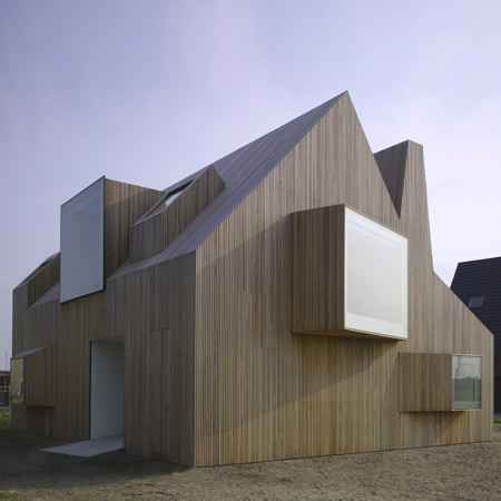
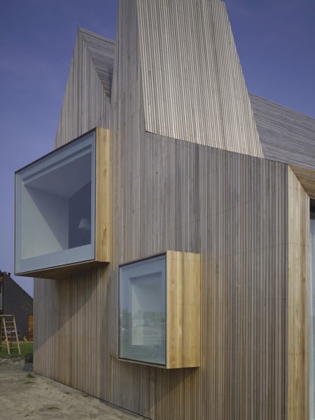
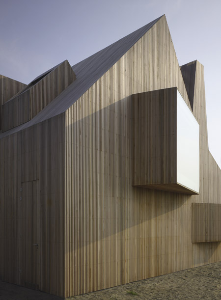
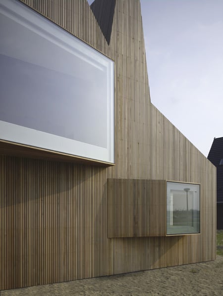
Called House Bierings, the timber-clad building has different shaped windows protruding from it’s surfaces at various angles on all sides.

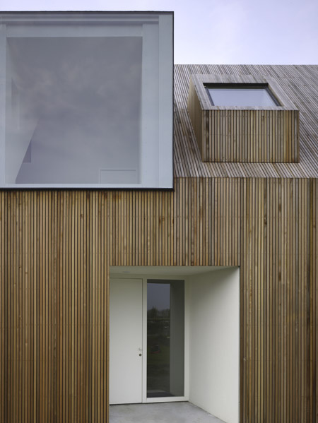
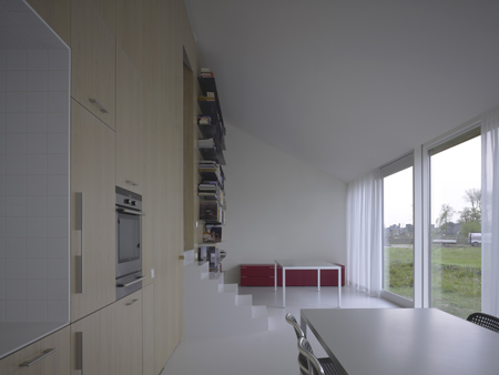
A deep porch leads through the entrance hall to a kitchen with a large glass window overlooking the garden.

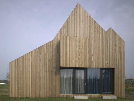
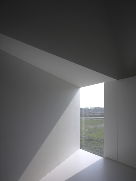
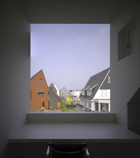
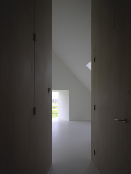
Each window is positioned to obscure views of neighbouring buildings and frame views of the countryside beyond.

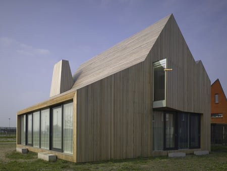
Photos are copyright Christian Richters/VIEW and used with permision.

Here’s some more information about the house from Rocha Tombal’s website:
–
House Bierings
2007-2008
From a basic form, defined by the municipal urban plan, sculptural “eyes” emerge with direct views to the varied countryside landscape.

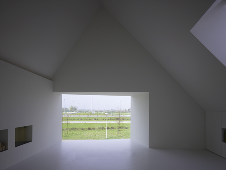
The form and orientation of the building avoid visual contact with the adjacent houses: at the ground floor the angled ceiling of the kitchen accentuates the intensive contact with the garden.

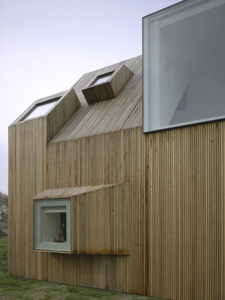
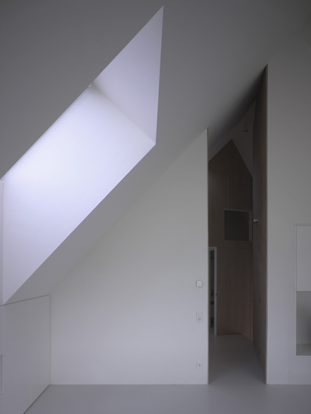
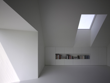
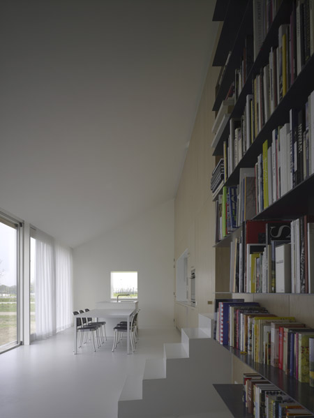
On the first floor, the different shaped openings in the roof and façade offer, like “fingers of light”, varied daylight experiences.

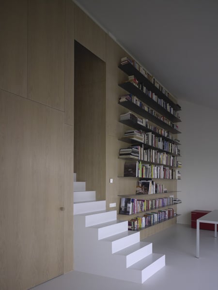
The routing through the house starts in the hall, a section of the ground floor volume.

After experiencing the entrance area and passing the gigantic pivoted door, the visitor arrives at the “heart of the house”, the kitchen.

Here he looks through the big glass wall straight into the garden, which suggests being outside again.

Behind him, the stair cuts a wooden wall inviting to follow the route towards the first floor.

Its angled form and extreme proportions (small and high) and the daylight entering from the ceiling, offer the feeling of walking in a medieval street.

At the end of it he discovers the living room, a quiet, north-lighted attic space, from which a big opening exposes the surrounding green like in a framed painting.


September 8th, 2009 at 12:22 am
incredible !!!!
September 8th, 2009 at 2:23 am
WOW great job
September 8th, 2009 at 3:54 am
wow this is nice! would like to see floor plans
September 8th, 2009 at 4:25 am
I want to live there!
September 8th, 2009 at 5:45 am
SEXY! What sh!t-hot detailing!!
September 8th, 2009 at 6:24 am
omg…….
September 8th, 2009 at 6:31 am
It is really beautiful!
September 8th, 2009 at 7:25 am
I like wood, big windows and clear, light interiors. Fine house:)
September 8th, 2009 at 8:14 am
wow beautiful project – well done.
September 8th, 2009 at 8:45 am
fantastic and to echo previous comments, great detailing, but please could we have some construction details and plans?
September 8th, 2009 at 9:03 am
what a pity that the residents themselves can not enjoy their view as the neighbours do. beautiful project!
September 8th, 2009 at 9:19 am
WOW!! Wonderfully put together, a stunning design, and clearly thought out… Ana Rocha and Michel Tombal; both the most talented people I worked with while I was a student at Mecanoo, now 10 years ago. I am so pleased to see them making their own way. Watch out for them, I am positive they will be creating some of the most outstanding work in the Netherlands in years to come. Bravo!
September 8th, 2009 at 9:26 am
luv the sharp crispy line.
September 8th, 2009 at 9:27 am
well done Iwona! excellent job!
September 8th, 2009 at 9:37 am
Wonderfully WoWWWW
September 8th, 2009 at 9:47 am
Love the interior.
September 8th, 2009 at 9:50 am
I’m surprised it is dutch and not swiss… Great design anyway. Personally I may have made a little bit less openings on the entrance facade… but I’m very picky
September 8th, 2009 at 9:50 am
only one thing: the opening window frames are thick and brown outside, though the rest of the frames are white or invisible, why`?
September 8th, 2009 at 10:31 am
lovin this
September 8th, 2009 at 10:35 am
great & clean job! I guess now we want to see some detail drawings…
September 8th, 2009 at 11:31 am
just stunningly beautiful: all show and a lot of substance
September 8th, 2009 at 11:49 am
Superb!
September 8th, 2009 at 12:23 pm
Amazing finishing
September 8th, 2009 at 1:35 pm
@archilocus
hmmm … I’d say this is as dutch as it gets nowadays …
plans can be found here:
http://www.dearchitect.nl/architect/images/68-71_Pr_Bierings_tcm422-505167.pdf
September 8th, 2009 at 2:44 pm
The alienated object is getting tedious isn’t it?
I admit that I was interested in the whole uncanny thing for a while but it is a dead end isn’t it.
A silly short lived joke not really any different from flying saucer shaped buildings. It’s ironic, post modern and in the end boring.
September 8th, 2009 at 2:45 pm
I’m at a loss for words…
September 8th, 2009 at 3:01 pm
its a pearl from outside. just beatuiful. but for a place to live in, the inside is too perfect. i won´t feel well. i would feel like a foreign body wich destroys the perfectly arranged interiors.
i would love to be his neighboor
September 8th, 2009 at 3:45 pm
Wonderful! pure and quiet.
September 8th, 2009 at 4:09 pm
really cool design! both exterior and interior
September 8th, 2009 at 5:01 pm
well, münte, you can always break something or take some wall off.
I agree with you anyways. It´s over designed for my taste. But usually this is what happens in this kind of projects and the way they are showed in this sites. too perfect.
Great job also!
Salute!!
September 8th, 2009 at 8:04 pm
Beauty, beauty…
September 8th, 2009 at 9:39 pm
not for living
September 9th, 2009 at 12:15 am
I would say dutch shell design meets portuguese detailing and light sensitivity
September 9th, 2009 at 7:32 am
Sometimes architecture seems easy and looks beautiful.
to rene: What do you mean by not for living? I would love to live there.
September 9th, 2009 at 11:25 am
WOW!!
September 9th, 2009 at 11:57 am
im on asuf’s side.
September 9th, 2009 at 12:16 pm
Wonderful exterior….How would I reach the books from the top shelf?? Great table furniture from MDFItalia and storage solutions in the bedrooms – concealed and visible.
September 9th, 2009 at 4:56 pm
Amazing!! This is a house i would simply love to live in.
September 10th, 2009 at 9:46 am
This is a really nice house!
Not as birght as i thought it would be, cut is ‘cosy’ and must feel warm
September 10th, 2009 at 9:54 am
Love the architecture! Ana Rocha giving the portuguese routes a new meaning! Congratulations!
September 11th, 2009 at 1:17 am
love it! the sculpting of light within the space and the strong geometric forms makes it really stunning.
September 11th, 2009 at 7:31 pm
for all: if you like it so much, you guys must go to Vorarlberg county – Austria and sorroundings from Switzerland – you’ll have enough – for local architecs this way of doing is a (contemporary) pattern…Peter Zumthor do not come from scratch..
…and , surprisingly, see the Great Award of Romanian Architecture from 2008’s Romanian Architectural Bienalle and also some Czeh contemporary wooden architecture.
is very enjoiable..
September 14th, 2009 at 11:22 am
love to see the plan if there is??????
September 18th, 2009 at 1:08 am
so nice, what lovely light
October 5th, 2009 at 5:32 pm
Superb Architectural DETAIL gives SMALL HOUSE big bang. Vertical wood siding climbs exterior neatly! Interior design has as much pizazz as the outside. Overall a succinct and original piece of art in the form of a home! Can I have a duplicate for my yard, please?
October 7th, 2009 at 3:29 am
anyone knows what the floor finish is? thanks
November 10th, 2009 at 7:35 am
The whole project – interior and exterior design – is too minimalistic for my taste. But I really loved the bookshelves. Can anyone tell me how they can stand all this weight? How are they mounted on the wall? Where can I find them? Thank you.
November 23rd, 2009 at 8:56 am
beautyfull and beautyfull… house Bierings for me feeling clean and cool. well! I love here.
only one thing,no premises roof , thanks!