Bell by Industrial Facility for IDEA International
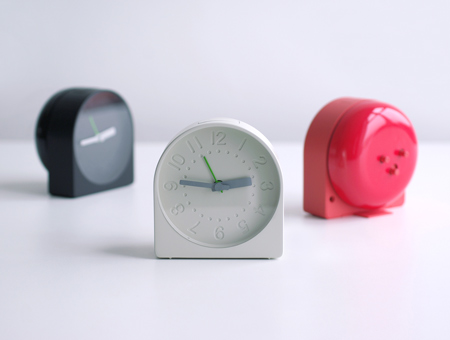
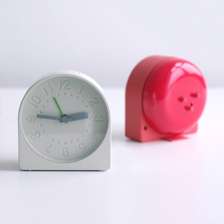
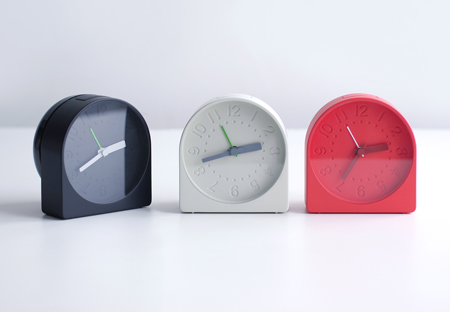
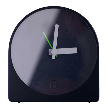
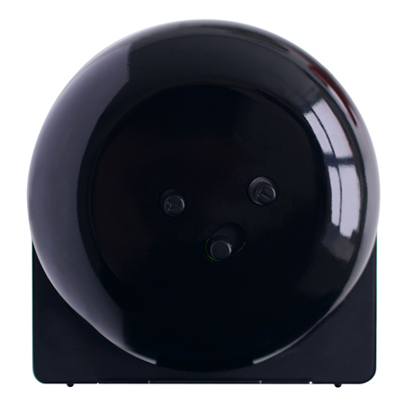
London Design Festival 09: at The Dock in London this week British design office Industrial Facility are showing an alarm clock where the back casing is formed by one large, loud bell.
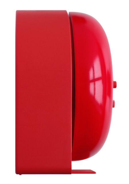
Industrial Facility say that this improves the efficiency of the clock, using fewer components and creating a louder ring.
Called Bell, the alarm clock was designed for Japanese design brand IDEA.
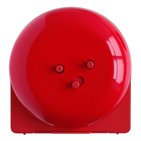
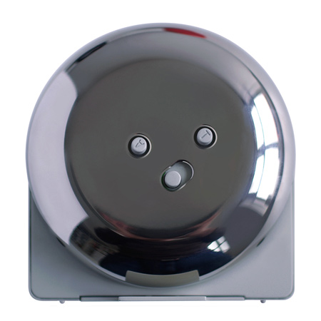
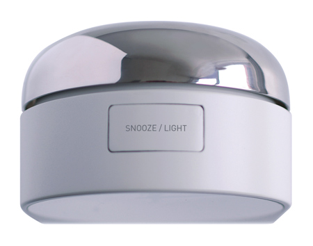
The product is available in three colours, each inspired by a loud object: a fire bell (red), bicycle bell (chrome) and door bell (black).
More Dezeen stories about Industrial Facility:
Table-Bench-Chair
Enchord Table
Two-timer
See all our stories about London Design Festival 2009 in our special category.
Here's some text from Industrial Facility:
--
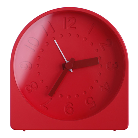
Project: Bell Alarm Clock
Client: IDEA Japan
Description: Bell is a new alarm clock designed by Industrial Facility, who have been working with IDEA International of Japan to develop a group of products where design is engaged beyond novelty.
'Bell' re-examines the world of the analogue alarm clock; by moving the bell component to form part of the clock's body, it saves components, simplifies the appearance, and creates a much louder ring.
Bell is louder than a mobile phone, a desk clock or a watch.
This loudness is reflected in the choice of colours: Fire bell Red, Bicycle bell Chrome, and Door bell Black.
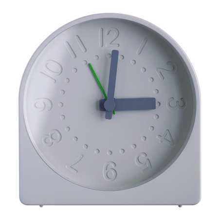
It features a no-nonsense interface with snooze control, moulded numeral display and LED illumination.