Redhill Apartment by Studio SKLIM

| 24 comments

Singapore based architect Kevin Lim of Studio SKLIM has completed the renovation of a public housing apartment in Singapore, where the space is organised by large wooden cabinets.

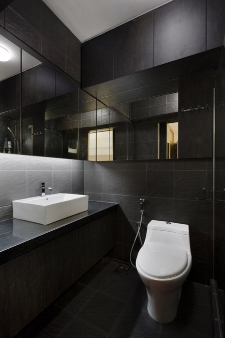
Called Redhill Apartment, the project incorporates an entrance hall, living room, dining room and kitchen.

Lim designed a set of built-in furniture pieces to divide the apartment into separate areas and provide storage.

Photographs are by Jeremy San.

Here's some more text from Kevin Lim:

--

Redhill Apartment
Redhill Road, Singapore

Public housing has come a long way in Singapore providing the needs for 80-90% of the population. The perception of public housing in the world is perhaps not of the best, but in Singapore, the quality and standards of these apartments well rest above the poverty line, driving prices rocket high.

The client had just returned from a three-year long diplomatic stint and was looking to refurbish his apartment to welcome his new addition to the family.

As with all projects, pragmatics was the primary driving force of this project. The main challenge was to reconfigure a public housing apartment amidst the regulatory constraints into an object of spatial flow.

The present main foyer/dining/living/kitchen space was segmented with proportions that were not user friendly. The foyer area and the kitchen entrance were too generous and encroached upon the dining room.

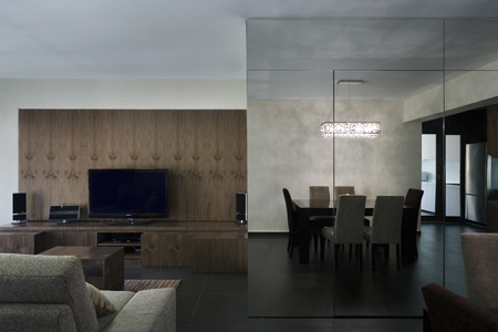
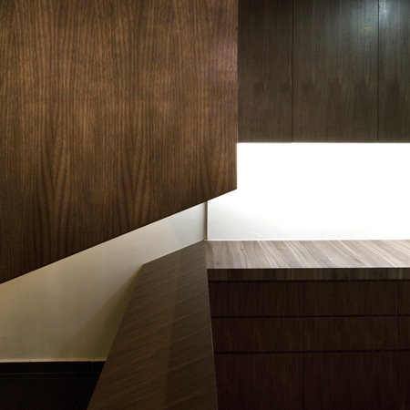
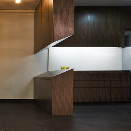
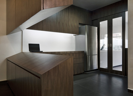
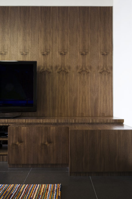
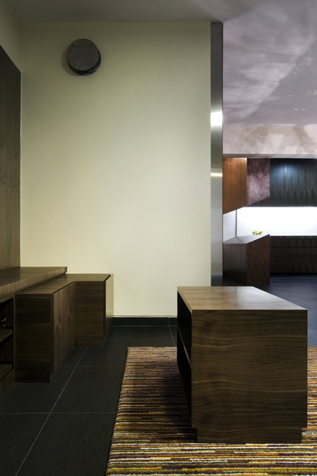
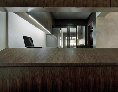
After a study of the existing structure, we removed one of the non-load bearing walls and reconfigured the rest of the surrounding spaces. The concept was simple: to create a large space with distributed furniture and a mirrored surface to reflect the surrounding spaces. The kitchen was subdivided into a wet and dry area with part of the latter extending to become a foyer cabinet.

The dining space became larger and visual continuity was achieved with all the surrounding built-in furniture; from the foyer to the dry kitchen to the living room set. It became a set of separate furniture pieces for one big space!

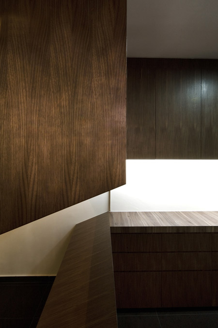
The design approach to the individual furniture pieces were derived from their inherent functions and their relationship to each other in that particular space. For example, the slope of the entrance foyer piece was a reflection of the inclined shoe rack enclosed in the bottom cabinet and the gap between the top and bottom pieces provided natural cross ventilation and a view towards the entrance from the kitchen.

The furniture pieces were designed as a set for the space and related to the bigger spatial flow with geometry and material continuity.

dzn_Redhill Apartment by Studio SKLIM 1

Facts & Figures

Client: Private
Architect: Studio SKLIM - Kevin S. K. Lim.
Main Photography: Copyright - Jeremy San, images courtesy of Studio SKLIM
Gross Floor area: 110 m2

One Response to Redhill Apartment by Studio SKLIM

  1. archilocus says:

    First time I see a shoe rack being the guideline for the visual (mis)connection between the kitchen and the entrance… I cannot help myself thinking that piece would be better horizontal rather than sloping.

  2. vrijaya says:

    you are right, it is quite query with that slope shaped board.

  3. Yoko Hanai says:

    This is just an elegant and classic interior. It is hard to tell it’s public housing!

  4. Sandip says:

    The slope of the board with the complementary slope above it creates a space between that is fraught with tension and yet naturally releases it. An animated suspension of possibility, soothed by the calm natural rythym of wood. This is an instinctive, poetic exploration of de-construction, moving planes apart with angular ease.

  5. johncaleb says:

    wow! a HDB looking so good is almost unbelievable!

  6. Thierry says:

    public housing? HDB flat? that’s amazing.

  7. Zaedrus says:

    Good looking public housing.
    Better looking than my own housing.

    But I can’t get past the book matched veneer. It’s so distracting.

  8. logorithm says:

    The sloping cabinet top is weird and wasted. Some 1.8m run of worktop is wasted.

  9. moe makouk says:

    seems like a huge family coffin, lifeless..dead wood

  10. ThirskUK says:

    Oh my god this is the building where I used to live!!!!!

  11. Rac says:

    Wasted, though beautifully!! afterall, not every nook n corner of a house has to be used as workspace.. it can be elegantly left empty and the slope ensures tat.. though, the ‘de-con’ slope is not repeated or juxtaposed anywhere else.. would have been good if the language continued..

  12. Le Genius says:

    Great interior! The slopes are making the space flow subtly and especially unexpected as derived from the shoe rack profile.

  13. esc says:

    Is anyone else bothered by the detail in the bathroom right above the medicine cabinet mirror doors (left side) it ruins the line from the head cabinets on the back wall…

  14. jeanpierre says:

    “The slope of the board with the complementary slope above it creates a space between that is fraught with tension and yet naturally releases it. An animated suspension of possibility, soothed by the calm natural rythym of wood. This is an instinctive, poetic exploration of de-construction, moving planes apart with angular ease.”

    yeah yeah don’t care, how do it put a glass or a photo frame on it?

  15. the slope is just a design idea. In this case, we can’t say it’s a good idea. But, maybe the client ask for something like that. We don’t know.

    The main problem is the wood repeat in the laminate. Ouch !!! That is disturbing. The cabinet maker should have been fired.

  16. Mikkel Lin says:

    The carpet on the floor is from Ikea ;)
    I have one too.

  17. Messiar says:

    I find the wood veneer rather pleasing as it adds a different scale and dimension to an otherwise large surface, imagine if it were just a singular plain color. The pieces could thus be viewed from different scales. Good Job!

  18. Heath says:

    That kitchen could really do with some more bench space.

  19. depressing
    where’s the light? sell all that wood for window money

  20. logorithm says:

    Whoops! Correction: Not 1.8m of worktop wasted, but 2.4m.

    I like the slope underside the hanging cabinet though. A lot!

  21. Jack says:

    Great, with one exception…
    I love wood grain so, the repeating grain in the cabinets would drive me nuts. It takes a naturally beautiful, random pattern and makes it a robotic not, er, random pattern. Kinda looks like one of those ‘magic eye’ images where you stare at it and dolphins appear.
    The slopped bits are a nice touch but, a waste of space for an apartment (okay, so that’s two exceptions).

  22. Quentin says:

    nice, simple, minimalism…but why the designer didn t use the same wood in the bedroom? of course he got a reason for that…. let s guess…..
    Regards

  23. Leegoo says:

    I love it, especially the mirrior wall in the dining area. Just the bedroom design is not perfect.

  24. Josh says:

    Looks to be a cool retreat in a hot and humid country.

Leave a Reply

Your email address will not be published. Required fields are marked *

*

You may use these HTML tags and attributes: <a href="" title=""> <abbr title=""> <acronym title=""> <b> <blockquote cite=""> <cite> <code> <del datetime=""> <em> <i> <q cite=""> <strike> <strong>